Hmm for me this doesnt really represent a night time scene, The local lighting is very very intense. Moonlight will will be mostly towards the blue tone range with white light. Blue and green tones are picked up by the eye in low light level enviroments, so for example you wouldnt expect to see much red at all in the distant hills.
The water seems far too bright and seems almost irradiant, it would almost be a a simple but varied tone closely matching the sky with some subtle reflections and specular where necessary.
As things fall off into the distance their saturation will drop dramatically due to the atmosphere, being pushed away from their local color and dropping into the ambient tones.
This should almost be a domanance of hue piece, meaning everything should be a dirivative hue of the main diffused light source.
The resolution of your textures are very apparent, they need to be boosted up to provide a bit of break up for the eye, at the moment they really appear like solid flat dominating tones which is distracting for the eye. You have strong saturated colors combating the contrast of the piece.
Make the local artificial light source with a greater fall off and subtlety, at the moment its effect is too powerful for the composition.
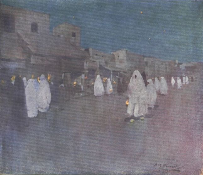
This image is a demonstration of a dominance of hue in moonlight:
FX supervisor - double negative