Maya for 3D Printing - Rapid Prototyping
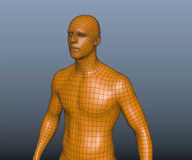
In this course we're going to look at something a little different, creating technically accurate 3D printed parts.
#
1
11-04-2005
, 12:01 AM
my website
I'm not a geek. I'm a nerd.
msn - g1842@hotmail.com
I'm up for a chat anytime.
#
2
11-04-2005
, 12:07 AM
AIM: mhcannonDMC
"If you love your job, you'll never work another day in your life."
#
3
11-04-2005
, 12:56 AM
I'm not a geek. I'm a nerd.
msn - g1842@hotmail.com
I'm up for a chat anytime.
#
4
11-04-2005
, 12:59 AM
I'm not a geek. I'm a nerd.
msn - g1842@hotmail.com
I'm up for a chat anytime.
#
5
11-04-2005
, 06:30 AM
Okay, that's good... so what do they want? I'd love to be able to help or provide meaningful suggestions, without the right info that's hard to do. What do you plan to put in the image you posted regard the clan's site? or did you just want a critique of the image layout?Originally posted by gohan1842
i kno wat they want. this is just the start
AIM: mhcannonDMC
"If you love your job, you'll never work another day in your life."
#
6
13-04-2005
, 07:31 PM
I'm not a geek. I'm a nerd.
msn - g1842@hotmail.com
I'm up for a chat anytime.
#
7
13-04-2005
, 10:15 PM
Subscriber
Join Date: Jun 2004
Join Date: Jun 2004
Posts: 119
If so I would look at (in a design way) how those structures are going to react when they are made bigger by the contents they hold. I'm sure with tables or CSS you could make it look nice, but on every site I do I always get that bit wrong and find menues being placed where they shouldnt be, and find them stretching and losing all thier shape and style.
As you mentioned you will be changing the black background. The only thing I can think of is to keep it to a solid colour, or make the pattern very very small so it doesnt distract from the main part of the site. If it was my site the background would have a pattern smaller in size than "mesh/fishnet" border you have on the elements, something not to disimilar to the tiny pattern used here at SM froum for the background - also makes it very light to download, just a timy repeating gif.
#
8
14-04-2005
, 08:20 PM
I'm not a geek. I'm a nerd.
msn - g1842@hotmail.com
I'm up for a chat anytime.
#
9
14-04-2005
, 08:21 PM
I'm not a geek. I'm a nerd.
msn - g1842@hotmail.com
I'm up for a chat anytime.
#
10
15-04-2005
, 09:56 AM
#
11
15-04-2005
, 10:11 PM
I'm not a geek. I'm a nerd.
msn - g1842@hotmail.com
I'm up for a chat anytime.
#
12
23-04-2005
, 07:03 AM
yeah, btw, reduce the border width on all the "windows", and cut down on the distance between the menus,
these tiny adjustments can make wonders to your site,
try it out, let me see how it works,
Cheers,
Tariq
Posting Rules Forum Rules
Similar Threads
New 3D Tutorial Website In Development
by keithd203 in forum Maya Basics & Newbie Lounge replies 9 on 21-01-2009
Perfecto's Website
by Perfecto in forum Maya Basics & Newbie Lounge replies 9 on 24-06-2007
Website UP!!! (BETA - Big time) -- feedback
by tariqrf in forum Maya Basics & Newbie Lounge replies 4 on 27-04-2005
Need a website for a shader please.
by davis_drawings in forum SimplyMaya Tutorials replies 4 on 24-04-2005
Website Help
by painterdan in forum Maya Basics & Newbie Lounge replies 17 on 20-04-2004
Topics
Free Courses
Full Courses
VFX News
How computer animation was used 30 years ago to make a Roger Rabbit short
On 2022-07-18 14:30:13
Sneak peek at Houdini 19.5
On 2022-07-18 14:17:59
VFX Breakdown The Man Who Fell To Earth
On 2022-07-15 13:14:36
Resident Evil - Teaser Trailer
On 2022-05-13 13:52:25
New cloud modeling nodes for Bifrost
On 2022-05-02 20:24:13
MPC Showreel 2022
On 2022-04-13 16:02:13


