Introduction to Maya - Modeling Fundamentals Vol 1
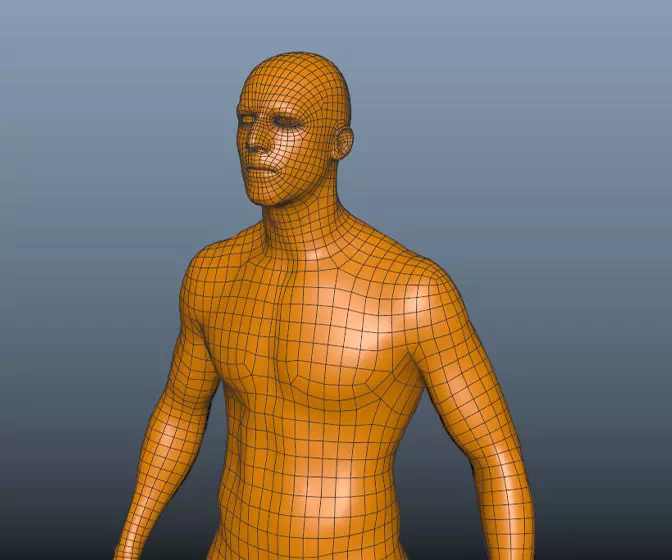
This course will look at the fundamentals of modeling in Maya with an emphasis on creating good topology. We'll look at what makes a good model in Maya and why objects are modeled in the way they are.
#
31
11-12-2003
, 08:27 PM
#
32
12-12-2003
, 05:24 AM
Subscriber
Join Date: Nov 2003
Join Date: Nov 2003
Posts: 58
#
33
12-12-2003
, 05:53 AM
Subscriber
Join Date: Nov 2003
Join Date: Nov 2003
Posts: 58
#
34
12-12-2003
, 08:46 AM
#
35
12-12-2003
, 09:54 AM
I love this scene so much, your textures on the smaller models are superb.
(1) Lightbulb is too opaque, color is not good. I think you need a better glass shader for that and then dirty it up a bit.
(2) The wire shadows are a too defined. I doubt that under "real world" lighting they would cast any shadows unless it was a bright sunny say or artificially lit at night.
But then I guess you could tweek a scene like this to death...!
That'll do donkey... that'll do...
#
36
12-12-2003
, 07:39 PM
Subscriber
Join Date: Nov 2003
Join Date: Nov 2003
Posts: 58
#
37
12-12-2003
, 08:43 PM


aim: rabidflamingo
Last edited by soulcialism; 12-12-2003 at 08:46 PM.
#
38
13-12-2003
, 03:29 AM
this is really going well.
the one shading comment I would make is that it seems your bump is a bit much... the human eye can see past a bump after a certain amount, and it looks just a little off. I just realized another possiblilty- most of the smudges on your wall are in grayscale, so maybe that is what makes the bump more pronounced (e.g. the wall is all grayscale just like an actual bump map). A little hint of colour should fix this.
that's really the only bug I see.
Great job, keep up the good work!

#
39
16-12-2003
, 07:29 PM

Dave Baer
Professor of Digital Arts
Digital Media Arts College
Boca Raton, Florida
dbaer@dmac.edu
#
40
17-12-2003
, 07:30 AM
Subscriber
Join Date: Nov 2003
Join Date: Nov 2003
Posts: 58
#
41
17-12-2003
, 07:34 AM
Subscriber
Join Date: Nov 2003
Join Date: Nov 2003
Posts: 58
-flipfl0p
#
42
17-12-2003
, 08:02 AM
Subscriber
Join Date: Nov 2003
Join Date: Nov 2003
Posts: 58
#
43
17-12-2003
, 09:54 AM
That'll do donkey... that'll do...
#
44
17-12-2003
, 12:44 PM
Registered User
Join Date: Nov 2003
Join Date: Nov 2003
Location: Portugal
Posts: 15
#
45
17-12-2003
, 08:45 PM
i like the darker pic personally, but i see what you're going for with the adjusted pic. maybe just a little too blue for me...
aim: rabidflamingo
Posting Rules Forum Rules
Similar Threads
Thumbnails in WIP & Finished Work
by Nilla in forum Site News & Announcements replies 11 on 09-12-2010
WIP critiques - a suggestion
by Alan in forum Maya Basics & Newbie Lounge replies 2 on 14-01-2004
Commando Rodent Gopher - Concepts + WIP
by orgeeizm in forum Work In Progress replies 31 on 15-10-2003
FN tactical shotgun WIP
by [icarus_uk] in forum Work In Progress replies 7 on 15-08-2003
Topics
Free Courses
Full Courses
VFX News
How computer animation was used 30 years ago to make a Roger Rabbit short
On 2022-07-18 14:30:13
Sneak peek at Houdini 19.5
On 2022-07-18 14:17:59
VFX Breakdown The Man Who Fell To Earth
On 2022-07-15 13:14:36
Resident Evil - Teaser Trailer
On 2022-05-13 13:52:25
New cloud modeling nodes for Bifrost
On 2022-05-02 20:24:13
MPC Showreel 2022
On 2022-04-13 16:02:13

