Maya for 3D Printing - Rapid Prototyping
In this course we're going to look at something a little different, creating technically accurate 3D printed parts.
# 1 23-07-2010 , 11:57 PM
Mayastatic's Avatar
Subscriber
Join Date: Jul 2006
Location: germany
Posts: 154

pocketswatch

Hey!

Long time that I made a new thread, but today its time to re activate my account on th eold good SM! user added image

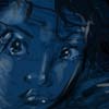
This is an actually work of me, where I´m telling a story about 2 people and there past. Its an animation where the pocketclock runs counterclockwise and the camera is moving towards the center and in the middle of that shorts of there life are shown to tell where the story is about.

Its the Intro of a Film I have done and I think its Ok not the greatest work ever but in short deadline, the best what I can do..

What do you think about that still? Is it appealing to yo?
Is the lightning Ok, or do you feel anything when you look at the stil?

best regards!! user added image

Attached Thumbnails
# 2 24-07-2010 , 12:59 AM
bullet1968's Avatar
Lifetime Member
Join Date: Feb 2010
Location: Australia
Posts: 4,255
The picture is good...I like black and white. It reminds me of my Granfather...sitting in the lounge listening to the radio and world events. Sunday morning on the farm before they went out Grandfather and Father to tend the horses.

cheers bullet


bullet1968

"A Darkness at Sethanon", a book I aspire to model some of the charcters and scenes
# 3 24-07-2010 , 01:27 AM
Perfecto's Avatar
Registered User
Join Date: Mar 2007
Location: TN (USA)
Posts: 1,889
My first reaction was...UGH, time to get up and get my son ready for school.

I really like the style. To me it has a real classy style. Looking at it makes me automatically think "the past". I do feel/sense some kind of mood when I look at it, but for the life of me I can't seem to identify the mood I'm interpreting if that makes any sense.


Don't be satisfied with what you can do but rather strive to do the things you can't do!
Exceed Expectations!
# 4 24-07-2010 , 01:34 AM
bullet1968's Avatar
Lifetime Member
Join Date: Feb 2010
Location: Australia
Posts: 4,255
Bahahahah Im not alone with that comment Perfecto!!! eh??? I know how you feel.

The mood id probably something from your childhood maybe?? Thats what mine was (I think). It actually now I think about it (for some reason) gives me visions of WW2 and someone on a train going to war???

cheers bullet


bullet1968

"A Darkness at Sethanon", a book I aspire to model some of the charcters and scenes
# 5 24-07-2010 , 05:39 PM
Registered User
Join Date: May 2009
Posts: 153
good work mate...

# 6 25-07-2010 , 08:25 AM
halfloaf's Avatar
Lifetime Member
Join Date: Mar 2008
Location: Bristol, UK.
Posts: 191
Good work, my only comment is that if it's a pocket watch then the scale of the timber texture is a bit small. I'd increase the texture so that the grain appears larger.

Very nice mood!

J

# 7 25-07-2010 , 06:06 PM
Gen's Avatar
Super Moderator
Join Date: Dec 2006
Location: South FL
Posts: 3,522
Pretty image. My only crits are concerning what Halfloaf said. The scale of the texture makes the watch look really large, plus if you roughed up the texture with some relief it would blend with the mood a bit more.


- Genny
__________________
::|| My CG Blog ||::
::|| My Maya FAQ ||::
# 8 25-07-2010 , 07:00 PM
Mayastatic's Avatar
Subscriber
Join Date: Jul 2006
Location: germany
Posts: 154
Hey thanks for your "good" comments.
Nice that it do overall well!

Concerning what halfloaf and GecT said, you are totaly right with your opinion!! Nothing more to say! user added image

But funny, because I thought about it when it was time for texturing. After some tests and style variations I decided to cover the floor, because I wantet the focus to be only on the pocket watch!

Nothing should disturb was my thought. Any relief or "visible" background would deflect the focus of the animation.
And the focus is the counterclockwise ticking p watch.

But you see it and thats a reason to change it!

I think that it would be not so a blinker, when the lit area would be bigger, I think thats more a reason why it looks a little big.

Perfection is really hard to achive, but for that there are forums like SM to be better every day!

Thank you very much!

# 9 29-07-2010 , 12:55 PM
murambi's Avatar
Head of 3d Admedia
Join Date: May 2007
Location: nairobi , ken-ya
Posts: 1,340
any chance we would get to see the animation

# 10 30-07-2010 , 02:14 AM
Mayastatic's Avatar
Subscriber
Join Date: Jul 2006
Location: germany
Posts: 154
Hey Murambi,

the production is not yet finished, but I look that I can show you the animation without post effects!

I´m not at my workstation, but I will do upload it hopefully this week!

Best regards!

# 11 30-07-2010 , 08:14 PM
Rhetoric Camel's Avatar
Subscriber
Join Date: Dec 2006
Location: Plattsburgh New York
Posts: 1,222
It needs a "second" hand.
I've seen small wood grain on tables before so that didn't really come to mind, but making the wood grain a bit bigger might help a little more.

# 12 02-08-2010 , 02:31 AM
twisteddragon33's Avatar
Registered User
Join Date: Apr 2003
Location: New York, USA
Posts: 1,945
Shouldn't the roman numeral 4 be IV not IIII


________________________
AIM: SublimeDragon33
Catch me if i'm on. Always up for a chat.
e-mail: sublimedragon33@gmail.com
# 13 02-08-2010 , 02:45 AM
bullet1968's Avatar
Lifetime Member
Join Date: Feb 2010
Location: Australia
Posts: 4,255
WELL SPOTTED


bullet1968

"A Darkness at Sethanon", a book I aspire to model some of the charcters and scenes
# 14 02-08-2010 , 01:46 PM
Mayastatic's Avatar
Subscriber
Join Date: Jul 2006
Location: germany
Posts: 154
Hey twisteddragon33,

nicely attentive, but you aren´t right!

On dials with Roman figures 4 is often found in the representation IIII instead of IV. Ground for this is that IV is the abbreviation of Jupiter (IVPPITER) for the Roman God and has been unusual with it the use of IV already in the antiquity!

take a look at google pics and search for watches with Roman dials, you will be surprised! user added image

Cheers and see you!

# 15 02-08-2010 , 04:21 PM
bullet1968's Avatar
Lifetime Member
Join Date: Feb 2010
Location: Australia
Posts: 4,255
It looks like you are both right! It is a matter of choice these days...interesting though..as I was taught in school IV..so sing along..you sat potato I say potatoe..he he. What a diverse world we have


bullet1968

"A Darkness at Sethanon", a book I aspire to model some of the charcters and scenes
Posting Rules Forum Rules
You may not post new threads | You may not post replies | You may not post attachments | You may not edit your posts | BB code is On | Smilies are On | [IMG] code is On | HTML code is Off