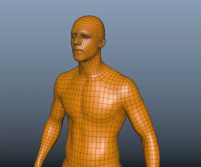
Digital humans the art of the digital double
Ever wanted to know how digital doubles are created in the movie industry? This course will give you an insight into how it's done.
# 76 26-07-2007 , 09:34 PM
Some Guy's Avatar
Subscriber
Join Date: Apr 2005
Location: Wagga Wagga, Australia
Posts: 1,432
With the angle, try one like no.1 c'ept lower down like it is from a small child's view.


"If Less is more then think how much more more would be..."


Winner June 2009 Spaceship Challenge
# 77 26-07-2007 , 11:44 PM
gster123's Avatar
Moderator
Join Date: May 2005
Location: Manchester Uk
Posts: 6,300
Think funkey bunnies is spot on with his suggestion for the camera close to the end of the broom.


"No pressure, no diamonds" Thomas Carlyle
# 78 26-07-2007 , 11:53 PM
arran's Avatar
Registered User
Join Date: Dec 2005
Location: Brooklyn, NY
Posts: 3,708
yeah - good to see you still working on this joopson.

Like the others, I definitely agree that a more dramatic camera angle will really help. I also think that a few more objects will help break up the scene and give it more interest - maybe a table behind the ninja with a vase, or a chest of a drawers... just an idea. user added image

# 79 27-07-2007 , 06:21 AM
Joopson's Avatar
Registered User
Join Date: Jul 2005
Location: Boston, MA
Posts: 2,314
which angle is better (or should i change them both, lol)
also, sorry, only 2 minutes of rendering time each, so alot of noise

1

Attached Thumbnails

Environment Artist @ Plastic Piranha
www.joopson.com
# 80 27-07-2007 , 06:22 AM
Joopson's Avatar
Registered User
Join Date: Jul 2005
Location: Boston, MA
Posts: 2,314
2

Attached Images

Environment Artist @ Plastic Piranha
www.joopson.com
# 81 27-07-2007 , 06:48 AM
arran's Avatar
Registered User
Join Date: Dec 2005
Location: Brooklyn, NY
Posts: 3,708
definitely 1 - it already looks a lot better - though I might rotate the character a bit just so you can see his pose. I might also move the tv in the bedroom forward a touch just so you can see it.

# 82 27-07-2007 , 06:55 AM
gster123's Avatar
Moderator
Join Date: May 2005
Location: Manchester Uk
Posts: 6,300
I would say right in between 1 and 2!


"No pressure, no diamonds" Thomas Carlyle
# 83 27-07-2007 , 07:50 AM
Joopson's Avatar
Registered User
Join Date: Jul 2005
Location: Boston, MA
Posts: 2,314
thanks, i added a table behind him, with a vase, but i think it looks like crap. its a thin hallway, and i personally leave my hallways empty, but oh well, what do you think???

Attached Images

Environment Artist @ Plastic Piranha
www.joopson.com
# 84 27-07-2007 , 08:37 AM
THX1138's Avatar
19 year Veteran
Join Date: Sep 2002
Location: U.S.A.
Posts: 2,140
I think the superbright light you have in the hallway is what the real problem is. I don't think has anything to do with the camera angle or the modeling. All that stuff looks fantastic. Loose the big bright light, and add some small lights on the walls ( to the front and back) and see what happens.

Of course this is only a suggestion.

# 85 27-07-2007 , 09:36 AM
Funky Bunnies's Avatar
Subscriber
Join Date: Mar 2005
Location: Illinois, USA
Posts: 250
as far as the angle I agree with gster, I think it would look best inbetween the two angles. Maybe with a bit of a bias towards the second one. The pose is really nice and you lose a lot of its dynamism in the first one because its too hidden and because the pose was created with a frontal view in mind and in the second one because it loses the viewer's involvement. (He could also be scooted a little closer to the door, I think.)

Another thing that I think could be improved is THX's suggestion. I would use much dimmer light. This is probably at night and the lighting is too distracting. I think you should have a dim light at the left, the dimmer light coming from the tv, and add some rimlight if you need to.

I don't think you need the table behind him - especially with so much showing. Remember, the audience is pretty smart, if we see the end of a table there we'll know it's a table. I think it's just a bit distracting atm.

Anyway it's shaping up, man.
Keep on truckin' user added image

# 86 29-07-2007 , 12:48 AM
Perfecto's Avatar
Registered User
Join Date: Mar 2007
Location: TN (USA)
Posts: 1,889
I'm lovin' it alot! The style is great! After you incorporate the suggestions from the guys above, it'll be pretty awesome. Nice work Joopson


Don't be satisfied with what you can do but rather strive to do the things you can't do!
Exceed Expectations!
# 87 01-08-2007 , 12:04 AM
deadjackal's Avatar
Registered User
Join Date: Jun 2007
Location: Türkiye
Posts: 53
yes man your work is grate.i think u can make an animation film with this scene actually with this brain. user added image

# 88 03-08-2007 , 08:05 PM
Joopson's Avatar
Registered User
Join Date: Jul 2005
Location: Boston, MA
Posts: 2,314
ok, tell me what you think of this one:

Attached Thumbnails

Environment Artist @ Plastic Piranha
www.joopson.com
# 89 03-08-2007 , 08:11 PM
Jr.Who
Guest
Posts: n/a
I think it should be a bit darker in the parent‘s room, and it would be nice if you could add some DoF, mostly on the broom (since it’s so close to the camera).
user added image

# 90 03-08-2007 , 08:20 PM
Funky Bunnies's Avatar
Subscriber
Join Date: Mar 2005
Location: Illinois, USA
Posts: 250
I agree, I think it could be a bit darker and don't be afraid to mess with it a little in photoshop. I think you could see just a little bit more of his face and I think he could be closer to the door with the door closed a little bit more. It's kinda weird that he's putting his hand to his ear awkwardly far from an open door. Oh also, I think the TV should be more of a blue color. If you have the time it would be nice to tweak the pose, it's not as awesome from this angle because you were planning on a different view when you made it.

Anyway, this looks a ton better than it did before.
Great job, man user added image

Just a little more

Posting Rules Forum Rules
You may not post new threads | You may not post replies | You may not post attachments | You may not edit your posts | BB code is On | Smilies are On | [IMG] code is Off | HTML code is Off

Similar Threads