Beer glass scene creation
This course contains a little bit of everything with modeling, UVing, texturing and dynamics in Maya, as well as compositing multilayered EXR's in Photoshop.
#
16
23-05-2007
, 06:37 PM
#
17
24-05-2007
, 06:03 PM
just setting up a final pose for the final renders

#
18
25-05-2007
, 11:22 AM
#
19
25-05-2007
, 11:24 AM
things to do.
eyes textures
build and texture a sword
bump map tweaking
some light tweaks

#
20
25-05-2007
, 01:29 PM
Life is a funny thing,
Beauty is a blossom,
If you want to get your finger bit...
Poke it at a Possum.
#
21
25-05-2007
, 02:03 PM
The background will be a lot more colorful.

#
22
25-05-2007
, 06:28 PM
Nice work tweetytunes.
Don't be satisfied with what you can do but rather strive to do the things you can't do!
Exceed Expectations!
#
23
26-05-2007
, 12:02 AM
#
24
30-05-2007
, 12:42 PM
I like it very much. Looking very good.
Chris (formerly R@nSiD)
When the power of love overcomes the love of power the world will truely know peace - Jimmy Hendrix
 Winner SM VFX Challenge 1
 3rd Place SM SteamPunk Challenge (May 2007)
#
25
30-05-2007
, 12:47 PM

Reminds me of WH40k model bases.

#
26
30-05-2007
, 03:08 PM
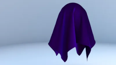
its all down to work really. Been learning syflex and ncloth for awhile now so I added the cape and the last 2 weeks been working on backgrounds/vue/and paint effects and thought I`d give him a cool base. The war hammer look was not intended but gladly excepted as a compument.
got the eyes and teeth done now but I`ll away from the model at prez so will post after. Now on with the sword and with the extra days the bump maps.

#
27
31-05-2007
, 03:31 PM
but here is the face details and the sword so far

#
28
31-05-2007
, 03:32 PM
Well at least you can now see how the sword fits with the model. The case still needs texturing.
Now going to a degree show this weekend to find some new animators for work back at my old uni in Swansea, so I`m hoping to get this finished on the trip.
Can I just say how cool this model is mike - loved working on it

Last edited by tweetytunes; 31-05-2007 at 03:47 PM.
#
29
31-05-2007
, 04:07 PM
good job mate!

Last edited by arran; 31-05-2007 at 04:10 PM.
#
30
31-05-2007
, 05:35 PM
and heres one just for you (u down with the blue yet ????)
current render time 14 seconds with the grass SWEEEET !!!

Last edited by tweetytunes; 31-05-2007 at 05:47 PM.
Posting Rules Forum Rules
Similar Threads
Hardware texturing problem...
by DeirdreDarling in forum Maya Materials & Textures replies 2 on 05-07-2012
Preparing a model before texturing...
by goggles in forum Maya Basics & Newbie Lounge replies 7 on 09-09-2011
Getting good in texturing
by chameleon101 in forum Maya Basics & Newbie Lounge replies 3 on 11-08-2011
maya texturing - whole process greatly confusing
by n88tr in forum Maya Materials & Textures replies 11 on 09-06-2010
Texturing Help
by alienware197 in forum Maya Basics & Newbie Lounge replies 3 on 14-10-2004
Topics
Free Courses
Full Courses
VFX News
How computer animation was used 30 years ago to make a Roger Rabbit short
On 2022-07-18 14:30:13
Sneak peek at Houdini 19.5
On 2022-07-18 14:17:59
VFX Breakdown The Man Who Fell To Earth
On 2022-07-15 13:14:36
Resident Evil - Teaser Trailer
On 2022-05-13 13:52:25
New cloud modeling nodes for Bifrost
On 2022-05-02 20:24:13
MPC Showreel 2022
On 2022-04-13 16:02:13
