Introduction to Maya - Rendering in Arnold
This course will look at the fundamentals of rendering in Arnold. We'll go through the different light types available, cameras, shaders, Arnold's render settings and finally how to split an image into render passes (AOV's), before we then reassemble it i
#
1
11-04-2011
, 07:45 AM

Registered User
Join Date: Dec 2010
Join Date: Dec 2010
Location: Uk
Posts: 193
Realism
But just done this tin and would like to get it looking more realistic.
Could anyone give a few suggestion?
Thanks
Graham
Last edited by Miss_Nova; 16-04-2011 at 08:45 PM. Reason: Thumbnail
#
2
11-04-2011
, 11:13 AM

Subscriber
Join Date: Jan 2010
Join Date: Jan 2010
Location: Budapest, Hungary
Posts: 244
Looks pretty real for me. You want to make the comp more real or just the sardine box?
#
3
12-04-2011
, 07:39 AM
Registered User
Join Date: Dec 2010
Join Date: Dec 2010
Location: Uk
Posts: 193
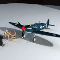
Its a little side project. I suppose Im talking lighting and mood of environment,
Its currently in a HDRi environment and has an area light pointing at it and a point on the near side.
Any suggestions?
#
4
12-04-2011
, 08:10 AM
Lifetime Member
Join Date: Feb 2010
Join Date: Feb 2010
Location: Australia
Posts: 4,255
cheers bullet
bullet1968
"A Darkness at Sethanon", a book I aspire to model some of the charcters and scenes
#
5
12-04-2011
, 09:02 AM
Subscriber
Join Date: Jan 2010
Join Date: Jan 2010
Location: Budapest, Hungary
Posts: 244

#
6
12-04-2011
, 11:33 AM

The Nurb Herd
Join Date: Oct 2007
Join Date: Oct 2007
Location: London
Posts: 2,381
funnily enough i made one of these for a ch4 thing recently. if you ask me, my version looked better than the final version.

its looking like a nice start tho. rather than doing a cg table. you should try comping it into a photo of a table.
#
7
12-04-2011
, 12:10 PM
Lifetime Member
Join Date: Feb 2010
Join Date: Feb 2010
Location: Australia
Posts: 4,255
cheers bullet
bullet1968
"A Darkness at Sethanon", a book I aspire to model some of the charcters and scenes
#
8
14-04-2011
, 07:43 AM
Registered User
Join Date: Dec 2010
Join Date: Dec 2010
Location: Uk
Posts: 193
anyway cheers,
Posting Rules Forum Rules
Similar Threads
increase realism
by danotronXX in forum Maya Basics & Newbie Lounge replies 4 on 25-11-2007
add some realism
by jakwag in forum Maya Basics & Newbie Lounge replies 6 on 04-08-2004
Realism -\/ector(\/)an
by Vectorman in forum Previous Challenges (Archives) replies 34 on 30-04-2003
Realism - el_newty
by el_newty in forum Previous Challenges (Archives) replies 13 on 10-04-2003
Realism - caligraphics
by caligraphics in forum Previous Challenges (Archives) replies 24 on 08-04-2003
Topics


Free Courses


Full Courses


VFX News
How computer animation was used 30 years ago to make a Roger Rabbit short
On 2022-07-18 14:30:13
Sneak peek at Houdini 19.5
On 2022-07-18 14:17:59
VFX Breakdown The Man Who Fell To Earth
On 2022-07-15 13:14:36
Resident Evil - Teaser Trailer
On 2022-05-13 13:52:25
New cloud modeling nodes for Bifrost
On 2022-05-02 20:24:13
MPC Showreel 2022
On 2022-04-13 16:02:13