Introduction to Maya - Modeling Fundamentals Vol 1
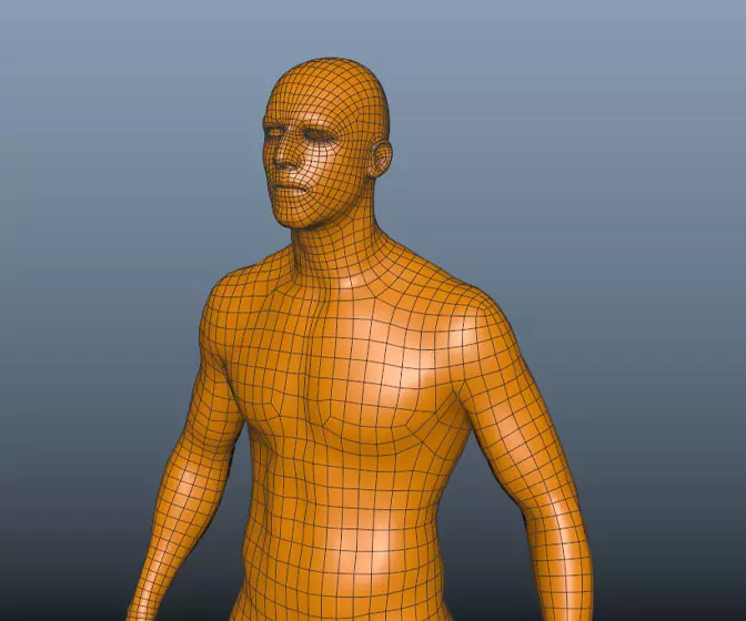
This course will look at the fundamentals of modeling in Maya with an emphasis on creating good topology. We'll look at what makes a good model in Maya and why objects are modeled in the way they are.
#
1
06-12-2006
, 02:40 PM
Registered User
Join Date: Dec 2006
Join Date: Dec 2006
Location: Serbia
Posts: 7
coca cola tin can
Geometry: nurbs patches, no trimes
Render: Maya software render
any comments will be.....
#
2
06-12-2006
, 02:53 PM
The can looks out of proportion, ie it seems a bit too long, also I think that the metal could do with soem work. maybe add a environment reflection node for it to reflect (in the reflected clolour channel) since your using the software rendering engine.
"No pressure, no diamonds" Thomas Carlyle
#
3
06-12-2006
, 08:32 PM
It might be nice to add some real drops of water to contrast against the ones on the label.
#
4
08-12-2006
, 01:08 PM
The only thing I think could need improvement is the top part. I like it alot but alot of coke cans have alot of darker and more dirtier look. Thats just my opinion good job! Looking forward to more.
#
5
20-12-2006
, 05:17 PM
Subscriber
Join Date: Feb 2006
Join Date: Feb 2006
Posts: 1,937
#
6
09-01-2007
, 04:53 PM
The unfocused can in the back is pretty cool.
"The reasonable man adapts himself to the world; the unreasonable one persists in trying to adapt the world to himself. Therefore all progress depends on the unreasonable man."
George Bernard Shaw - Man and Superman
#
7
10-01-2007
, 02:24 PM

keep it up
Matt
Live the life you love, love the life you live
#
8
11-01-2007
, 06:09 AM
Uvek zadovoljstvo upoznati nekog iz chirona

goksimaster
Posting Rules Forum Rules
Similar Threads
Topics
Free Courses
Full Courses
VFX News
How computer animation was used 30 years ago to make a Roger Rabbit short
On 2022-07-18 14:30:13
Sneak peek at Houdini 19.5
On 2022-07-18 14:17:59
VFX Breakdown The Man Who Fell To Earth
On 2022-07-15 13:14:36
Resident Evil - Teaser Trailer
On 2022-05-13 13:52:25
New cloud modeling nodes for Bifrost
On 2022-05-02 20:24:13
MPC Showreel 2022
On 2022-04-13 16:02:13

