Introduction to Maya - Modeling Fundamentals Vol 2
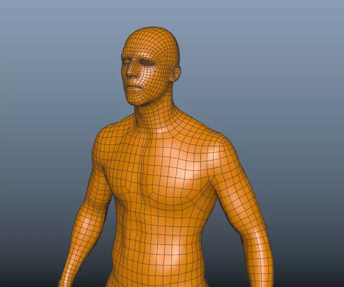
This course will look in the fundamentals of modeling in Maya with an emphasis on creating good topology. It's aimed at people that have some modeling experience in Maya but are having trouble with
complex objects.
#
1
08-08-2003
, 06:40 PM
Edited Photo
So I attached the edited photo and would like any one to comment on it and see was looks wrong or what you think changed about it.
By the way it was taken in Whistler, BC, Canada. Beautiful place!
mahalo,
Myk
<a href="https://www.metic.net" rel="noopener noreferrer nofollow" class="giveMeEllipsisa" target="_blank">www.metic.net</a><br />
#
2
08-08-2003
, 07:00 PM
Can you show us the original photo?
Alan
#
3
08-08-2003
, 09:19 PM
mahalo,
Myk
<a href="https://www.metic.net" rel="noopener noreferrer nofollow" class="giveMeEllipsisa" target="_blank">www.metic.net</a><br />
#
4
08-08-2003
, 09:21 PM
mahalo,
Myk
<a href="https://www.metic.net" rel="noopener noreferrer nofollow" class="giveMeEllipsisa" target="_blank">www.metic.net</a><br />
#
5
08-08-2003
, 09:25 PM
#
6
09-08-2003
, 05:04 AM
Registered User
Join Date: Jul 2003
Join Date: Jul 2003
Posts: 51
so Id either desaturate the people or play with the levels of the background.
Last edited by Harvezter; 09-08-2003 at 05:06 AM.
#
7
09-08-2003
, 05:41 AM
The guy on the right, take a look at his legs and where his foot touches...Now slowly start looking up and the part that catches me is where his right arm meets with the person onto his right (purple sweater). Its like as if he's leaning backwards because his legs are forward and his arms is behind the person next to him. It looks weird because both their feet (the guy on the far right and the person to his right) are standing on the same level, but as it goes up, the guy on the right seems as if he is a little bit behind the person next to him but his body doesnt show it because he is standing straight up.
It wouldve looked alright if it showed that the person all the way on the right was adjusting his hand far back enough in order to be behind the person to his right.
Also another thing that gave it off to me was his ski-thingy (i dont know what you call it) that he is holding on his right hand. If you look at it closely, youll see that it goes behind the ski-thingy of the person on his right. But his arms arent positioned to be going on that direction for his ski-thingy to go behind the person next to him. Look at his left hand and that shows that his hand is curved and positioned in a way that his ski-thingy he is holding is slanted and compare it with the one on his right hand.
Bahh its the Z-depth of that guy.
My suggestions would be to make the guy seem as if he's really behind or in front depending on what you wanna do but scale him to make him match his real height relevant to the people next to him and add a bit of darker shade on the parts closer to the person on his right esp his arm glove area.
Also add a very light shadow to where he is standing at, just a little bit. Its very hard to notice by just looking at it (unless you have ultra laser eyes) so use the color grabber tool or something and match it with the other peoples shadows (preferrably the ones on the outer area as well like him)
<a href="https://forums.simplymaya.com/showthread.php?s=&threadid=16675">May/June 2005 Challenge Entry</a>
Last edited by orgeeizm; 09-08-2003 at 05:44 AM.
#
8
09-08-2003
, 03:21 PM
mahalo,
Myk
<a href="https://www.metic.net" rel="noopener noreferrer nofollow" class="giveMeEllipsisa" target="_blank">www.metic.net</a><br />
#
9
09-08-2003
, 06:26 PM
and havin a closer framing also fixes great part of the "zdepth problem" (as long as you have enough resolution to print it ok after...)
#
10
10-08-2003
, 03:44 PM
just curious, but what golden square rule are you using? you reframed it into a 2:1 ratio. there is nothing wong with the normal picture ratios for small format films which is 1.5:1. it is actually a pity that most digicams dont have a 1.5:1 ratio, but usually the 4:3 like most computer screens haveOriginally posted by dragonfx
so that it follows the "golden square" rule and their faces/bodies are in the picture natural attention spots...
 . if you try for an professional look, a ratio of 1.25:1 would be really eye catching - that is what big format cams use. but i doubt the image allows printing out on 8x10 paper (i would not even try with anything that has less than 4 megapixel). and if the picture is supposed to look a bit wider and not to narrow, a 1.6:1 ratio would be fine ...
just my $ 0.02
#
11
11-08-2003
, 10:01 AM
i was aiming for 16:9(1.7) wich is aprox the golden rule(1+square root of 5)/2... and resulted in 575:304 (1.8) so to be made by eye is not that wrong... actually the attention focus points are not exact and were putted by eye followin the "roughly at thirds of the image" wich is what you should use when looking trough camera...
I suppose he has a higher resolution version in his pc and this is just for posting... anyways you can double resolution by software and then sharpen in lab mode...
#
12
11-08-2003
, 10:18 AM
and now please dont rip my head off for playing with them numbers :p
#
13
12-08-2003
, 08:57 AM
you can also speak of the attenton focus points "or whatever you call it in english", theyre also wrong...

-------------------------------------------------------------------
proffesional!? what?
Posting Rules Forum Rules
Similar Threads
photo real usb connector
by ctbram in forum Work In Progress replies 1 on 18-11-2009
using a photo of a face as a face texture
by DjSneeze in forum Maya Basics & Newbie Lounge replies 2 on 29-11-2008
Boat model needed for photo project. Feel like helping?
by foto-z in forum Maya Basics & Newbie Lounge replies 6 on 28-08-2006
photo realistic female poly head ( eyelids)
by fire_master in forum Maya Basics & Newbie Lounge replies 0 on 28-06-2004
Not quite photo real Legos...
by brian_ellebracht in forum Finished Work replies 12 on 15-11-2002
Topics
Free Courses
Full Courses
VFX News
How computer animation was used 30 years ago to make a Roger Rabbit short
On 2022-07-18 14:30:13
Sneak peek at Houdini 19.5
On 2022-07-18 14:17:59
VFX Breakdown The Man Who Fell To Earth
On 2022-07-15 13:14:36
Resident Evil - Teaser Trailer
On 2022-05-13 13:52:25
New cloud modeling nodes for Bifrost
On 2022-05-02 20:24:13
MPC Showreel 2022
On 2022-04-13 16:02:13

