Complex UV Layout in Maya
Over the last couple of years UV layout in Maya has changed for the better. In this course we're going to be taking a look at some of those changes as we UV map an entire character
# 16 06-03-2005 , 03:23 PM
cornholio's Avatar
Registered User
Join Date: Aug 2004
Location: Philippines
Posts: 58
hey RC...this is my render of your pimp ride...you've been pimped man..hehehe..

i wasnt able to do a good background image for it...i been kinda busy with work,thats why..=)

anyway i hope you'll like this one...


user added image


Last edited by cornholio; 06-03-2005 at 03:28 PM.
# 17 06-03-2005 , 03:48 PM
RubberChicken's Avatar
Subscriber
Join Date: May 2004
Location: That place with all those people
Posts: 1,041
L0l, nice work cornholio. Im having a hard time deciding which is better your renders or mine user added image user added image


Watch Space Wars at www.3dden.co.uk now!
__________________________

My pin number is XXXX
# 18 06-03-2005 , 04:55 PM
cornholio's Avatar
Registered User
Join Date: Aug 2004
Location: Philippines
Posts: 58
LOL RC...anyway..heres an update...i put some light to add some shadows in it..with a physical light shader...

great model...you wouldnt mind if i tweak a few things in it,would you?...hehehe

Attached Thumbnails
# 19 06-03-2005 , 05:05 PM
mhcannon's Avatar
Subscriber
Join Date: Sep 2004
Location: Waianae, HI
Posts: 1,275
pare ko, the render looks dark to me. can you add a fill light to pull out some the details in RC's model?


AIM: mhcannonDMC

"If you love your job, you'll never work another day in your life."
# 20 06-03-2005 , 05:14 PM
cornholio's Avatar
Registered User
Join Date: Aug 2004
Location: Philippines
Posts: 58
ok...workin on it...i'll post it later...for now..i'm gonna take a nap first..thank you for the comment...

thanks again RC...

# 21 06-03-2005 , 09:20 PM
RubberChicken's Avatar
Subscriber
Join Date: May 2004
Location: That place with all those people
Posts: 1,041
Hey np cornholio, and I will have to agree with mh on the second render, it does look too dark.


Watch Space Wars at www.3dden.co.uk now!
__________________________

My pin number is XXXX
# 22 07-03-2005 , 09:08 AM
cornholio's Avatar
Registered User
Join Date: Aug 2004
Location: Philippines
Posts: 58
yeah i agree with you two..anyway...heres an update..i included it in our scene...

hope you guys will like it...


thanks...

toodaloo

Attached Thumbnails
# 23 07-03-2005 , 02:43 PM
Dragon3D's Avatar
Registered User
Join Date: Oct 2004
Location: VA
Posts: 53
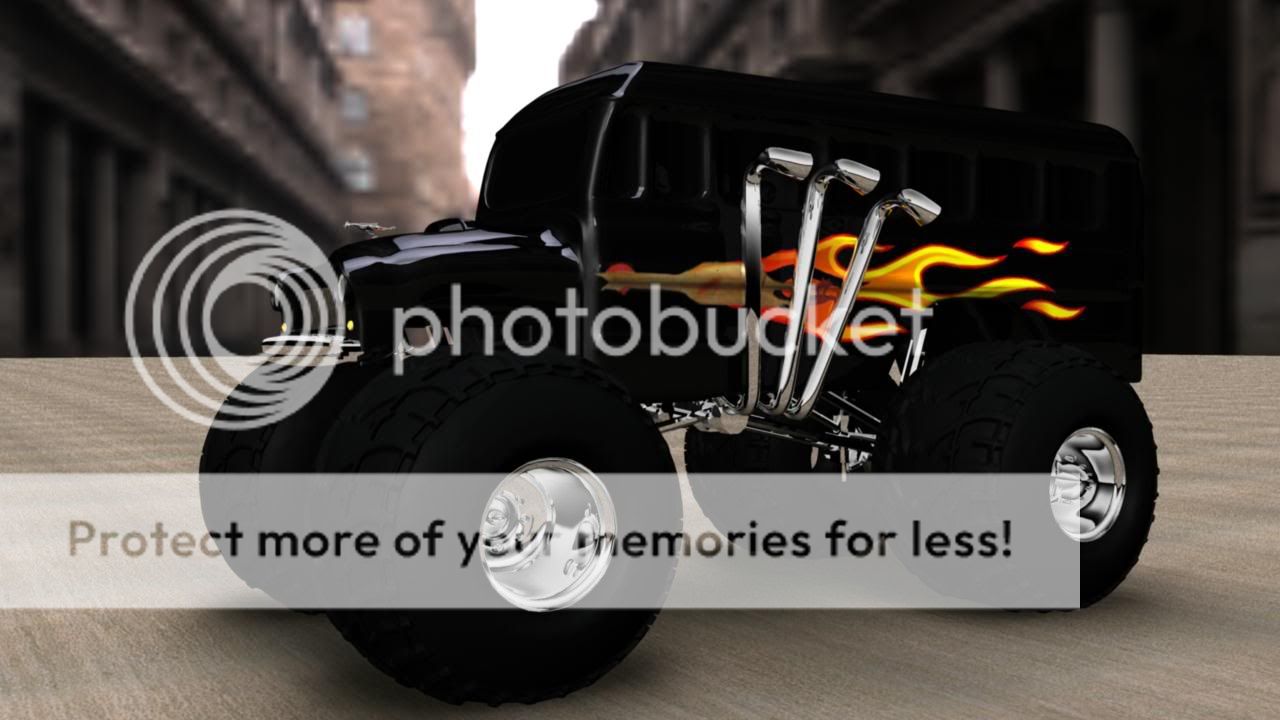
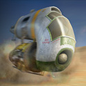
Looks sweet though imo I think that you should add some windows on there. The body just looks like one solid object. The windows would help break it up a bit. You should add some sparkles to the paint to, that would help bring out the detail you have put into the body of the bus.

Looks sweet though I would drive it user added image

D.

EDIT: One more thing, if you made the tires a little more on the gray side rather then black like the bus I think it would help alot also. Right now they get lost in the body even with the ligher render. It looks like there is some good detail in the tires that you can't see at all.


Last edited by Dragon3D; 07-03-2005 at 02:47 PM.
# 24 08-03-2005 , 02:27 AM
metallicjet66's Avatar
Subscriber
Join Date: Sep 2004
Location: Florida, U.S.A
Posts: 517
nice....one thing is if u brighten the wheels jus a tiny bit more, it'll be perfect

# 25 08-03-2005 , 05:46 PM
DJbLAZER's Avatar
Registered User
Join Date: Jun 2004
Location: Gothenburg, Sweden
Posts: 1,318
The tires and the street have rgb value of like (0,0,0) it looks like.. waaaay to dark.

# 26 08-03-2005 , 07:21 PM
RubberChicken's Avatar
Subscriber
Join Date: May 2004
Location: That place with all those people
Posts: 1,041
Also it looks like you forgot to smooth the bumper in the last render user added image


Watch Space Wars at www.3dden.co.uk now!
__________________________

My pin number is XXXX
# 27 08-03-2005 , 11:15 PM
cornholio's Avatar
Registered User
Join Date: Aug 2004
Location: Philippines
Posts: 58
ok...i'll try to render another one..post it later...

# 28 24-03-2005 , 01:17 PM
gilbertron's Avatar
Registered User
Join Date: Feb 2005
Location: the seat infront of my pc
Posts: 6
uve done some great work here but from the side the front looks a bit small like there isnt a engine under the hood...so maybe a bigger front may look better maybe with a bit of engine coming out of the bonet, though this will change the look of the car i think it should be experimented.

anyway well done

# 29 24-03-2005 , 02:46 PM
Pony's Avatar
Subscriber
Join Date: Mar 2003
Location: with PonysGirl
Posts: 2,573
great chickens !

# 30 25-03-2005 , 06:32 PM
R4s1n's Avatar
Subscriber
Join Date: Oct 2003
Location: Manchester
Posts: 34
Looks sweet! I'm wondering what the back of the car says?

Posting Rules Forum Rules
You may not post new threads | You may not post replies | You may not post attachments | You may not edit your posts | BB code is On | Smilies are On | [IMG] code is On | HTML code is Off

Similar Threads