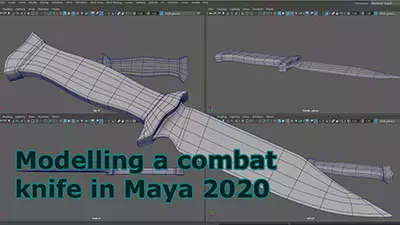
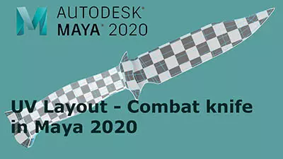
Maya 2020 fundamentals - modelling the real world
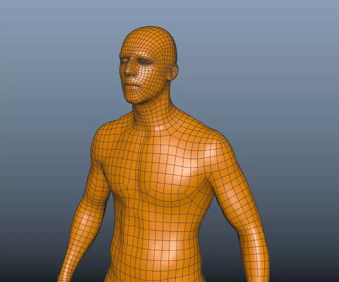
Get halfway through a model and find it's an unworkable mess? Can't add edge loops where you need them? Can't subdivide a mesh properly? If any of this sounds familiar check this course out.
# 16 06-07-2004 , 12:48 AM
roach105's Avatar
Subscriber
Join Date: Dec 2002
Location: T.O Baby!
Posts: 1,016
fix some stuff. added some texturing on the bleechers. added some fog. and other small things

Attached Thumbnails
# 17 06-07-2004 , 12:53 AM
Kurt's Avatar
Registered User
Join Date: May 2002
Location: Niagara Falls, Canada
Posts: 5,310
Very nice mate....... going to be a good peice of work for your portfolio....


I am enough of an artist to draw freely upon my imagination, knowledge is limited, imagination encircles the world. (Albert Einstein)

https://www.artstation.com/kurtb
# 18 06-07-2004 , 03:56 AM
roach105's Avatar
Subscriber
Join Date: Dec 2002
Location: T.O Baby!
Posts: 1,016
Thanks kurt. Does anyone have better idea on how to create a better field. Currently I just created a photoshop texture. Wondering if anyone has better ideas so when Iam closer it would look more realistic.

# 19 06-07-2004 , 04:13 AM
mtmckinley's Avatar
The Maya Mountain
Join Date: Aug 2002
Location: Seattle, WA
Posts: 8,245
a higher res texture maybe? Turn off "Use Multi-Pixel Filter" in the Anti-Alias options to avoid texture blurring.

# 20 08-07-2004 , 05:38 PM
roach105's Avatar
Subscriber
Join Date: Dec 2002
Location: T.O Baby!
Posts: 1,016
another update. I got the grass looking better. Also lit the scene more. I added the crowd but I dont like it. Need to work on the crowd more. I will add some simple men on the field. Still need to work on the texturing of the bleechers.

This image was rendered originally at 1200 x 600. I have another render that I took to photoshop and gave it a bit of sepia look. It looks awesome. I will do one at the end.

Attached Thumbnails
# 21 08-07-2004 , 08:29 PM
I-Iybrid's Avatar
Simply Maya OG
Join Date: Dec 2002
Location: Queensbury NY, US A
Posts: 1,438
Quick question Roach. Did you model each of the seats in the bleachers, or is it a texture/bump map? Cause if you modeled each seat......damn. user added image


- Hybrid
# 22 08-07-2004 , 10:52 PM
NextDesign's Avatar
Technical Director
Join Date: Feb 2004
Posts: 2,988
He probably just made one low-low poly seat, and duplicated it.


Imagination is more important than knowledge.
# 23 09-07-2004 , 02:00 AM
roach105's Avatar
Subscriber
Join Date: Dec 2002
Location: T.O Baby!
Posts: 1,016
the first picture on the page up top has each seat. I had a plane and extruded the faces. This really slowed the system down. So I tried texturing a crowd which is what the second render is the red crowd and blue on the opposite side. I don't think it worked out to well.

Does it look like a crowd to you guys?

# 24 09-07-2004 , 03:04 AM
kbrown's Avatar
Moderator
Join Date: Sep 2002
Location: London, UK
Posts: 3,198
Yup, the crowd looks nice. You could try and add some random flags, banners and whatnot there so it wouldn't look so flat. I think the grass is bit too bright...


Kari
- My Website
- My IMDB

Do a lot, Fail a lot and Learn a lot!
# 25 09-07-2004 , 04:01 AM
roach105's Avatar
Subscriber
Join Date: Dec 2002
Location: T.O Baby!
Posts: 1,016
I will try the flag stuff its an awesome idea. The grass is bright. Thats what I hate about LCD displays. The grass looks fine on my laptop and then on a CRT it looks bright.

# 26 09-07-2004 , 06:10 PM
roach105's Avatar
Subscriber
Join Date: Dec 2002
Location: T.O Baby!
Posts: 1,016
worked a bit on the fans

Attached Thumbnails
# 27 10-07-2004 , 03:10 AM
Subscriber
Join Date: Feb 2004
Posts: 54
me gusta esto bueno ti trabajo en estadio grande
yeah i like it the flags look great

# 28 10-07-2004 , 05:03 AM
brian_ellebracht's Avatar
Registered User
Join Date: Oct 2002
Location: St. louis Mo
Posts: 1,580
This is really cool. I have one comment though, take it with a grain of thought, its just an opinion. I think that the grass its a bit to bright, or oversaturated. But the overall env is pretty cool so far!

Brian


I liked the saturation of the grass in the top image, and the model/texture of the grass in the bottom user added image


Please check
My (old) website!
# 29 10-07-2004 , 10:50 AM
kbrown's Avatar
Moderator
Join Date: Sep 2002
Location: London, UK
Posts: 3,198


Kari
- My Website
- My IMDB

Do a lot, Fail a lot and Learn a lot!
# 30 12-07-2004 , 03:11 PM
roach105's Avatar
Subscriber
Join Date: Dec 2002
Location: T.O Baby!
Posts: 1,016
I think I like the old grass better also.

Here is sort of look Im going for at the end. This was brought into Maya and adjust some of the coloring.

Attached Thumbnails
Posting Rules Forum Rules
You may not post new threads | You may not post replies | You may not post attachments | You may not edit your posts | BB code is On | Smilies are On | [IMG] code is On | HTML code is Off

Similar Threads