and bonus stop motion animation video for the same ad
https://www.youtube.com/watch?v=oW1j88cv4jE


Originally posted by Altadena
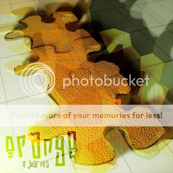
edges look kinda funky
I have no idea what you two are talking about! I love it! It makes me want some citrus! Very effective ad! I love the idea, and I love how you carried out the purpose! KUTGWOriginally posted by wokendreams
lower the contrast or adjust the colours in photoshop, its really hard to look at.


Originally posted by petrol
The idea is fine, but im struggling to see the point of those overlays. ie. The warped jigsaw peices, the greeny yellowy lines, and the hexagonal pattern. Simplicity is the height of sophistication; get rid of all the crap and it would look quite nice
/Edit - i've just noticed the dodgy edges too on the 2nd and 3rd closest pieces, and now I'm wondering if the overlays are trying to hide them