Introduction to Maya - Modeling Fundamentals Vol 1
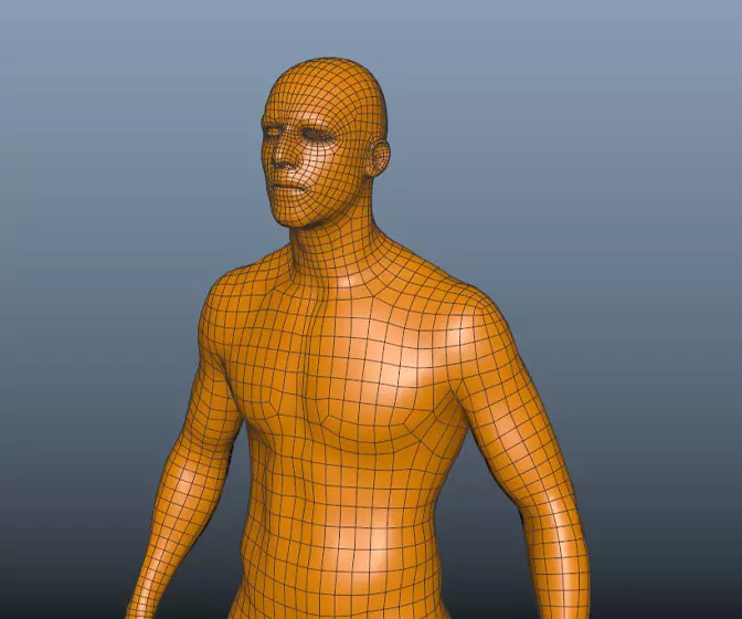
This course will look at the fundamentals of modeling in Maya with an emphasis on creating good topology. We'll look at what makes a good model in Maya and why objects are modeled in the way they are.
#
16
28-03-2010
, 10:00 PM
Location: the netherlands
Posts: 1045
"@ben:
a: active only shows the state of a link on click and will disappaer the moment you let the mouse of the link, I want to know how to make this "stick".
And thanks for your offer and compliment."
But then....use a:visited?. Unless you use images for the buttons, and use javascript to control it so that once a buttons been hovered/clicked on, it permenantly remains in its altered state. But Ive been told from said reliable web designer source, its not good practice to use images for links.
#
17
28-03-2010
, 11:55 PM
EduSciVis-er
Join Date: Dec 2005
Join Date: Dec 2005
Location: Toronto
Posts: 3,374
#
18
29-03-2010
, 10:05 PM
a: visited shows the links you have visited, I want to click on a link and as long as I stay on that page I want the active page link to have different color than the other links
@stwert;
You speak wise words only I have no idea how to accomplish those things you just said
 seriously dude I learned html/css/java on the fly last saturday so I am a tad inexperienced to say the least
But thanks for thinking along I really appreciate it :attn:
My website;
https://www.eyellem.com
LinkedIn:
https://www.linkedin.com/pub/martin-van-stein/42/a81/b82
Yoda post;
https://forum.simplymaya.com/showthre...highlight=yoda
Indiana Jones Post;
https://srv01.simply3dworld.com/showt...threadid=29188
#
19
29-03-2010
, 10:24 PM
EduSciVis-er
Join Date: Dec 2005
Join Date: Dec 2005
Location: Toronto
Posts: 3,374
For the scrolling, add two arrow buttons, one on the left and one on the right. However you are automatically advancing your list of images when you click an image on the right side, do the exact same when you click on the arrow button, except the image shouldn't change. I don't think this should be too hard to add in. (I hope
 )
)For the currently open links to pages, presumably you have those links as separate html for each page? Or is it done with css? If you have html, just change the color of the Stills link on the https://eyellem.com/stills.html page...
Anyway, hope that gives you some ideas and keep up the awesome work!
#
20
29-03-2010
, 10:51 PM
I dont want to annoy you...(!!) just having trouble regetting my head around the css links rules. I would have thought that a:visited would then keep that link a different colour for thereafter, so if you click on a link, then you go that page that is linked, the link thats on that page will have altered colour. I guess I must be wrong, as your doing it right now, and its been a while since I have.
Another option Id recommend for images if youre up for it, is a javascript script called slimbox, or lightbox. I think their are a few variations. I have a version I could send but it doesnt have slideshow arrows so you have to close one image when you want to look at another. Its more complicated than doing it the html way, but they always come with instructions, and I dont know any javascript and I managed to get it to work fairly easily.
#
21
31-03-2010
, 08:13 PM
I have been busy fiddling with this and other stuff, with regards to links keeping the color when they are active:
Normally you would do something like this:
<ul>
<li>
<a href="/xxxxx.html" >subject</a>
</li>
</ul>
Now in the ref part you type this:
<a href="/xxxxx.html" class="keepactve ">subject</a>
In your css type this:
ul.keepactive
{color: xxxx;}
So if you have multiple links in your html you can ad this class to the link you want to have active and the css picks it up

With regards to the image gallery, there was an arrow with the template i have downloaded but I actually like the fact that there isn't to much junk on the page.
Do you guys have any problems loading my page( with regards to speed), because I can load the page pretty quick here no hick ups or waiting times whatsoever.
And thanks for your help guys

My website;
https://www.eyellem.com
LinkedIn:
https://www.linkedin.com/pub/martin-van-stein/42/a81/b82
Yoda post;
https://forum.simplymaya.com/showthre...highlight=yoda
Indiana Jones Post;
https://srv01.simply3dworld.com/showt...threadid=29188
#
22
31-03-2010
, 09:35 PM
You increased the contrast then went back to near black on black.
"If I have seen further it is by standing on the shoulders of giants." Sir Isaac Newton, 1675
#
23
31-03-2010
, 09:37 PM
I get your page but a utube embeded video in the middle of your page so I cannot see your buttons, this only happens on your site, have you been hacked?,.....dave
Edit: I am only using your first link

Avatar Challenge Winner 2010
Last edited by daverave; 31-03-2010 at 09:44 PM.
#
24
31-03-2010
, 10:26 PM
I have been fiddling again so naturally there would be something I forgot, thanks for the heads up
Does this look better?
@daverave
That's funny I don't have the idea that i have been hacked.
What is your screensize? I have seen it on 17" and up and I have kept a width of 1024.
I also have tested with various browsers Chrome, IE and mozilla Firefox and there they displayed fine.
Are you using an old browser ?
My website;
https://www.eyellem.com
LinkedIn:
https://www.linkedin.com/pub/martin-van-stein/42/a81/b82
Yoda post;
https://forum.simplymaya.com/showthre...highlight=yoda
Indiana Jones Post;
https://srv01.simply3dworld.com/showt...threadid=29188
#
25
31-03-2010
, 10:27 PM
"If I have seen further it is by standing on the shoulders of giants." Sir Isaac Newton, 1675
#
26
31-03-2010
, 11:14 PM

Avatar Challenge Winner 2010
#
27
31-03-2010
, 11:15 PM

Avatar Challenge Winner 2010
#
28
01-04-2010
, 08:51 AM
And what is your screensize?
To be honest I haven't taken older browsers into account and most people can view my website just fine so I really want to know what is going wrong

My website;
https://www.eyellem.com
LinkedIn:
https://www.linkedin.com/pub/martin-van-stein/42/a81/b82
Yoda post;
https://forum.simplymaya.com/showthre...highlight=yoda
Indiana Jones Post;
https://srv01.simply3dworld.com/showt...threadid=29188
#
29
01-04-2010
, 11:01 AM
i dont have any problems viewing your site, other than, on the gallery page, the images do a strange sort of transition, they sort of desaturate and then resaturate, only takes a couple of seconds. then again thats on a ps3 browser, so i wouldnt worry about it as ps3 browser is pathetic and cant even display hotmail or facebook properly
Last edited by ben hobden; 01-04-2010 at 11:07 AM.
#
30
01-04-2010
, 01:46 PM
I get what you mean with crossplatform compatibility issues, but to be quite honest I really don't care if not every soul in the world can watch my site, I have tried it on different browsers of this generation, so if someone who still uses netscape 1.0 isn't able to properly watch it I really couldn't care less, because most of the time does people live in a shed and talk about the good old days when everything was better , and probably never started a 3d package.
The people who mostly watch my site ( i hope at least
 ) are people who like 3d and those guys and gals are always into new tech and stuff so they probably don't have IE 5 or something like that :p
My website;
https://www.eyellem.com
LinkedIn:
https://www.linkedin.com/pub/martin-van-stein/42/a81/b82
Yoda post;
https://forum.simplymaya.com/showthre...highlight=yoda
Indiana Jones Post;
https://srv01.simply3dworld.com/showt...threadid=29188
Posting Rules Forum Rules
Similar Threads
New 3D Tutorial Website In Development
by keithd203 in forum Maya Basics & Newbie Lounge replies 9 on 21-01-2009
Perfecto's Website
by Perfecto in forum Maya Basics & Newbie Lounge replies 9 on 24-06-2007
Website UP!!! (BETA - Big time) -- feedback
by tariqrf in forum Maya Basics & Newbie Lounge replies 4 on 27-04-2005
Need a website for a shader please.
by davis_drawings in forum SimplyMaya Tutorials replies 4 on 24-04-2005
Website Help
by painterdan in forum Maya Basics & Newbie Lounge replies 17 on 20-04-2004
Topics
Free Courses
Full Courses
VFX News
How computer animation was used 30 years ago to make a Roger Rabbit short
On 2022-07-18 14:30:13
Sneak peek at Houdini 19.5
On 2022-07-18 14:17:59
VFX Breakdown The Man Who Fell To Earth
On 2022-07-15 13:14:36
Resident Evil - Teaser Trailer
On 2022-05-13 13:52:25
New cloud modeling nodes for Bifrost
On 2022-05-02 20:24:13
MPC Showreel 2022
On 2022-04-13 16:02:13


