Maya for 3D Printing - Rapid Prototyping
In this course we're going to look at something a little different, creating technically accurate 3D printed parts.
#
31
19-06-2007
, 09:16 PM
Registered User
Join Date: Sep 2006
Join Date: Sep 2006
Posts: 38
#
32
20-06-2007
, 01:39 AM

Moderator
Join Date: May 2005
Join Date: May 2005
Location: Manchester Uk
Posts: 6,300
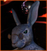
Im thinking that a lot of the uglyness will come frome the textures and the detialing, what I want for the skin is to have sort of "squiddey" bits mixed with whale skin that will then go to the barnicles and other bits and bobs, hence the starfish. It might be that it looks odd at the mo, bit unsure as what to do but as its a sub tool I can just leave it off
I had a look at Pirates, dead mans heast and when I saw it I thiought a lot of them were a tad overdone. What I might do is go back and add some detail to his face to better define his muscles and give him character from there as I think that hes a bit too smooth at the moment.
"No pressure, no diamonds" Thomas Carlyle
#
33
20-06-2007
, 04:28 AM

Registered User
Join Date: May 2004
Join Date: May 2004
Location: UK
Posts: 1,991

If he's going to have only a few artefacts over his face then I'd say you could do with working the face shape up a bit more. Places like around the eyes and defining the nose area more.
Si
Examples of bTraffic - a traffic animation tool for Maya
bFlocking - a tool for Maya 8.5+ to generate flocking and swarming behaviours
Jan/Feb Challenge 2007 Entry and W.I.P
May/Jun Challenge 2006 Entry and W.I.P
Mar/Apr Challenge 2006 Entry and W.I.P
Jan/Feb Challenge 2006 Entry and W.I.P
Nov/Dec Challenge 2005 Entry and W.I.P
Sep/Oct Challenge 2005 Entry and W.I.P
Jul/Aug Challenge 2005 Entry
www.flash-fx.net
#
34
20-06-2007
, 06:21 AM
Moderator
Join Date: May 2005
Join Date: May 2005
Location: Manchester Uk
Posts: 6,300
Think i will have a fiddle with the face as i'm not too happy with it at the moment, thats one of the great things about Z brush, its easy to just fiddle with the mesh to get it how you want withouht pushing and pulling verts forever.
"No pressure, no diamonds" Thomas Carlyle
#
35
20-06-2007
, 02:37 PM
Registered User
Join Date: Dec 2005
Join Date: Dec 2005
Location: Brooklyn, NY
Posts: 3,708
I think that the main problem with the starfish, for me, is that it's a bit too big at the moment and as it's own, it's really sticking out. I think once you get a whole lot of sea crap covering his face (maybe only on one half?) it will definitely look a lot better.
This is going to be a great entry!

#
36
22-06-2007
, 01:18 AM
Moderator
Join Date: May 2005
Join Date: May 2005
Location: Manchester Uk
Posts: 6,300
Heres a bit of an update, had a fiddle and changed his fase a bit to try and make him a bit meaner/ugly.
"No pressure, no diamonds" Thomas Carlyle
Last edited by gster123; 22-06-2007 at 01:21 AM.
#
37
22-06-2007
, 10:11 PM
Moderator
Join Date: May 2005
Join Date: May 2005
Location: Manchester Uk
Posts: 6,300
I've changed the materialso that you can see the details a bit better (as feel the red wax looses some definition with the finer detials)
"No pressure, no diamonds" Thomas Carlyle
#
38
22-06-2007
, 11:00 PM
Registered User
Join Date: Dec 2005
Join Date: Dec 2005
Location: Brooklyn, NY
Posts: 3,708
cheers gster -Originally posted by gster123
Cheers Arran, good to see you back on, have you got your winning model? Would like to see a few snaps of it.
- I actually got an email from mike just the other day to say that it's in the post - as soon as it comes through I'll post some pics. The model is definitely coming along - i think the nose needs a bit of work though - I know it's supposed to be fairly flat - but I still think it needs a touch more definition around the nostrils. maybe you can give him a Daniella Westbrook cocaine nose to make him look really freaky! :eeek2:
still think the starfish needs to be smaller, but if not, I would definitely move it slightly, as right now the top of the starfish and the bottom of the hat are sharing the same edge and so it's looking kind of awkward - whenever you have the edge of two objects share the same space it just tends to flatten the image.
Keep up the good work - looking forward to seeing that shader on your model and some more sea objects on his face.
#
39
23-06-2007
, 05:09 PM
Moderator
Join Date: May 2005
Join Date: May 2005
Location: Manchester Uk
Posts: 6,300
I'll have to re-uv the head and then reimport it as the low mesh, as I've made some major changes fromn when he was origianlly imported into Zbrush.
Then i'll make a colour map of the bits make all my maps than bring it into maya for final completion, lighting and rendering
"No pressure, no diamonds" Thomas Carlyle
#
40
23-06-2007
, 11:09 PM

Registered User
Join Date: May 2005
Join Date: May 2005
Location: United States
Posts: 513

@ arran:
Daniella Westbrook cocaine nose :lmao:

#
41
24-06-2007
, 02:58 AM
Subscriber
Join Date: Mar 2005
Join Date: Mar 2005
Location: Illinois, USA
Posts: 250
Without that, details are just details.
#
42
24-06-2007
, 02:59 AM
Subscriber
Join Date: Mar 2005
Join Date: Mar 2005
Location: Illinois, USA
Posts: 250
#
43
24-06-2007
, 04:33 AM
Moderator
Join Date: May 2005
Join Date: May 2005
Location: Manchester Uk
Posts: 6,300
To me its what I'm aiming for, kind of lost facial features turning, fish like but keeping a human look, but then again I might have overlooked sometihing glaringley obvious, as for the detailing i've not touched the actual face yet, just the hat, which, is what i'm after it looking like. And I wont untill I'm happy with the overall look, before adding the detials.
It could be that i'm just modeling, free form rarther than sticking with a concept, so its dificult to see how I want it to look, then agian im not to sure!! as its all addding to the model each time I open it.
"No pressure, no diamonds" Thomas Carlyle
#
44
24-06-2007
, 09:24 AM
Subscriber
Join Date: Mar 2005
Join Date: Mar 2005
Location: Illinois, USA
Posts: 250
The problem I have with it is that there isn't any real structure that stands out to me, it's all washed out and relaxed. Add some spots of tension and imply some bone and cartilage structure.
It's hard to say much since I don't really know what you're going for
but do a search for mermen or fish beings or something. Since you're basing this off of potc I assume you've seen this already? it may help with some ideas. There were also a couple articles at cgtalk a while back.as far as the character design I think what would make it easier on you is to take a human, and take 1 or 2 aquatic creatures and try to mix the human to meet the patterns of those aquatic creature. This will force consistency in the design and also make it more readable as a human transitioning to beast.
...sorry, I hope that was helpful at all :p
get this part down and I think you'll have something really sweet at the end of this.
#
45
25-06-2007
, 06:32 PM
Moderator
Join Date: May 2005
Join Date: May 2005
Location: Manchester Uk
Posts: 6,300
I need to think what to do with him really. was thinking a bit "eeley" with his looks, quite washed out so to speak.
Had a bit of a sculpt to give him some character, think hes looking a bit more menacing.....
"No pressure, no diamonds" Thomas Carlyle
Last edited by gster123; 25-06-2007 at 06:35 PM.
Posting Rules Forum Rules
Similar Threads
New Challenge: My Dream Office $500 First Prize
by Nilla in forum Previous Challenges (Archives) replies 18 on 03-08-2011
Summer Challenge Winners!
by mtmckinley in forum Site News & Announcements replies 16 on 07-10-2008
Amoeba - summer challenge
by amoeba in forum Previous Challenges (Archives) replies 70 on 05-09-2008
Summer Challenge Winners!
by mtmckinley in forum Site News & Announcements replies 21 on 15-09-2007
Summer Challenge!
by mtmckinley in forum Previous Challenges (Archives) replies 34 on 30-08-2007
Topics

Free Courses


Full Courses


VFX News
How computer animation was used 30 years ago to make a Roger Rabbit short
On 2022-07-18 14:30:13
Sneak peek at Houdini 19.5
On 2022-07-18 14:17:59
VFX Breakdown The Man Who Fell To Earth
On 2022-07-15 13:14:36
Resident Evil - Teaser Trailer
On 2022-05-13 13:52:25
New cloud modeling nodes for Bifrost
On 2022-05-02 20:24:13
MPC Showreel 2022
On 2022-04-13 16:02:13