Maya 2020 fundamentals - modelling the real world
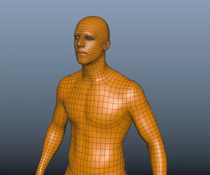
Get halfway through a model and find it's an unworkable mess? Can't add edge loops where you need them? Can't subdivide a mesh properly? If any of this sounds familiar check this course out.
#
1
01-08-2005
, 05:02 AM
3D scene for webpage
-Brian
www.ahearnart.com
aim: kaltnue303
JOIN THE 3D USERS MYSPACE GROUP:
https://groups.myspace.com/3DNERDS
#
2
01-08-2005
, 03:57 PM
Subscriber
Join Date: Aug 2004
Join Date: Aug 2004
Posts: 515
post the webpage when your done, i need some inspiration for my own.
First year 3D Grad
#
3
04-08-2005
, 12:34 AM
I agree with Turbo Dan, post the link when you are done.
You going to use flash?
"Creativity is allowing yourself to make mistakes. Art is knowing which ones to keep - Scott Adams"
<b>Toxic Bunny</b>
#
4
04-08-2005
, 12:38 AM
www.ahearnart.com
aim: kaltnue303
JOIN THE 3D USERS MYSPACE GROUP:
https://groups.myspace.com/3DNERDS
#
5
04-08-2005
, 06:47 PM
First off, its a great job. I think for me the only problem was that I had to follow the image down to the bottom to view the hopscotch (with my eyes, not scrolling with mouse) I wasnt drawn to the image as a whole in one go, I had to look at it all over. The composition of the objects is fine, just placement of the image on the page.
Perhaps center the image more, and scale it down a little, not too muchthough.
Otherwise thats my only gripe, great job again.
_J
#
6
12-08-2005
, 03:48 PM
There's nothing normal about normals. In FACT i think the are abnormal.
#
7
17-08-2005
, 05:43 AM
site: https://www.ahearnart.com/temp.html
www.ahearnart.com
aim: kaltnue303
JOIN THE 3D USERS MYSPACE GROUP:
https://groups.myspace.com/3DNERDS
#
8
17-08-2005
, 05:51 AM

Nobody felt like avenging your death. Sorry.
#
9
17-08-2005
, 08:35 AM

Only thing is it doesnt really fit with the navigational layout of the web page.
Generally navigation sits top or left as people's eyes are naturally drawn to scan those areas first. With this kind of design you might be better having the image central (top aligned) so you scan it all before scrolling down for the news info (maybe even an anchor tag in the image somewhere which moves you straight to the news underneath?).
If you end up doing it all in flash then this wouldnt be an issue.
Just ideas however, interpret as you see fit

#
10
17-08-2005
, 03:33 PM
Looks good though mate
Imagination is more important than knowledge.
#
11
17-08-2005
, 06:36 PM
https://www.ahearnart.com/home.html
www.ahearnart.com
aim: kaltnue303
JOIN THE 3D USERS MYSPACE GROUP:
https://groups.myspace.com/3DNERDS
#
12
17-08-2005
, 10:43 PM
 You are tallented.
Keep up the good work
"Creativity is allowing yourself to make mistakes. Art is knowing which ones to keep - Scott Adams"
<b>Toxic Bunny</b>
#
13
18-08-2005
, 03:47 PM
https://www.ahearnart.com/gallery.html
It had to break the format of always having the hopskotch image as the menu bar, but I'll just add a smaller one on the side.
www.ahearnart.com
aim: kaltnue303
JOIN THE 3D USERS MYSPACE GROUP:
https://groups.myspace.com/3DNERDS
Posting Rules Forum Rules
Similar Threads
trouble opening maya scene
by jooleyinboots in forum Maya Technical Issues replies 3 on 07-10-2022
Can't open this one scene every other scene is fine..
by illbleed in forum Maya Basics & Newbie Lounge replies 3 on 25-09-2013
EasyToy - A Sketch-based 3D modeling Software
by crefun in forum Maya Basics & Newbie Lounge replies 1 on 27-09-2009
Up 3D
by stwert in forum Maya Basics & Newbie Lounge replies 7 on 01-07-2009
Maya and Swift 3D
by Nate0125RS in forum Maya Technical Issues replies 0 on 04-03-2009
Topics
Free Courses
Full Courses
VFX News
How computer animation was used 30 years ago to make a Roger Rabbit short
On 2022-07-18 14:30:13
Sneak peek at Houdini 19.5
On 2022-07-18 14:17:59
VFX Breakdown The Man Who Fell To Earth
On 2022-07-15 13:14:36
Resident Evil - Teaser Trailer
On 2022-05-13 13:52:25
New cloud modeling nodes for Bifrost
On 2022-05-02 20:24:13
MPC Showreel 2022
On 2022-04-13 16:02:13
