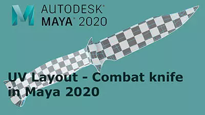
Introduction to Maya - Modeling Fundamentals Vol 2
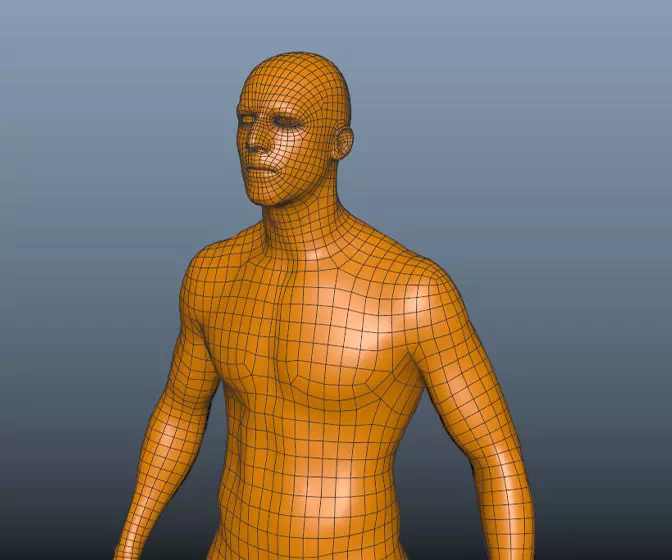
This course will look in the fundamentals of modeling in Maya with an emphasis on creating good topology. It's aimed at people that have some modeling experience in Maya but are having trouble with
complex objects.
#
16
14-10-2007
, 10:33 PM
thanks
#
17
15-10-2007
, 04:01 AM
sept/oct challenge
#
18
15-10-2007
, 05:38 AM
If you give this a smooth transition it will be that much better.
Looks great though:attn:
Edit; if you give the spotlights penumbra angle a value of 5 or something and use the drop off y"ll get a smoother transition i think
#
19
15-10-2007
, 06:20 AM
are you going for a night scene?
#
20
16-10-2007
, 12:59 AM
Great so far
Furthermore, the rest of the environment is totally dark... Try to put some vague light so the rest of the room will be a bit visible.
I'm glad you decided to follow my advice
 .
.EDIT: Try to break the edges of the doorway a bit. It may look nice.
Last edited by BennyK; 16-10-2007 at 01:01 AM.
#
21
16-10-2007
, 03:01 AM
sept/oct challenge
BennyK thanks for your advice which gave me a diff view of things hpfull i should be able to finish b4 deadline.
#
22
19-10-2007
, 03:46 PM
sept/oct challenge
cheers
#
23
19-10-2007
, 06:42 PM
As for the image you placed as a background i would only use the mountain then create a sphere asign a shader with a transparencyramp going from black to purple and on the colorchannel slap a granite(tweak the granite texture to a black background with white dots-simulating stars- on it.
You can also create a moon which emanates a slight blueish light(if i'm not mistaken)
Just spice things up and you will have a
great scene

#
24
20-10-2007
, 06:34 AM
Very Nice
*I also agree with Maston about the light as I suggested earlier.
*Try removing that barely visible obstacle on the right and continue the floor and pillars to the right so it doesn't look so empty.
I'll attach an image explaining what I meant in the LAST TIP.
the coloring/texturing looks pretty good, aside from the above I think your ready for your final
 .
.Benny
Last edited by BennyK; 20-10-2007 at 06:36 AM.
#
25
25-10-2007
, 10:41 PM
sept/oct challenge
#
26
29-10-2007
, 02:55 PM
Are you going to post a final entry? I hadn't seen any progress in 2 weeks
 . I'm really looking forward to seeing it finished... In my opinion you've done the best scene.
Benny
#
27
29-10-2007
, 10:00 PM
#
28
31-10-2007
, 07:40 AM
sept/oct challenge
am sorry i was unable to post my final entry i do feel dissapointed myself but this is due to situations out of my control had to work away for a while and havent been home very much to finish it off from were i left it. i do appriciate your contribution which had also helped alot in getting to the current stage. just for the sake of it i will finish it off and up date you gys
cheers
Posting Rules Forum Rules
Similar Threads
New Challenge: My Dream Office $500 First Prize
by Nilla in forum Previous Challenges (Archives) replies 18 on 03-08-2011
Sept/Oct Challenge Winners!
by mtmckinley in forum Site News & Announcements replies 16 on 19-11-2007
Legolas_hv - Sept/Oct Challenge
by Legolas_hv in forum Previous Challenges (Archives) replies 34 on 26-10-2007
BadTertle - Sept/Oct Challenge
by badtertle in forum Previous Challenges (Archives) replies 6 on 17-09-2007
Sept/Oct Challenge Rules and Guidelines!
by mtmckinley in forum Previous Challenges (Archives) replies 85 on 01-11-2005
Topics
Free Courses
Full Courses
VFX News
How computer animation was used 30 years ago to make a Roger Rabbit short
On 2022-07-18 14:30:13
Sneak peek at Houdini 19.5
On 2022-07-18 14:17:59
VFX Breakdown The Man Who Fell To Earth
On 2022-07-15 13:14:36
Resident Evil - Teaser Trailer
On 2022-05-13 13:52:25
New cloud modeling nodes for Bifrost
On 2022-05-02 20:24:13
MPC Showreel 2022
On 2022-04-13 16:02:13
