this is a lil piece i put together as kind of a "i wish my home were this cool" type of thing :bgreen:
before textures:

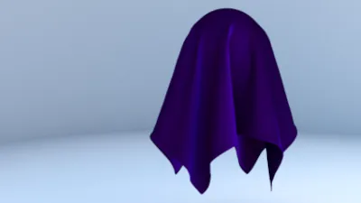
After Textures:

so yes i wonder "Is this good enough for the gallery?"
 we shall see
 we shall see
 )
)