This is the very first time i am using this forum and posting my works on here. I hope to be receiving constructive, positive and also Negative feedbacks from everyone on here.
The project is called 'The Landmark' and it consists of 28 bungalows (as we call it here) or some would probably call it beach houses.
The project isn't completed yet as I still have to do the interior also and some other exterior shots. But the shots for the beach houses itself are completed so, I wanted to share them you guys.
Some of you would probably think, that the render looks rather dull but...
I have faced so many problems yet. I wanted to actually render it using Mental Ray, Turtle or Renderman but, the thing is that I have a major computer issue which is my limit. Mental Ray crashed so many times. Turtle and Renderman wouldn't render the transparencies for some reasons so, I had to opt for the Maya Renderer. Too bad though... But the whole images look ok to me for it doesn't have to look too realistic.
The other reason i am here also is because i would like receive ideas from Maya users. Ideas about Texturing and Lighting and Rendering techniques i could use to improve that type of imagery in the future.
For those images, i have used 1 main light source (Directional)
and a couple of Ambient lights around. Should i have used an Area Light instead?
and for the rendering part, i have used production level with gaussian filter. Should i have used the Triangle Filter instead?
If someone could clarify this for me...it'd be much appreciated

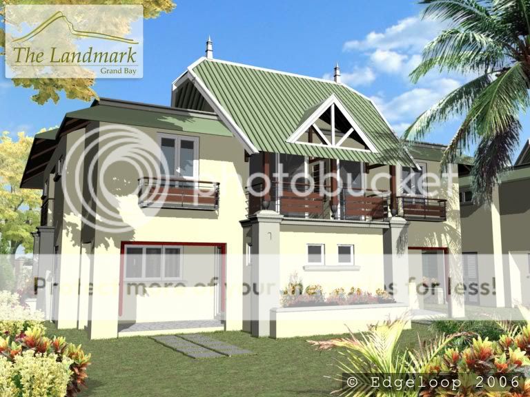
unit 1 Parking View
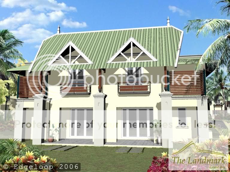
unit 1 Garden View
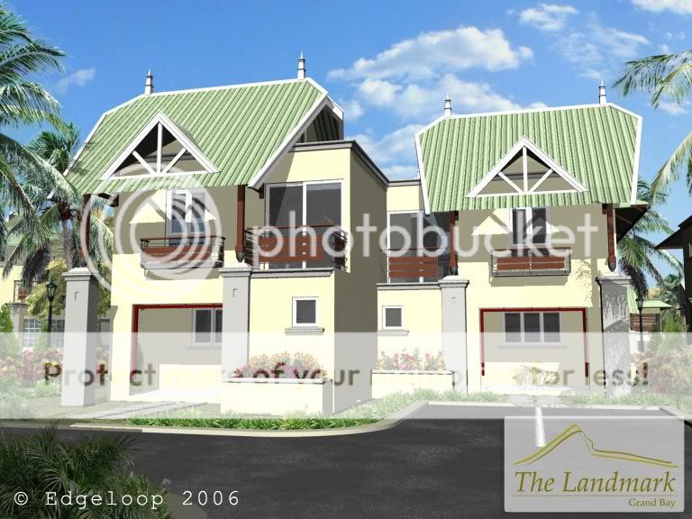
unit 2 Parking View
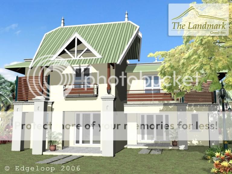
unit 2 Garden View
But i do hope you guys like it... and Thanks for dropping by and comment
Cheers,
:edge: Loop