Introduction to Maya - Modeling Fundamentals Vol 2
This course will look in the fundamentals of modeling in Maya with an emphasis on creating good topology. It's aimed at people that have some modeling experience in Maya but are having trouble with
complex objects.
#
76
26-07-2007
, 09:34 PM

Subscriber
Join Date: Apr 2005
Join Date: Apr 2005
Location: Wagga Wagga, Australia
Posts: 1,432

#
77
26-07-2007
, 11:44 PM

Moderator
Join Date: May 2005
Join Date: May 2005
Location: Manchester Uk
Posts: 6,300
"No pressure, no diamonds" Thomas Carlyle
#
78
26-07-2007
, 11:53 PM

Registered User
Join Date: Dec 2005
Join Date: Dec 2005
Location: Brooklyn, NY
Posts: 3,708
Like the others, I definitely agree that a more dramatic camera angle will really help. I also think that a few more objects will help break up the scene and give it more interest - maybe a table behind the ninja with a vase, or a chest of a drawers... just an idea.

#
79
27-07-2007
, 06:21 AM

Registered User
Join Date: Jul 2005
Join Date: Jul 2005
Location: Boston, MA
Posts: 2,314
also, sorry, only 2 minutes of rendering time each, so alot of noise
1
#
80
27-07-2007
, 06:22 AM
Registered User
Join Date: Jul 2005
Join Date: Jul 2005
Location: Boston, MA
Posts: 2,314
#
81
27-07-2007
, 06:48 AM
Registered User
Join Date: Dec 2005
Join Date: Dec 2005
Location: Brooklyn, NY
Posts: 3,708
#
82
27-07-2007
, 06:55 AM
Moderator
Join Date: May 2005
Join Date: May 2005
Location: Manchester Uk
Posts: 6,300
"No pressure, no diamonds" Thomas Carlyle
#
83
27-07-2007
, 07:50 AM
Registered User
Join Date: Jul 2005
Join Date: Jul 2005
Location: Boston, MA
Posts: 2,314
#
84
27-07-2007
, 08:37 AM

19 year Veteran
Join Date: Sep 2002
Join Date: Sep 2002
Location: U.S.A.
Posts: 2,140
Of course this is only a suggestion.
#
85
27-07-2007
, 09:36 AM
Subscriber
Join Date: Mar 2005
Join Date: Mar 2005
Location: Illinois, USA
Posts: 250
Another thing that I think could be improved is THX's suggestion. I would use much dimmer light. This is probably at night and the lighting is too distracting. I think you should have a dim light at the left, the dimmer light coming from the tv, and add some rimlight if you need to.
I don't think you need the table behind him - especially with so much showing. Remember, the audience is pretty smart, if we see the end of a table there we'll know it's a table. I think it's just a bit distracting atm.
Anyway it's shaping up, man.
Keep on truckin'

#
86
29-07-2007
, 12:48 AM

Registered User
Join Date: Mar 2007
Join Date: Mar 2007
Location: TN (USA)
Posts: 1,889
Don't be satisfied with what you can do but rather strive to do the things you can't do!
Exceed Expectations!
#
87
01-08-2007
, 12:04 AM

Registered User
Join Date: Jun 2007
Join Date: Jun 2007
Location: Türkiye
Posts: 53

#
88
03-08-2007
, 08:05 PM
Registered User
Join Date: Jul 2005
Join Date: Jul 2005
Location: Boston, MA
Posts: 2,314
#
89
03-08-2007
, 08:11 PM
Guest
Posts: n/a
#
90
03-08-2007
, 08:20 PM
Subscriber
Join Date: Mar 2005
Join Date: Mar 2005
Location: Illinois, USA
Posts: 250
Anyway, this looks a ton better than it did before.
Great job, man
Just a little more
Posting Rules Forum Rules
Similar Threads
same animations on duplicate models
by Tammy in forum Maya Basics & Newbie Lounge replies 1 on 07-05-2007
Niggly random problem that happens time to time
by moosenoodles in forum Maya Basics & Newbie Lounge replies 1 on 02-07-2006
Hogwarts, just in maya this time.
by ckyuk in forum Work In Progress replies 22 on 02-03-2006
time delay
by hi2all in forum Programming replies 2 on 15-02-2006
For people who have lots of time
by bubbleme80 in forum Maya Basics & Newbie Lounge replies 0 on 21-03-2005
Topics


Free Courses


Full Courses


VFX News
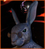
How computer animation was used 30 years ago to make a Roger Rabbit short
On 2022-07-18 14:30:13
Sneak peek at Houdini 19.5
On 2022-07-18 14:17:59
VFX Breakdown The Man Who Fell To Earth
On 2022-07-15 13:14:36
Resident Evil - Teaser Trailer
On 2022-05-13 13:52:25
New cloud modeling nodes for Bifrost
On 2022-05-02 20:24:13
MPC Showreel 2022
On 2022-04-13 16:02:13