Digital humans the art of the digital double
Ever wanted to know how digital doubles are created in the movie industry? This course will give you an insight into how it's done.
#
1
07-02-2009
, 02:14 AM
Subscriber
Join Date: Sep 2005
Join Date: Sep 2005
Location: Illinois
Posts: 364
house by the lake
#
2
07-02-2009
, 02:33 AM
Guest
Posts: n/a

#
3
07-02-2009
, 09:44 AM
Subscriber
Join Date: Sep 2005
Join Date: Sep 2005
Location: Illinois
Posts: 364
#
4
07-02-2009
, 11:43 AM

Moderator
Join Date: May 2005
Join Date: May 2005
Location: Manchester Uk
Posts: 6,300
For a portfolio peice I would really tey to go the extra mile with the composition, meodleing, texturing etc etc, it looks a bit rushed, add some wear and tear in there.
Don't hate me for it, its just how I see it, with more time on it for the modeling and texturing and maybe adding nice plant life around it will be a good pice.
"No pressure, no diamonds" Thomas Carlyle
#
5
07-02-2009
, 12:20 PM

The Nurb Herd
Join Date: Oct 2007
Join Date: Oct 2007
Location: London
Posts: 2,381
I think you need to increase the size of the texture on the hills. Also is that the shadow from the house casting on them? I don't think that light would illuminate that much.
With regards to the lawn, i think you could use the sculpt geometry tool to bash it up a bit, also a bump map or two would help in places.
#
6
07-02-2009
, 06:53 PM
Subscriber
Join Date: Sep 2005
Join Date: Sep 2005
Location: Illinois
Posts: 364
I hate to admit it gster but I did rush to finish because I want to stat on another piece more interesting. I will add more detail before I put it in my portoflio. Thanks for pushing me guys, I need it sometimes LOL!Originally posted by gster123
Its very simplistic and lacking in detials for the modeling and texturing, texture sizes ect throw off the scale.
For a portfolio peice I would really tey to go the extra mile with the composition, meodleing, texturing etc etc, it looks a bit rushed, add some wear and tear in there.
Don't hate me for it, its just how I see it, with more time on it for the modeling and texturing and maybe adding nice plant life around it will be a good pice.
#
7
09-02-2009
, 01:16 AM

Moderator
Join Date: May 2003
Join Date: May 2003
Location: London
Posts: 1,001
The water seems far too bright and seems almost irradiant, it would almost be a a simple but varied tone closely matching the sky with some subtle reflections and specular where necessary.
As things fall off into the distance their saturation will drop dramatically due to the atmosphere, being pushed away from their local color and dropping into the ambient tones.
This should almost be a domanance of hue piece, meaning everything should be a dirivative hue of the main diffused light source.
The resolution of your textures are very apparent, they need to be boosted up to provide a bit of break up for the eye, at the moment they really appear like solid flat dominating tones which is distracting for the eye. You have strong saturated colors combating the contrast of the piece.
Make the local artificial light source with a greater fall off and subtlety, at the moment its effect is too powerful for the composition.
This image is a demonstration of a dominance of hue in moonlight:
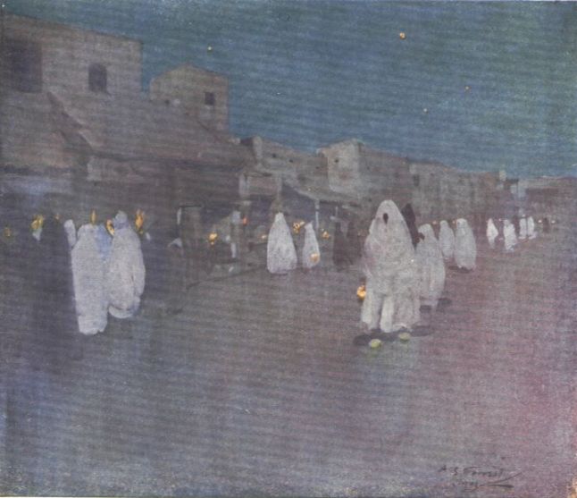
FX supervisor - double negative
Posting Rules Forum Rules
Similar Threads
New Training Series: Spach-Alspaugh House & Environment
by Nilla in forum Site News & Announcements replies 0 on 06-10-2015
Lonley house at mountains
by Skalman in forum Work In Progress replies 1 on 06-10-2013
modeling a house
by SimplyMarc in forum SimplyMaya Tutorials replies 3 on 22-05-2011
Champy Lake Monster
by Rhetoric Camel in forum Work In Progress replies 26 on 15-04-2009
My house...not...anyway: a house
by Renderizer in forum Work In Progress replies 10 on 17-11-2003
Topics

Free Courses


Full Courses


VFX News
How computer animation was used 30 years ago to make a Roger Rabbit short
On 2022-07-18 14:30:13
Sneak peek at Houdini 19.5
On 2022-07-18 14:17:59
VFX Breakdown The Man Who Fell To Earth
On 2022-07-15 13:14:36
Resident Evil - Teaser Trailer
On 2022-05-13 13:52:25
New cloud modeling nodes for Bifrost
On 2022-05-02 20:24:13
MPC Showreel 2022
On 2022-04-13 16:02:13