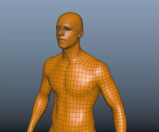
Maya for 3D Printing - Rapid Prototyping
In this course we're going to look at something a little different, creating technically accurate 3D printed parts.
#
16
20-03-2003
, 09:42 PM
The lighting seems a bit harsh on your render. Try playing with the settings...maybe tone it down a touch.
Keep going! It's coming along great!
https://www.darrylworley.com/
https://www.defendamerica.mil/nmam.html
#
17
21-03-2003
, 06:20 PM
Nice Model
#
18
22-03-2003
, 12:15 AM
About the buttons, yeah I see what you mean, will def add some dirt

thanks for the C&C.
cheers
Rich
#
20
28-03-2003
, 04:51 PM
 .
.
"I should call you sugar maple tree cause i'd totally tap that" haha
email - mattwettstein@gmail.com
#
21
28-03-2003
, 10:34 PM
Me TooOriginally posted by englar
i prefer nokia

- Hybrid
#
22
31-03-2003
, 06:31 PM
Another thing regardig textures.. If you change the map type from quadratic to mipmap the texture files tend to be crispier and sharper..
Good work

Carsten Lind
Senior 3D Artist,
Maya Software Manager & Maya Instructor
LEGO Systems A/S
#
23
05-04-2003
, 02:48 PM
But i gotta say nice model

Hi, im a signature virus.
Copy me into your signature to help me spread!
#
24
07-04-2003
, 02:55 AM
what is to be,
so go.we going down
#
25
22-04-2003
, 09:48 PM
reduced the bump map on the body of the phone
any comments welcome
cheers
Rich
#
26
25-04-2003
, 12:59 AM
 . Great job though!
"I should call you sugar maple tree cause i'd totally tap that" haha
email - mattwettstein@gmail.com
#
27
25-04-2003
, 05:32 PM
yeah I def need work on the textures, I think I have sorted the poly edge showing down the bottom right - just softened the normal more and it seems to have solved it (just rendering now to make sure)
The lighting - I was messing with HDRI fake in GI_Joe but might remove it and just use normal lighting.
cheers
Rich
#
28
25-04-2003
, 06:51 PM
 )
)Still the mesh still needs a bit of work - I might have to convert to subds then crease some edges then convert back - but I don't know if I will lose the texture map or not?
cheers
Rich
#
29
26-04-2003
, 03:51 AM
 .
.
"I should call you sugar maple tree cause i'd totally tap that" haha
email - mattwettstein@gmail.com
#
30
26-04-2003
, 11:27 AM
I know what you mean aboyut the light blue colour on the buttons - i have messed with that colour an unbelievable amount - The problem is it is a layered shader with transparency through to the light blue coloured lambert shader underneath - can't seem to get it to look sharp or the right colour. Nevermind, I will continue to mess - Thanks again for the C&C realy apreciate it - it's kinda hard for me to look at it (looked at it so much!!)
cheers
Rich
Posting Rules Forum Rules
Similar Threads
increase realism
by danotronXX in forum Maya Basics & Newbie Lounge replies 4 on 25-11-2007
add some realism
by jakwag in forum Maya Basics & Newbie Lounge replies 6 on 04-08-2004
May Challenge - cb8rwh - Normal
by cb8rwh in forum Previous Challenges (Archives) replies 100 on 01-06-2003
Realism -\/ector(\/)an
by Vectorman in forum Previous Challenges (Archives) replies 34 on 30-04-2003
Realism - tariqrf
by tariqrf in forum Previous Challenges (Archives) replies 23 on 22-04-2003
Topics
Free Courses
Full Courses
VFX News
How computer animation was used 30 years ago to make a Roger Rabbit short
On 2022-07-18 14:30:13
Sneak peek at Houdini 19.5
On 2022-07-18 14:17:59
VFX Breakdown The Man Who Fell To Earth
On 2022-07-15 13:14:36
Resident Evil - Teaser Trailer
On 2022-05-13 13:52:25
New cloud modeling nodes for Bifrost
On 2022-05-02 20:24:13
MPC Showreel 2022
On 2022-04-13 16:02:13


