Complex UV Layout in Maya
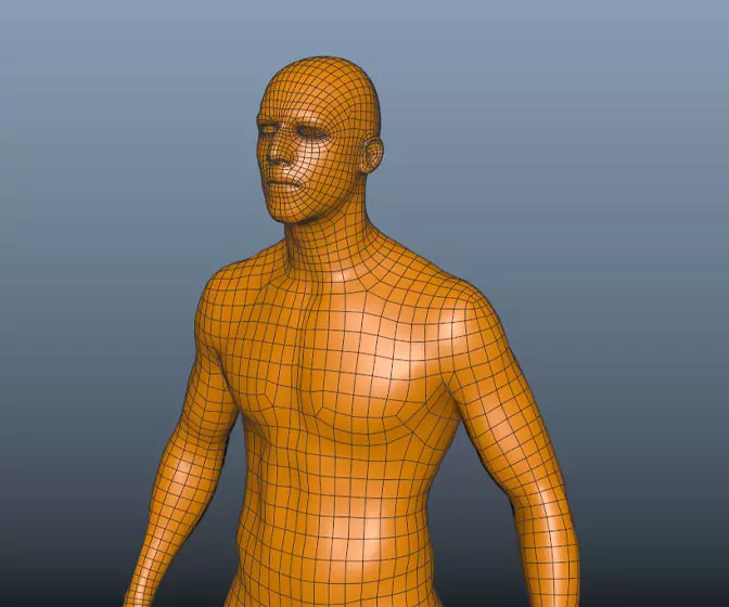
Over the last couple of years UV layout in Maya has changed for the better. In this course we're going to be taking a look at some of those changes as we UV map an entire character
# 1 08-04-2003 , 12:23 AM
Aphex's Avatar
Registered User
Join Date: Jun 2002
Posts: 99

Katana

This was only meant to be a katana shot, modeled on my own katana from above the bed user added image
I went to pain staking detail on the lace by actually making a 3d lace and literally wrapping it in the same fashion as on the real thing and then textured it, but you can't actually see that when the whole sword is in view, and besides the sword alone didn't make a very good picture, so i've tried to knock up a desktop out of it, i would like to add shafts of light to it, but can't figure out how to do it very convincingly, but this is where it's at so far.

Mayas renderer btw

ps. the pic above is one i drew years ago and resides on my wall, i photographed it and sketched it in psp, originally based on the lager of lamot logo



Last edited by Aphex; 08-04-2003 at 12:26 AM.
# 2 08-04-2003 , 02:02 AM
MKess007's Avatar
Registered User
Join Date: Jun 2002
Location: Ohio, USA
Posts: 202
Is that a normal shadow or is it a shadow map?


mahalo,

Myk

<a href="https://www.metic.net" rel="noopener noreferrer nofollow" class="giveMeEllipsisa" target="_blank">www.metic.net</a><br />
# 3 08-04-2003 , 12:59 PM
Aphex's Avatar
Registered User
Join Date: Jun 2002
Posts: 99

# 4 09-04-2003 , 12:38 PM
twisteddragon33's Avatar
Registered User
Join Date: Apr 2003
Location: New York, USA
Posts: 1,945
The Katana seems to be bending on the left of the image where it meats the stand, and the wakisashi seems to ben din on the opposite side. im not sure if its from the lighting or not. I suggest you add a little color to the image in th eback to make it look something like a japanese silk painting, should bbe able to do it in a few minutes in psp, just use high opacity, low hardness and thick brush strokes, possibly angles brushes too.


________________________
AIM: SublimeDragon33
Catch me if i'm on. Always up for a chat.
e-mail: sublimedragon33@gmail.com
# 5 09-04-2003 , 01:31 PM
anita's Avatar
Subscriber
Join Date: Mar 2003
Location: Beverly Hills
Posts: 712
euuh ....maybe need some tutoring with efx...user added image


Alpha Gamma Sygma.
# 6 09-04-2003 , 03:17 PM
tariqrf's Avatar
Subscriber
Join Date: Jul 2002
Posts: 1,253
hmm.. looks goods, but try to make the object 'sit' in the background.. looks like its floating

# 7 09-04-2003 , 04:32 PM
twisteddragon33's Avatar
Registered User
Join Date: Apr 2003
Location: New York, USA
Posts: 1,945
I like the Blue dragon Theme though. I have a black dragon and a soon to be red dragon set to get to me soon. I will model my Black tang when it comes too. Make a whole sword case for themuser added image

but i like your background a lot.


________________________
AIM: SublimeDragon33
Catch me if i'm on. Always up for a chat.
e-mail: sublimedragon33@gmail.com
# 8 09-04-2003 , 07:21 PM
Aphex's Avatar
Registered User
Join Date: Jun 2002
Posts: 99
Twisted-- hmm, i like the sound of the silk painting idea, i'll go and check sum out 'cos i'm not too sure what they looklike, i wasn't really happy with the background for the dragon either, i just rushed one up to get the idea down, as for the bend in the sword, i think you could be right, after looking at it more closely it seems to be a little less 'bent' than the katana above but the katanas bend was totally mirrored so it must be equal.

Tariqrf-- your not wrong, it does look 'floaty', must be 'cos of all the black, i might have to rethink either the plinth, the floor or the lighting or maybe all three to correct that.

Anita-- maybe??? i could never have too much tutoring i guess, hey! maybe you could teach me sometime, i'd love some shafts of light in there user added image


Last edited by Aphex; 09-04-2003 at 08:08 PM.
# 9 09-04-2003 , 10:03 PM
anita's Avatar
Subscriber
Join Date: Mar 2003
Location: Beverly Hills
Posts: 712
it would help to put a point light somewhere in ur scene with no decay!
its too even u need somewhere where the color is brightest.


Alpha Gamma Sygma.
# 10 10-04-2003 , 01:24 AM
tariqrf's Avatar
Subscriber
Join Date: Jul 2002
Posts: 1,253
i would suggest adding 4-5 point lights with low intensity on the ground... or on the corners (where the wall and the ground meets)..

# 11 10-04-2003 , 01:00 PM
Aphex's Avatar
Registered User
Join Date: Jun 2002
Posts: 99
ahaa point lights, i've tried to achieve what your saying but with ambient lights (1 either side and 1 in front of plinth) but they kinda washed the scene of color a little too much so i knocked their intensity down to 0.01 each! which made it a little pointless having 'em, they just kinda tweeked the gamma up a little, so i'll drop 'em completely now and try some point lighting, cheers peeps

# 12 10-04-2003 , 04:17 PM
shoaib's Avatar
Registered User
Join Date: Feb 2003
Location: Pakistan
Posts: 106
using point lights is a veryy good idea to achieve the good results... i have seen a few scenes in which the artists have used more than 50 lights but with very low intensity .... and in the end it gives a veryy nice feel...
try using Decay as well.... but with decay u will need to increase the intensity...play around with Decay and Intensity and u will get good results....

Posting Rules Forum Rules
You may not post new threads | You may not post replies | You may not post attachments | You may not edit your posts | BB code is On | Smilies are On | [IMG] code is On | HTML code is Off

Similar Threads