
Complex UV Layout in Maya
Over the last couple of years UV layout in Maya has changed for the better. In this course we're going to be taking a look at some of those changes as we UV map an entire character
#
1
11-02-2004
, 09:28 AM
Registered User
Join Date: Nov 2003
Join Date: Nov 2003
Location: Leon, Spain
Posts: 6
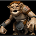
Girl.:_:. "gallery submission"
#
2
11-02-2004
, 10:24 AM

Subscriber
Join Date: Mar 2003
Join Date: Mar 2003
Location: with PonysGirl
Posts: 2,573
your sampler info node /w ramp could be made to respect the amount of light that it is getting. So it dosn't have that highlight like up under the hat whare it should be more subdued becouse of shadow.
really nice though, what render did you use ?
#
3
11-02-2004
, 01:08 PM
Registered User
Join Date: Nov 2003
Join Date: Nov 2003
Location: Leon, Spain
Posts: 6
#
4
11-02-2004
, 01:26 PM

Subscriber
Join Date: Dec 2002
Join Date: Dec 2002
Location: T.O Baby!
Posts: 1,016
#
5
11-02-2004
, 04:10 PM
Registered User
Join Date: Nov 2003
Join Date: Nov 2003
Location: Leon, Spain
Posts: 6
#
6
11-02-2004
, 04:23 PM

Moderator
Join Date: Oct 2002
Join Date: Oct 2002
Location: London, UK
Posts: 2,800
I think that your skin shader could do with some work also, there doesnt appear to be any transluncency or a defined highlight (It's too diffuse).
I do however like the eyes I think that they work well in the model.
Alan
#
7
11-02-2004
, 04:26 PM

Subscriber
Join Date: Oct 2003
Join Date: Oct 2003
Location: Paris, France
Posts: 418
That'll do donkey... that'll do...
#
8
11-02-2004
, 06:13 PM

Moderator
Join Date: Sep 2002
Join Date: Sep 2002
Location: Plantation, Florida
Posts: 1,568
The lighting needs work. She pops out of the scene too much. There are highlights on her forehead under the hat where there should be shadow and the bounced light is too heavy under her chin and on her neck.
Her eyes are blue... everywhere. The whites of her eyes shouldn't be blue at all. In that kind of lighting they should, at most, be an off white or eggshell color.
Almost there but not quite a finished image. Also, don't be afraid to use photoshop to help edit your images. You dont have to get it perfect in Maya all the time.

Dave Baer
Professor of Digital Arts
Digital Media Arts College
Boca Raton, Florida
dbaer@dmac.edu
#
9
11-02-2004
, 07:24 PM

Registered User
Join Date: Jun 2003
Join Date: Jun 2003
Location: Johannesburg
Posts: 641

-------------------------------------------
#
10
12-02-2004
, 10:27 AM
Registered User
Join Date: Nov 2003
Join Date: Nov 2003
Location: Leon, Spain
Posts: 6

and the lighting... yes, needs a lot of work.
thanks for yours reply, and sorry for my bad english
#
11
13-02-2004
, 12:14 PM
Moderator
Join Date: Oct 2002
Join Date: Oct 2002
Location: London, UK
Posts: 2,800
Fair comment but my problem is with the smooth profile of it. With a weave that strong the edge of the hat would not be smooth. It would be bumpy and thus a displacement would work better.The bump on the hat is fine. There are some brands of hat (Kangol, in particular) that use a strong weave like that, so that's fine.
I hadnt noticed the whites of the eyes being blue but now that it's been brought up it really does stand out. The eyes are also missing that one bright white spec higlight that gives eyes depth. You really need that to help sell the picture.
Alan
#
12
03-03-2004
, 11:03 AM
Registered User
Join Date: Mar 2004
Join Date: Mar 2004
Posts: 1

#
13
03-03-2004
, 03:24 PM

Registered User
Join Date: Dec 2003
Join Date: Dec 2003
Location: Lisbon
Posts: 71
Any way god job
weld some pixels !!!
Last edited by Pixelwelder; 03-03-2004 at 03:27 PM.
#
14
05-03-2004
, 05:29 PM
Registered User
Join Date: Nov 2003
Join Date: Nov 2003
Location: Leon, Spain
Posts: 6

#
15
05-03-2004
, 07:18 PM

Registered User
Join Date: Jan 2003
Join Date: Jan 2003
Location: AB, Canada
Posts: 550

Posting Rules Forum Rules
Similar Threads
Char: Girl
by Sir-Avalon in forum Work In Progress replies 47 on 21-03-2005
Excalibur "Gallery Submission"
by ringhino in forum Finished Work replies 6 on 18-01-2005
Space Girl
by Benzeno in forum Maya Basics & Newbie Lounge replies 6 on 07-11-2004
character - girl [nudity]
by rotbol in forum Work In Progress replies 37 on 11-06-2004
my girl textured
by raul in forum Work In Progress replies 6 on 22-11-2002
Topics


Free Courses


Full Courses


VFX News
How computer animation was used 30 years ago to make a Roger Rabbit short
On 2022-07-18 14:30:13
Sneak peek at Houdini 19.5
On 2022-07-18 14:17:59
VFX Breakdown The Man Who Fell To Earth
On 2022-07-15 13:14:36
Resident Evil - Teaser Trailer
On 2022-05-13 13:52:25
New cloud modeling nodes for Bifrost
On 2022-05-02 20:24:13
MPC Showreel 2022
On 2022-04-13 16:02:13