Maya 2020 fundamentals - modelling the real world
Get halfway through a model and find it's an unworkable mess? Can't add edge loops where you need them? Can't subdivide a mesh properly? If any of this sounds familiar check this course out.
# 16 18-08-2008 , 04:06 AM
Soulrider911's Avatar
Subscriber
Join Date: Jul 2007
Location: California
Posts: 180
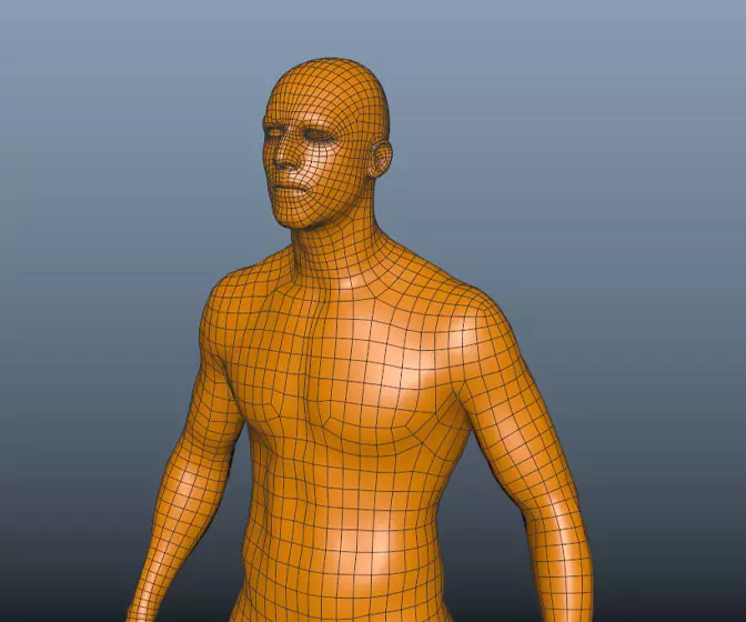
i could probably step down the smoothing on the face, its a little unnecessary, as it still looks good at a level 1 smooth, same with a lot of the other elements.
thanks


Bradysammons.com
New Media Designer
Student: Academy of Art University S.F.
My WIP
# 17 18-08-2008 , 12:41 PM
Soulrider911's Avatar
Subscriber
Join Date: Jul 2007
Location: California
Posts: 180
first render...man i ahve such a hard time with rendering it always looks like garbage...anyone have any tips

Attached Thumbnails

Bradysammons.com
New Media Designer
Student: Academy of Art University S.F.
My WIP
# 18 18-08-2008 , 01:39 PM
Acid44
Guest
Posts: n/a
i dont have any tips cause i suck at rendering :p but the model iss looking great so faruser added image

# 19 18-08-2008 , 02:04 PM
Gen's Avatar
Super Moderator
Join Date: Dec 2006
Location: South FL
Posts: 3,522
I would say start with a more interesting camera angle, the model already has the bind pose thing going on so may want to ditch the 12 O' clock view and maybe soften the shadows a wee bit. This render doesn't "look like garbage" btw.


- Genny
__________________
::|| My CG Blog ||::
::|| My Maya FAQ ||::
# 20 18-08-2008 , 02:10 PM
NeoStrider's Avatar
Registered User
Join Date: Jun 2004
Location: Cleveland, Ohio (USA)
Posts: 1,541
rendering is supposed to look like garbage until you've spent as much time on lighting, posing, & camera placement as you have on the actual modeling/texturing...

everyone always wants to learn how to model/texture and then just find some 'make awesome render' preset or plugin *MR SKY COUGH* that will make their model or scene look perfect... you've really gotta finesse it if you want something to look good, because eventually all the plugins will just look same old, same old.


Accept no substitutions.
# 21 18-08-2008 , 02:39 PM
Soulrider911's Avatar
Subscriber
Join Date: Jul 2007
Location: California
Posts: 180
right... but is there any tips to go along with that, like what types of lights to use, how many, where to place em??? ect...


Bradysammons.com
New Media Designer
Student: Academy of Art University S.F.
My WIP
# 22 18-08-2008 , 03:22 PM
Gen's Avatar
Super Moderator
Join Date: Dec 2006
Location: South FL
Posts: 3,522
You could look into 3 point lighting (some people think its a cure all but quite frankly I think it has its time and place). And I agree with NeoStrider, lighting isn't a cookie cutter, cut and dry matter at all, just like modeling,texturing, animating, the possibilities are endless and you can actually find yourself tweaking lights and whatnot and doing test renders for quite a while before you get things "just so". The MR physical sky feature is great (for certain situations)I've seen cases where it did more harm than good.

Personally I think it comes down to what mood you're trying to set/ what you're trying to show off or hide. I suggest you google up images, like studio lighting (or something really specific lol) just as an example and take some notes.


- Genny
__________________
::|| My CG Blog ||::
::|| My Maya FAQ ||::
# 23 19-08-2008 , 03:31 AM
Soulrider911's Avatar
Subscriber
Join Date: Jul 2007
Location: California
Posts: 180

pic

Render2

Attached Thumbnails

Bradysammons.com
New Media Designer
Student: Academy of Art University S.F.
My WIP
# 24 19-08-2008 , 04:31 AM
younglion's Avatar
Registered User
Join Date: Jun 2005
Location: t-dot
Posts: 646
i think you should try a 3 point light system for this character

# 25 19-08-2008 , 10:54 AM
Soulrider911's Avatar
Subscriber
Join Date: Jul 2007
Location: California
Posts: 180
the second one is 3-point,,,,but i think i should do without the final gather...kinda made it come out the way i wasn't intending


Bradysammons.com
New Media Designer
Student: Academy of Art University S.F.
My WIP
# 26 19-08-2008 , 11:05 AM
NeoStrider's Avatar
Registered User
Join Date: Jun 2004
Location: Cleveland, Ohio (USA)
Posts: 1,541
if that was three-point the shadow would be coming off at an angle... unless you've got the lighting camera-centric (based on the location of the camera), then it makes sense but really kinda looks the same.

try altering the colors of the lights. you don't have to have a blatantly orange light, but the subtlety of color helps suggest a mood. you'll notice that some people that use a slight color in one light use the complimentary color in the other light. the most successful combo is the orange/blue for lighting. (the blue suggests areas of shadow - or the places where there's a lack of orange lighting.)

don't forget that when trying out the three-point lighting scheme, your key light is the only one that casts a shadow. it's also the brightest of the 3 lights. the fill light should be about a third to two-thirds of the intensity of the key, and your backlight can be a half to a quarter strength of the key.

if you want a softer (but still defined) shadow in the back, try using an area light instead of a spotlight or a point light.


Accept no substitutions.
# 27 19-08-2008 , 11:31 AM
Soulrider911's Avatar
Subscriber
Join Date: Jul 2007
Location: California
Posts: 180
Thanks so much for the taking time to explain.
BRady


Bradysammons.com
New Media Designer
Student: Academy of Art University S.F.
My WIP
# 28 19-08-2008 , 06:45 PM
vladimirjp's Avatar
Subscriber
Join Date: Jun 2003
Location: stuck in the 90's boston, USA
Posts: 1,871
it looks great the way iit is now user added image

now make him move :blush:

# 29 27-08-2008 , 09:49 AM
Soulrider911's Avatar
Subscriber
Join Date: Jul 2007
Location: California
Posts: 180

Trying to get the lights right

Another render

Attached Thumbnails

Bradysammons.com
New Media Designer
Student: Academy of Art University S.F.
My WIP
# 30 27-08-2008 , 10:00 AM
Bluethunder's Avatar
Registered User
Join Date: May 2008
Posts: 97
he looks great!

Heheh.. I think he indulged in a few too many donuts... He can barely fit his uniform on user added image

Great work!

Posting Rules Forum Rules
You may not post new threads | You may not post replies | You may not post attachments | You may not edit your posts | BB code is On | Smilies are On | [IMG] code is On | HTML code is Off

Similar Threads