Substance Painter
In this start to finish texturing project within Substance Painter we cover all the techniques you need to texture the robot character.
#
1
24-01-2003
, 10:11 PM
Registered User
Join Date: Jun 2002
Join Date: Jun 2002
Posts: 99
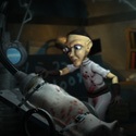
Slave of Indriya MkII
Is it any better though? COMPARISON
#
2
24-01-2003
, 10:50 PM

Registered User
Join Date: Oct 2002
Join Date: Oct 2002
Location: St. louis Mo
Posts: 1,580
Thanks,
Brian
#
4
25-01-2003
, 01:44 AM

Registered User
Join Date: Dec 2002
Join Date: Dec 2002
Location: Seattle, WA
Posts: 1,154
 ):
):Lighting is much better. More depth to the scene.
The bump map on the walls is too strong. Tone it down a bit to look more natural.
Somehow, the character and the skull look like they're floating a bit off the ground. It may be that the models are actually on the ground, but the way the lighting and the shadows fall there, it looks like they're floating.
The jug in the lower right hand corner draws too much attention to itself. Part of it is the brightness of the hilites, part of it is its position in the frame. Reducing the brightness on the jug will help it recede a bit more. Possibly repositioning it further back in the image might help too.
The shackles and chains are too shiny. They look brand new. Doesn't seem right for this type of scene.
You're almost there...
#
5
25-01-2003
, 02:18 AM

Registered User
Join Date: May 2002
Join Date: May 2002
Location: Niagara Falls, Canada
Posts: 5,310
I am enough of an artist to draw freely upon my imagination, knowledge is limited, imagination encircles the world. (Albert Einstein)
https://www.artstation.com/kurtb
#
6
25-01-2003
, 01:39 PM
Registered User
Join Date: Jun 2002
Join Date: Jun 2002
Posts: 99

oh well, you could always leave that classy swatch watch there fer a while, oooo and don't forget the tricycle and that erm thingummy jig, oh and not forgetting the table and chairs of course

The medieval ages were never renowned for expert stone masonry, the chains ARE new, the previous inmate knackered the old ones, and its hard to get a shadow on a dark floor, but there is one there honest, and as for the mouth; i dare say mine would wouldn't look pretty wide if i were choking myself to death on a manicle, and as for the jug i couldn't really argue that one, i wasn't overley chuffed with it i must say, but heyho perfection isn't really my forte so i thought what the hell, whats a jug 'tween friends.
Seizure later

Last edited by Aphex; 25-01-2003 at 08:23 PM.
Posting Rules Forum Rules
Similar Threads
Battlestar Galactica Colonial Viper MKII
by ctbram in forum Work In Progress replies 85 on 23-01-2010
Mine Slave
by Lookey in forum Finished Work replies 6 on 15-03-2007
Mine Slave
by Lookey in forum Finished Work replies 7 on 25-11-2005
Slave of Indriya
by Aphex in forum Finished Work replies 7 on 24-01-2003
Topics

Free Courses


Full Courses


VFX News
How computer animation was used 30 years ago to make a Roger Rabbit short
On 2022-07-18 14:30:13
Sneak peek at Houdini 19.5
On 2022-07-18 14:17:59
VFX Breakdown The Man Who Fell To Earth
On 2022-07-15 13:14:36
Resident Evil - Teaser Trailer
On 2022-05-13 13:52:25
New cloud modeling nodes for Bifrost
On 2022-05-02 20:24:13
MPC Showreel 2022
On 2022-04-13 16:02:13