Maya for 3D Printing - Rapid Prototyping
In this course we're going to look at something a little different, creating technically accurate 3D printed parts.
# 1 23-01-2003 , 07:41 PM
Aphex's Avatar
Registered User
Join Date: Jun 2002
Posts: 99

Slave of Indriya

The more he struggles for the light (which represents his desires), the tighter chains get.
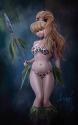
Branded and fettered by the dollar (represented by the chains), if he were to let go of the 'struggle for his desires', the chains would lengthen and eventually release him, then the brand would fade away.

maybe user added image

Good for gallery?LinkyLinky


Last edited by Aphex; 23-01-2003 at 07:43 PM.
# 2 23-01-2003 , 07:43 PM
kbrown's Avatar
Moderator
Join Date: Sep 2002
Location: London, UK
Posts: 3,198
Only thing that needs some work in my opinion is the skin shader. Otherwise it looks alrighty to me...


Kari
- My Website
- My IMDB

Do a lot, Fail a lot and Learn a lot!
# 3 23-01-2003 , 08:10 PM
Kevin
Guest
Posts: n/a
yes .. gets my vote for the gallery to!

thats 2 ... one more mod please

# 4 23-01-2003 , 08:23 PM
Registered User
Join Date: Jan 2003
Location: Rochester, NY
Posts: 3
Very nice pic! One suggestion is to have somewhere for the chains to go to in the floor (i.e. a block, a hook in the floor, etc.)

# 5 23-01-2003 , 08:50 PM
brian_ellebracht's Avatar
Registered User
Join Date: Oct 2002
Location: St. louis Mo
Posts: 1,580
wow. Nice anatomy. Looks good. The only c&C that I have is what Jmarsz had to say and also that maybe you could change the skinshader? It looks alittle plasicty. Overall good comp. though. Thanks,
Brian


Please check
My (old) website!
# 6 23-01-2003 , 09:14 PM
dannyngan's Avatar
Registered User
Join Date: Dec 2002
Location: Seattle, WA
Posts: 1,154
Nice job on the modeling. I agree with the previous suggestions people have made

I think the lighting needs work. It looks like you only have a single light in the scene, and that makes it look incomplete. There needs to be some more ambient light on the wall and the ground to give the image more depth and range. Also, the highlighted portion of the leg on the right side of the image throws off the composition -- it draws attention to it because the shadows are so dark and it is the same brightness as the face. Toning down the intensity there will definitely help focus the viewer's eye on the character's face some more.

The image is almost there. Not ready for the gallery just yet, though.


Danny Ngan
Animator | Amaze Entertainment
my website | my blog | my job
# 7 23-01-2003 , 10:00 PM
Kurt's Avatar
Registered User
Join Date: May 2002
Location: Niagara Falls, Canada
Posts: 5,310
Ya just work on the lighting a bit more and maybe some skin work other than that great job.....


I am enough of an artist to draw freely upon my imagination, knowledge is limited, imagination encircles the world. (Albert Einstein)

https://www.artstation.com/kurtb
# 8 24-01-2003 , 01:15 AM
Aphex's Avatar
Registered User
Join Date: Jun 2002
Posts: 99
yeah, good feedback thanx people, i too thought the skin looked a little 'action man' like, i tried toning down the blinn specularity, but it obviously didnt pull off too well, so i'll have a go at sorting it, i'll also put some ground loops in for the chains too.

hold fire, "i'll be back" user added image lol

Posting Rules Forum Rules
You may not post new threads | You may not post replies | You may not post attachments | You may not edit your posts | BB code is On | Smilies are On | [IMG] code is On | HTML code is Off

Similar Threads