Complex UV Layout in Maya
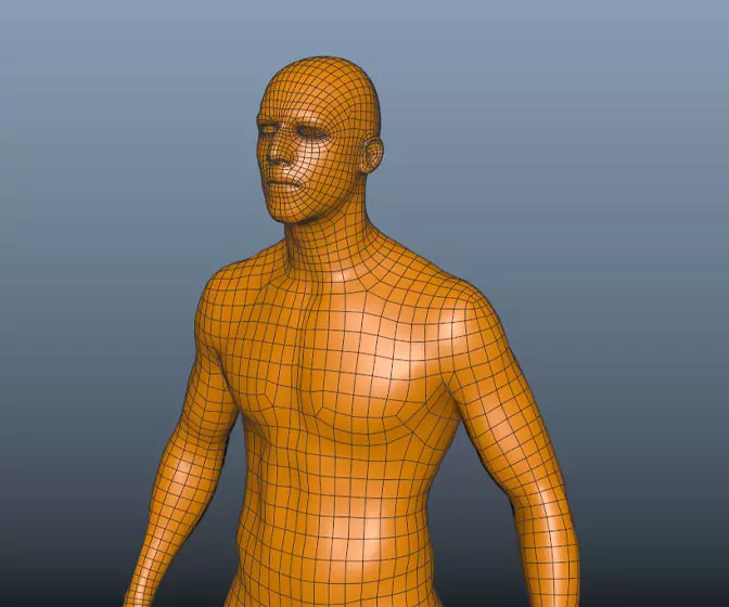
Over the last couple of years UV layout in Maya has changed for the better. In this course we're going to be taking a look at some of those changes as we UV map an entire character
#
1
21-05-2007
, 01:25 AM
creepy corridor
"You won't get anything done by planning" - Karl Pilkington
#
2
21-05-2007
, 01:34 AM
#
3
21-05-2007
, 03:16 AM
Subscriber
Join Date: Apr 2007
Join Date: Apr 2007
Posts: 144
whats that at the end of the hallway?
Its attracting attention and its too flat ; so u may wanna make it darker.
Last edited by njon; 26-05-2007 at 02:37 AM.
#
4
21-05-2007
, 03:31 AM
Yay, not a freshman anymore!
#
5
21-05-2007
, 06:21 AM
#
6
21-05-2007
, 12:20 PM
"No pressure, no diamonds" Thomas Carlyle
#
7
21-05-2007
, 12:51 PM
ill have a fiddle with and post the finished artical when i get time to do it!
"You won't get anything done by planning" - Karl Pilkington
#
8
30-05-2007
, 04:25 AM
Subscriber
Join Date: Feb 2006
Join Date: Feb 2006
Posts: 1,937
only crit atm is that the light lamp are abit to low to the ground i think if you place a human there?
#
9
30-05-2007
, 03:19 PM
and personally spoken a strong and crisp contrast within lighting gives me the creeps.
good work!
everything starts and ends in the right place at the right time.
#
10
30-05-2007
, 08:03 PM
It kind of makes me feel like if I stare at it long enough a creepy image is going to pop out of nowhere. Like that old image that used to float all over the internet, it looked like a messy room and then all of a sudden this horror movie looking dead girl with pop up for a second real quick.
Only crit I have has been mentioned, about the lights looking like they might be hanging down a little too low
Posting Rules Forum Rules
Similar Threads
Topics
Free Courses
Full Courses
VFX News
How computer animation was used 30 years ago to make a Roger Rabbit short
On 2022-07-18 14:30:13
Sneak peek at Houdini 19.5
On 2022-07-18 14:17:59
VFX Breakdown The Man Who Fell To Earth
On 2022-07-15 13:14:36
Resident Evil - Teaser Trailer
On 2022-05-13 13:52:25
New cloud modeling nodes for Bifrost
On 2022-05-02 20:24:13
MPC Showreel 2022
On 2022-04-13 16:02:13

