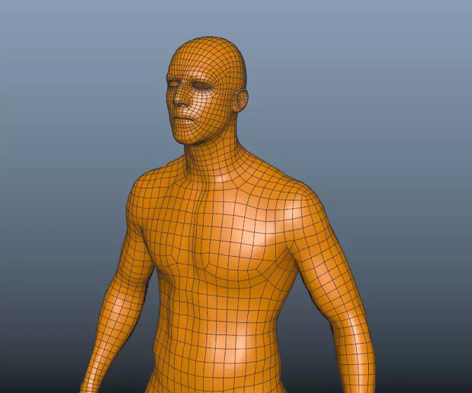
Digital humans the art of the digital double
Ever wanted to know how digital doubles are created in the movie industry? This course will give you an insight into how it's done.
#
1
24-03-2009
, 08:07 PM
Registered User
Join Date: Mar 2009
Join Date: Mar 2009
Posts: 3
first room model/render
Thanks
Last edited by kjleroy; 24-03-2009 at 08:25 PM.
#
2
24-03-2009
, 08:18 PM
#
4
24-03-2009
, 08:34 PM
it looks really cool, good job on the textures
but.. one thing...
how do you open your drawers?

that's a "Ch" pronounced as a "K"
Computer skills I should have:
Objective C, C#, Java, MEL. Python, C++, XML, JavaScript, XSLT, HTML, SQL, CSS, FXScript, Clips, SOAR, ActionScript, OpenGL, DirectX
Maya, XSI, Photoshop, AfterEffects, Motion, Illustrator, Flash, Swift3D
#
5
24-03-2009
, 08:43 PM
Registered User
Join Date: Mar 2009
Join Date: Mar 2009
Posts: 3
#
6
24-03-2009
, 09:11 PM
#
7
24-03-2009
, 11:05 PM
#
8
25-03-2009
, 03:47 AM
Subscriber
Join Date: Sep 2005
Join Date: Sep 2005
Location: Illinois
Posts: 364
Posting Rules Forum Rules
Similar Threads
Youth Room
by Perfecto in forum Work In Progress replies 8 on 29-10-2016
New Skype Room
by jamie1789 in forum Maya Basics & Newbie Lounge replies 3 on 03-09-2014
Boiler room
by Maurits Pfaff in forum Finished Work replies 11 on 03-10-2007
my room
by xmikx in forum Work In Progress replies 13 on 16-05-2007
Texturing a room
by Forlax in forum Maya Materials & Textures replies 1 on 10-10-2004
Topics
New tutorial - Create tileable textures from photos. Photoshop to Alchemist to Maya 2
By David
Site News & Announcements
5
Free Courses
Full Courses
VFX News
How computer animation was used 30 years ago to make a Roger Rabbit short
On 2022-07-18 14:30:13
Sneak peek at Houdini 19.5
On 2022-07-18 14:17:59
VFX Breakdown The Man Who Fell To Earth
On 2022-07-15 13:14:36
Resident Evil - Teaser Trailer
On 2022-05-13 13:52:25
New cloud modeling nodes for Bifrost
On 2022-05-02 20:24:13
MPC Showreel 2022
On 2022-04-13 16:02:13


