Introduction to Maya - Modeling Fundamentals Vol 2
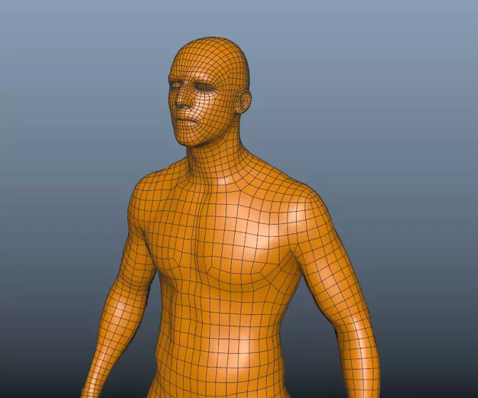
This course will look in the fundamentals of modeling in Maya with an emphasis on creating good topology. It's aimed at people that have some modeling experience in Maya but are having trouble with
complex objects.
#
1
24-03-2007
, 12:55 AM
Military sceane
#
2
24-03-2007
, 12:57 AM
#
3
24-03-2007
, 05:05 AM
Scene looks pretty cool so far although I have no idea what you're trying to achieve

#
4
24-03-2007
, 05:52 AM
Registered User
Join Date: Aug 2003
Join Date: Aug 2003
Posts: 71
<a href=https://theimagehosting.com><img src="https://images6.theimagehosting.com/58.415.gif" alt="Image Hosted by The Image Hosting" /></a>
#
5
24-03-2007
, 08:18 AM
#
6
24-03-2007
, 08:33 AM
#
7
24-03-2007
, 09:08 AM
#
8
24-03-2007
, 07:18 PM
"One day someone tells me that I was no one, no one is perfect, if God is perfect so I'm God" - No One
#
9
24-03-2007
, 09:21 PM
Maybe put the guy in a bit more of a natural pose cause at the moment it is looking a bit static and symetrical
Posting Rules Forum Rules
Similar Threads
Military helmet
by Lunnep in forum Maya Basics & Newbie Lounge replies 18 on 11-12-2007
Military Base Attack
by soreel in forum Finished Work replies 4 on 05-09-2007
military movie critiques appreciated
by danotronXX in forum Work In Progress replies 9 on 08-02-2007
Military net ?
by ColdWave in forum Maya Basics & Newbie Lounge replies 12 on 30-01-2007
*WAR*
by jklaroe in forum Maya Basics & Newbie Lounge replies 137 on 26-03-2003
Topics
New tutorial - Create tileable textures from photos. Photoshop to Alchemist to Maya 2
By David
Site News & Announcements
5
Free Courses
Full Courses
VFX News
How computer animation was used 30 years ago to make a Roger Rabbit short
On 2022-07-18 14:30:13
Sneak peek at Houdini 19.5
On 2022-07-18 14:17:59
VFX Breakdown The Man Who Fell To Earth
On 2022-07-15 13:14:36
Resident Evil - Teaser Trailer
On 2022-05-13 13:52:25
New cloud modeling nodes for Bifrost
On 2022-05-02 20:24:13
MPC Showreel 2022
On 2022-04-13 16:02:13
