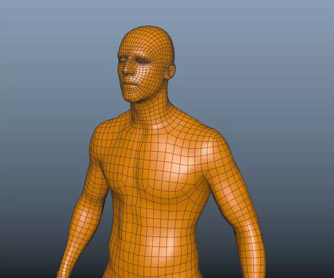
Complex UV Layout in Maya
Over the last couple of years UV layout in Maya has changed for the better. In this course we're going to be taking a look at some of those changes as we UV map an entire character
#
16
19-07-2007
, 04:54 PM
arran - At first I wanted it to have that nice sharp edge. I looked at my guitar again and realized it isnt that sharp. Its a bit smoother now, check last image.
Here I have added the back pannels and the neck screws with pannel. Also some shark inlays. Now just the tuning pegs left as well as the strings.
#
17
20-07-2007
, 04:16 AM
C&C welcome.
#
18
20-07-2007
, 11:46 AM
Sparticus
Expect to excell...
#
19
20-07-2007
, 01:22 PM

Si
Examples of bTraffic - a traffic animation tool for Maya
bFlocking - a tool for Maya 8.5+ to generate flocking and swarming behaviours
Jan/Feb Challenge 2007 Entry and W.I.P
May/Jun Challenge 2006 Entry and W.I.P
Mar/Apr Challenge 2006 Entry and W.I.P
Jan/Feb Challenge 2006 Entry and W.I.P
Nov/Dec Challenge 2005 Entry and W.I.P
Sep/Oct Challenge 2005 Entry and W.I.P
Jul/Aug Challenge 2005 Entry
www.flash-fx.net
#
20
20-07-2007
, 01:51 PM
t1ck135 - thank you, and you dont need to wait, here are some renders.
Still experimenting with materials such as the ones for frets, as you can see diferences in some pix. Their reflectivity and environment makes them look white sometimes.
#
21
22-07-2007
, 10:33 AM
#
22
23-07-2007
, 01:50 PM
Heres one of the finals.
#
23
23-07-2007
, 02:36 PM
u have a really nice nodel with great detail but the render leaves much to be desired
the textures need some work also
for the wood on the neck use a program called wood workshop which u can google to create hi res tilable textures
the wood on urs looks too stretched
the metal i think is too reflective
they are plian not really reflecting anything/stands out a little too much
not sure about the blue colour but thats beacause i dont like white , red or blue guitars
i also think its shader need a little work
also dont forget the strings
i too am working on a guitar here
a gibson les paul - would appreicate ur comments since ur also modelling a guitar
edit: junk inc. another technique is to create a polygon plane, scale so it is biger that ur reference an inncreae the no of subdivions in the channel box, use the split poly tool to trace a rough outline delete unwanted faces clean up any triangles and extrude up ,(also before u extrude up move the verts around so they follow the lines of the guitar)- just thought u might like to know another technique
pbarnes
Now at SMU doing BSc 3D Computer Animation so its hard to get on here
My wire render tut https://forum.simplymaya.com/showthre...threadid=20973
Last edited by pbman; 23-07-2007 at 02:40 PM.
#
24
23-07-2007
, 09:50 PM
#
25
23-07-2007
, 11:15 PM
Subscriber
Join Date: Aug 2004
Join Date: Aug 2004
Posts: 515
a strap would be perfect.
the last render looks nice.
i would like to see a bit darker of a shadow on it tho.
and more detail on the pickups, i dont see any metal whatever you call it on the pickups, conductors or whatever.
and maybe an electric cord comming out of the guitar, or unplugged beside the guitar all coiled up or just going out of the screen. that would also add some pa-zaz
First year 3D Grad
#
26
24-07-2007
, 07:06 AM
You must be thinking of these: https://cachepe.zzounds.com/media/qua...4c36284fb0.jpg
While I modeled these: https://content.answers.com/main/cont...0px-EMG_85.jpg
That said, I will think of something soft to add.
#
27
24-07-2007
, 11:29 AM
yeah emgs are nice setup - i cant see from ur render but on them in one corner have 'EMG' printed as i say i cant see so u may have already done this
also u say u ahve a guitar take a pic of it in its stand then one of the stand without it in then comp ur guitar in and use the first pic as reference as what the shadow depth, strength and colour should be
u then can include ur amp and lead in this which will make a real nice image at the end
Now at SMU doing BSc 3D Computer Animation so its hard to get on here
My wire render tut https://forum.simplymaya.com/showthre...threadid=20973
#
28
24-07-2007
, 12:31 PM
If it was me I would add an environment to start with so that you can see the reflections as at the mo theres nothing to reflect so the chrome looks white.
with my Les Paul I mainly used photo textures, think that the only procedural was the plastic and the chrome, everything had a bump and most had a fresnell effect to them, really adds to it.
With something like this where youve put in the time in modeling youve got to di it justice with the texturing and rendering, its a paint but at the end of the day it will be worth it for the praise you'll get off your mates!!
Good luck!
"No pressure, no diamonds" Thomas Carlyle
#
29
24-07-2007
, 11:33 PM
Subscriber
Join Date: Dec 2005
Join Date: Dec 2005
Posts: 17
Thanks PB for extra tips its always good to get different ways to do stuff then I can see what works best for me and incorporate into my workflow.
#
30
24-07-2007
, 11:44 PM
Subscriber
Join Date: Dec 2005
Join Date: Dec 2005
Posts: 17
Thanks PB for extra tips its always good to get different ways to do stuff then I can see what works best for me and incorporate into my workflow.
Posting Rules Forum Rules
Similar Threads
Guitar Strap plus Guitar
by Hansi3 in forum Animation replies 12 on 31-05-2013
a couple guitar videos
by Acid44 in forum Maya Basics & Newbie Lounge replies 11 on 21-10-2008
Electric Guitar!
by sumchans in forum Finished Work replies 7 on 13-12-2007
Cutting shape out of guitar
by IJke in forum Maya Basics & Newbie Lounge replies 9 on 23-01-2007
modeling a guitar
by MattTheMan in forum Maya Basics & Newbie Lounge replies 2 on 07-05-2005
Topics
Free Courses
Full Courses
VFX News
How computer animation was used 30 years ago to make a Roger Rabbit short
On 2022-07-18 14:30:13
Sneak peek at Houdini 19.5
On 2022-07-18 14:17:59
VFX Breakdown The Man Who Fell To Earth
On 2022-07-15 13:14:36
Resident Evil - Teaser Trailer
On 2022-05-13 13:52:25
New cloud modeling nodes for Bifrost
On 2022-05-02 20:24:13
MPC Showreel 2022
On 2022-04-13 16:02:13


