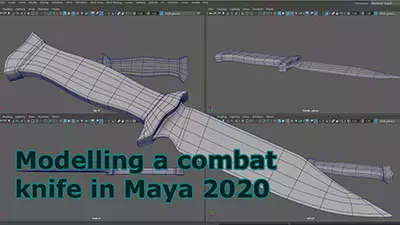
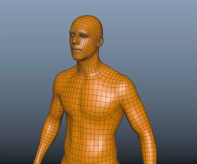
Introduction to Maya - Modeling Fundamentals Vol 2
This course will look in the fundamentals of modeling in Maya with an emphasis on creating good topology. It's aimed at people that have some modeling experience in Maya but are having trouble with
complex objects.
#
1
26-11-2007
, 04:49 AM
low poly snowboarder
#
2
26-11-2007
, 06:25 AM
#
3
26-11-2007
, 09:06 AM
Guest
Posts: n/a

#
4
26-11-2007
, 10:47 AM
Registered User
Join Date: Mar 2007
Join Date: Mar 2007
Posts: 1,055
I like it, don' think the head is too big overall, just strangely proportioned - very large jaw and lower face.
Like the texturing,
gubar
#
5
26-11-2007
, 03:12 PM
can we see a wire?:attn:
A great mod for Jedi academy www.moviebattles.com
Computer Rig-
64-bit vista
23.5 inch LCD + a 19 inch
Q6600 intell qaud
4 gigs of ddr2 ram
8800GTS 512 video card @700mhz
#
6
26-11-2007
, 04:12 PM
Registered User
Join Date: Nov 2007
Join Date: Nov 2007
Location: Huntsville, AL
Posts: 27
Seriously, its nice work but the head just looks rushed
#
7
26-11-2007
, 05:20 PM
starjsjswars: ill post up a wire later on today when i go back to tackling the head
#
8
26-11-2007
, 05:35 PM
#
9
26-11-2007
, 06:26 PM
hmmm...
EA Games
#
10
26-11-2007
, 07:17 PM
#
11
26-11-2007
, 07:26 PM
#
12
26-11-2007
, 07:41 PM
Subscriber
Join Date: Nov 2004
Join Date: Nov 2004
Posts: 1,043
#
13
26-11-2007
, 08:02 PM
 .. plus it would save on the time it takes to load the thread.
 About the model, Well the modeling is not to solid, there allot of geo that could be done without. For example ( i think this was mentioned earlier) there seems to be allot to cramped geo on top of the arm that you could collapse, it would clean up your mesh and also make editing, and animation easier.
The face is allot better in this latest image, though it still seems kinda strange. Maybe it's just the texture your using.
Also the hands could use a bit of extra attention, as well, the sleeves of his jacket seem to be shaped oddly, and also the seem to defy gravity slightly.
As for the textures, these are very well done and there are not any noticeable seams (that i have noticed.
All in all, pretty good, just pay extra attention to proportions, and Geometry.
Have Fun

www.stevenegan-cgi.com
"Your weapons are no match for ours! People of Mars, surrender!"
"Um, this isn't Mars. This is Earth."
"Earth? Earth-with-nuclear-weapons Earth?"
"Yes."
[long pause] "Friend!!"
#
14
26-11-2007
, 08:57 PM
EA Games
Last edited by djknucklez1; 26-11-2007 at 09:01 PM.
#
15
27-11-2007
, 01:28 AM
once again all tips greatly appreciated
djknucklez1: thanks for the reply also greatly appreciated the face does need a lot of work i havnt really gone anywhere near low poly heads before so its something i will do a lot more practice on, i will post a close up of the head and hands tonight some time, i do agree that the hands need a lot of work at the moment its just a procedural texture on them to simulate black gloves yet i will have to uv them and find a texture. The triangle will take a bit of work to get rid of especially in the face i think their are a fair few. but once again thaanks heaps for the feedback it is invaluable
Posting Rules Forum Rules
Similar Threads
Embed high poly object into low poly object
by Esperado in forum Dynamics & Special Effects replies 0 on 03-08-2017
Work Flow High Poly/Low Poly
by LadySekhmet in forum Maya Basics & Newbie Lounge replies 4 on 11-02-2012
Ncloth? and low poly modelling/high poly rendering?
by mcrae44 in forum Maya Basics & Newbie Lounge replies 5 on 22-03-2008
Low Poly?
by mclimer in forum Maya Modeling replies 4 on 02-03-2004
gourand shading on low poly
by stavs82 in forum Maya Basics & Newbie Lounge replies 3 on 04-06-2003
Topics
Free Courses
Full Courses
VFX News
How computer animation was used 30 years ago to make a Roger Rabbit short
On 2022-07-18 14:30:13
Sneak peek at Houdini 19.5
On 2022-07-18 14:17:59
VFX Breakdown The Man Who Fell To Earth
On 2022-07-15 13:14:36
Resident Evil - Teaser Trailer
On 2022-05-13 13:52:25
New cloud modeling nodes for Bifrost
On 2022-05-02 20:24:13
MPC Showreel 2022
On 2022-04-13 16:02:13


