Complex UV Layout in Maya
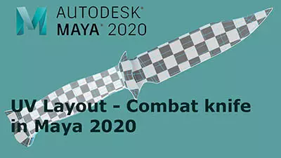
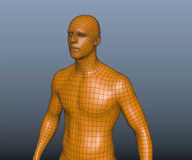
Over the last couple of years UV layout in Maya has changed for the better. In this course we're going to be taking a look at some of those changes as we UV map an entire character
#
31
07-05-2007
, 05:30 AM

#
32
07-05-2007
, 05:35 AM

#
33
07-05-2007
, 05:48 AM
#
34
07-05-2007
, 08:14 AM

Maybe a flaming mane, or something...

#
35
08-05-2007
, 05:52 AM
#
36
08-05-2007
, 08:31 AM

In my humble oppinion the demonic lavapattern looked the best when it was only shown on the lower legs and hooves. I guess I am thinking variation is your friend, both in color and in pattern. It's far from done yet I know but something to keep in mind and be observant about. Also keep in mind that it'd be my personal preferrence. Not necessarily yours. It's the latter that matter.
The uv's layed out so far, wow. Looks very clean and easy to paint on. I wish I could do that, but working on it.
#
37
08-05-2007
, 08:50 AM
 definitely like the new direction. I think that it would be good to get some contrast to the black and red with some different colors perhaps in the harness or his flaming mane.
#
38
08-05-2007
, 09:23 AM
I have to agree. I needed something to apply to the head to draw a little more attention to it, but I guess I am going overly nuts with the lava-crackle effect; I'll try to cut back :p
@ arran
I have something planned for the harnesses; I just need to develop an appropriate design on which I can apply my devious imaginings.
*Rubs hands together in a rather evil fashion*
Man, it's times like this that I need a smiley with horns, a pointy tail and a pitchfork...

#
39
10-05-2007
, 11:59 PM
#
40
11-05-2007
, 12:06 AM
#
41
11-05-2007
, 12:16 AM

#
42
11-05-2007
, 12:19 AM
Even lava from volcanos or parts of the earth where lava just bubbles on the surface aren't all just red, it's got more colore to it. And maybe even change up the red so some is darker and some is lighter than other parts.
other than that I have no crits it's coming along nicely. keep up the good work
#
43
11-05-2007
, 01:23 AM
But it definitely looks better with more than just red; thanks Camel ^_^

#
44
11-05-2007
, 02:01 AM
Is that even a real word?

#
45
11-05-2007
, 05:13 AM
Posting Rules Forum Rules
Similar Threads
Topics
Free Courses
Full Courses
VFX News
How computer animation was used 30 years ago to make a Roger Rabbit short
On 2022-07-18 14:30:13
Sneak peek at Houdini 19.5
On 2022-07-18 14:17:59
VFX Breakdown The Man Who Fell To Earth
On 2022-07-15 13:14:36
Resident Evil - Teaser Trailer
On 2022-05-13 13:52:25
New cloud modeling nodes for Bifrost
On 2022-05-02 20:24:13
MPC Showreel 2022
On 2022-04-13 16:02:13


