Complex UV Layout in Maya
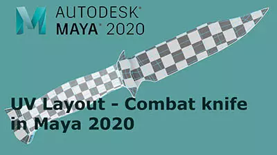
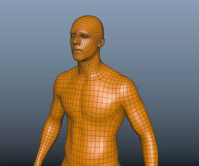
Over the last couple of years UV layout in Maya has changed for the better. In this course we're going to be taking a look at some of those changes as we UV map an entire character
#
91
22-12-2007
, 09:57 AM
nice model, I didn't have time to read the entire thread, but you're trying to light your plane now right.
I think the main thing that bothers me is that if the plane is in the sky you'd have only the sun as a light source, hence you'd get quite distinct shadows. Try a directional light for the sun, or if you want the easy way out use the physical sun and sky in MR.
have a look here you can see that one side of the plane is a lot darker then the other
https://www.richard-seaman.com/Aircra...ft10oClock.jpg
Also you might want to play a bit with your materials, even battered war planes would have a couple of reflective metal parts.
www.animateme.me.uk
#
92
22-12-2007
, 01:27 PM
Also the texturing could use some reality, like seams between hull plating and such(bump /displacement).
Maybe a specular map(instead of probably only tweaking specularity-value's).
Modeling wise i think the front of the plane seems a bit to flat, it's to straight if i look at the picture it needs a bit of a curveature the same goes for the wing.
I hope it is not to late because it needs a bit of tweaking, before you post it as a final.
best regards
edit forget the red circle around spikethingy , my bad sorry

#
93
26-12-2007
, 02:56 AM
Guest
Posts: n/a
I've looked at other pics and they don't have motion blur on the plane or the background. There is a small bump and there are shadows already.Originally posted by pbman
i like the propeller
how ever, the image is quite still, either give the plane some motion blur of give some to the background
the lighting is beeter but neeeds some work to match the environment, i also think there should be a bump on the wing.
i think there needs to be some shadows on the plane aswell
About the spec map, I've used them on a bunch of my models, but I don't really like them that much. Too much work into too little of a thing.
Posting Rules Forum Rules
Similar Threads
Polygon plane crashes Mental Ray (fatal..null DB tag)
by jttraverse in forum Lighting & Rendering replies 0 on 15-05-2015
Jr.Who - W.I.P. - Pirate Ship
by Jr.Who in forum Work In Progress replies 93 on 26-02-2008
Jr.Who - Finished - Spitfire Plane
by Jr.Who in forum Finished Work replies 10 on 18-01-2008
Jr.Who - W.I.P. - Assault Mech
by Jr.Who in forum Work In Progress replies 84 on 09-11-2007
Topics
New tutorial - Create tileable textures from photos. Photoshop to Alchemist to Maya 2
By David
Site News & Announcements
5
Free Courses
Full Courses
VFX News
How computer animation was used 30 years ago to make a Roger Rabbit short
On 2022-07-18 14:30:13
Sneak peek at Houdini 19.5
On 2022-07-18 14:17:59
VFX Breakdown The Man Who Fell To Earth
On 2022-07-15 13:14:36
Resident Evil - Teaser Trailer
On 2022-05-13 13:52:25
New cloud modeling nodes for Bifrost
On 2022-05-02 20:24:13
MPC Showreel 2022
On 2022-04-13 16:02:13
