Introduction to Maya - Modeling Fundamentals Vol 2
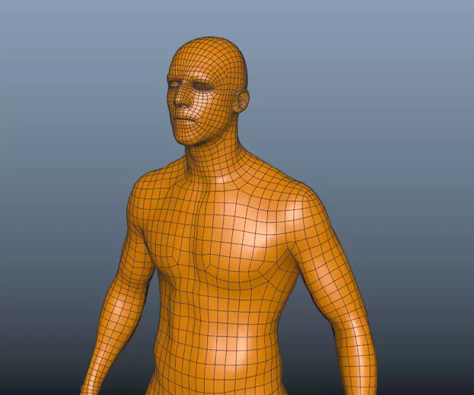
This course will look in the fundamentals of modeling in Maya with an emphasis on creating good topology. It's aimed at people that have some modeling experience in Maya but are having trouble with
complex objects.
#
1
29-04-2004
, 10:32 PM
#
2
29-04-2004
, 10:50 PM
#
3
30-04-2004
, 02:56 AM
#
4
30-04-2004
, 04:02 AM
I am enough of an artist to draw freely upon my imagination, knowledge is limited, imagination encircles the world. (Albert Einstein)
https://www.artstation.com/kurtb
#
5
30-04-2004
, 02:13 PM
<html><font size=2>
<font color="blue">
And after calming me down with some orange slices and some fetal spooning,
E.T. revealed to me his singular purpose.
--TOOL, 10,000 Days---
</font></pre>
</html>
#
6
30-04-2004
, 03:42 PM
who cares if it's not good enough for gallery.
i love this render, the lighting sets the exact mood i wanted !. i don't know what that dark burn on the white of the body is though...
#
7
30-04-2004
, 03:54 PM
I am enough of an artist to draw freely upon my imagination, knowledge is limited, imagination encircles the world. (Albert Einstein)
https://www.artstation.com/kurtb
#
8
30-04-2004
, 04:24 PM
There's not enough bounce light, the back end of the guitar blends into the ground too much.
I would expect some spec "pings" from the machine heads on the top of the neck nothing major but some.
I also think that the pickguard is too thick. Look at a real guitar and you will see that they dont slope up on the sides either they have a much harder straighter edge.
Just my 2 cents worth.

Alan
#
9
30-04-2004
, 08:46 PM
"Terminat Bora Diem, Terminal Auctor opus."
Posting Rules Forum Rules
Similar Threads
Gallery Submission
by dae in forum Finished Work replies 7 on 10-10-2004
Gallery Submission: Low poly man
by drknow in forum Finished Work replies 58 on 26-09-2003
Audiobahn Inc Stereo - Gallery Submission?
by Forum_snowboarder33 in forum Finished Work replies 7 on 20-07-2003
Gallery Submission: Chocks Away
by Alan in forum Finished Work replies 5 on 01-06-2003
Gallery submission
by mayaguy_dr in forum Finished Work replies 0 on 11-02-2003
Topics
Free Courses
Full Courses
VFX News
How computer animation was used 30 years ago to make a Roger Rabbit short
On 2022-07-18 14:30:13
Sneak peek at Houdini 19.5
On 2022-07-18 14:17:59
VFX Breakdown The Man Who Fell To Earth
On 2022-07-15 13:14:36
Resident Evil - Teaser Trailer
On 2022-05-13 13:52:25
New cloud modeling nodes for Bifrost
On 2022-05-02 20:24:13
MPC Showreel 2022
On 2022-04-13 16:02:13


