Integrating 3D models with photography
Interested in integrating your 3D work with the real world? This might help
#
1
16-01-2007
, 07:03 AM
Registered User
Join Date: Feb 2006
Join Date: Feb 2006
Location: Australia
Posts: 297
Web site logo
I've been asked to make a logo for a new site (www.animators-anonymous.com) so I thought I'd get some help from you guys...
The basic idea so far is a disc-like logo that I plan to add a coin spin style animation to. Below is a link to the 1st animation test:-
https://www.kickarz.com/AA_logo_spin01.wmv (right click - save target as - 475 Kb)
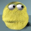
I have also attached a test render of what the final logo may look like.
Comments are more then welcome...
#
2
16-01-2007
, 07:14 AM

Moderator
Join Date: May 2005
Join Date: May 2005
Location: Manchester Uk
Posts: 6,300
For me I might drop the name in the logo and just go for a logo, mainly as it looks a bit too busy with the name in there, it also makes it a bit hard to read, maybe its the transparance on the material??
For me if your going for the name to be in there I would break it up into and give the name more space so that it's the main focus to the viewer.
Just some thoughts.
"No pressure, no diamonds" Thomas Carlyle
#
3
16-01-2007
, 08:00 AM
Senior Software Developer
Join Date: Jan 2005
Join Date: Jan 2005
Location: Livingston, Scotland
Posts: 1,701
I Agree with gster on the name, remove it. Also the AA at the top reminds me of the American Airborne symbol from WWII. Just in-case there is any fallout from the old boys or AA organisations. Also remove the name then continue the A down and leave a gap at the bottom.
Ideas that all
The Anim is OK, but is a little bit abrupt in its end and just seems to stop...
G/L on this and have fun, its nice to get a little commission on art now and again.
Chris (formerly R@nSiD)
When the power of love overcomes the love of power the world will truely know peace - Jimmy Hendrix
 Winner SM VFX Challenge 1
 3rd Place SM SteamPunk Challenge (May 2007)
#
4
16-01-2007
, 09:28 AM
Subscriber
Join Date: Feb 2006
Join Date: Feb 2006
Posts: 1,937
about the logo, the colour isnt really doing it for me aswell and is also abit to transparent/see though which is making it abit harder to read but the logo is really nice. about the test animation i really like it alot, well goodluck and hope you make the customers happy lol. cheers, marlon
#
5
16-01-2007
, 01:16 PM
Registered User
Join Date: Feb 2006
Join Date: Feb 2006
Location: Australia
Posts: 297
gster123 - although the glass/plastic material kinda works for the AA bit itself, you are right about the text - very hard to read. I may play with colors/texures a little before I remove it completely.
R@nSiD - I had NOT seen the American Airborne logo before today (had to ask google to show me) - thats spooky! I'm now a little concerned about being SO similar. The animation needs a lot of tweeking still - it was just a test to see if I could actually pull off a coin spin. To tell you the truth, I messed about for ages with keying rotations & faking deceleration before I scrapped all that and simply tapped the edge of an active rigid softbody disc with a passive one in a scene with some gravity. (it's so simple - I'm embarrassed).
marlonjohn - busy is an understatement m8, I have something like 4 projects on the go plus my day job. I have a fair bit on today so I may not get a chance to progress on this until tonight. I think I'll just retry the animation again with the logo as is with some adjustments to the forces etc. I'll post the result when it's ready.
Thanks again,
Dave.
#
6
16-01-2007
, 01:54 PM
Registered User
Join Date: Feb 2005
Join Date: Feb 2005
Location: This Place
Posts: 220
Book Wise
https://X4nd5r.deviantart.com
#
7
16-01-2007
, 02:11 PM
Registered User
Join Date: Feb 2006
Join Date: Feb 2006
Location: Australia
Posts: 297
#
8
16-01-2007
, 08:40 PM
Registered User
Join Date: Feb 2006
Join Date: Feb 2006
Location: Australia
Posts: 297
The jagged A's are much smoother now & I've played a little with the color/texture to make it ezr to see. (still looks a lot like the American Airborne logo, so I'm still scratching my head over that one).
Also, I've just set up another coin spin simulation using the logo this time. I'll post link when it's finished rendering...
#
9
16-01-2007
, 08:43 PM
Registered User
Join Date: Feb 2006
Join Date: Feb 2006
Location: Australia
Posts: 297
Cheers!
#
10
17-01-2007
, 12:03 AM
Registered User
Join Date: Feb 2005
Join Date: Feb 2005
Location: This Place
Posts: 220
Book Wise
https://X4nd5r.deviantart.com
#
11
17-01-2007
, 03:33 AM
Subscriber
Join Date: Feb 2006
Join Date: Feb 2006
Posts: 1,937
"Also the AA at the top reminds me of the American Airborne symbol from WWII."
 thats is freaky, looks neally the same... all my hair's on my back jumped up when i saw that, wow.
#
12
17-01-2007
, 03:36 AM
Moderator
Join Date: May 2005
Join Date: May 2005
Location: Manchester Uk
Posts: 6,300
That would have ended up exactly the same! Good job I looked it up before suggesting it, would have looked a right one!!
"No pressure, no diamonds" Thomas Carlyle
#
13
17-01-2007
, 04:16 AM
Senior Software Developer
Join Date: Jan 2005
Join Date: Jan 2005
Location: Livingston, Scotland
Posts: 1,701

Chris (formerly R@nSiD)
When the power of love overcomes the love of power the world will truely know peace - Jimmy Hendrix
Winner SM VFX Challenge 1 3rd Place SM SteamPunk Challenge (May 2007)
#
14
17-01-2007
, 11:24 AM
Registered User
Join Date: Feb 2006
Join Date: Feb 2006
Location: Australia
Posts: 297

Moving on.... I have at last finished rendering the 2nd dynamics test:
https://www.kickarz.com/AA_logo_spin02.wmv (save target as - 1.4Mb)
Note: this is just a test and will not be used as the main logo design will be changed.
Dave.
#
15
17-01-2007
, 12:14 PM
Senior Software Developer
Join Date: Jan 2005
Join Date: Jan 2005
Location: Livingston, Scotland
Posts: 1,701
The spinning coin/logo is 110% better. Looks good...
Chris (formerly R@nSiD)
When the power of love overcomes the love of power the world will truely know peace - Jimmy Hendrix
Winner SM VFX Challenge 1 3rd Place SM SteamPunk Challenge (May 2007)
Posting Rules Forum Rules
Similar Threads
New web site
by kbrown in forum Maya Basics & Newbie Lounge replies 12 on 11-05-2006
Invitation to RenderNode Magazine web site
by rendernode in forum Maya Basics & Newbie Lounge replies 1 on 15-08-2003
web site up...crits,comments and thoughts welcome
by mushroomgod in forum Maya Basics & Newbie Lounge replies 18 on 28-09-2002
web site for customer
by Kevin in forum Maya Basics & Newbie Lounge replies 8 on 15-09-2002
Topics


Free Courses


Full Courses


VFX News
How computer animation was used 30 years ago to make a Roger Rabbit short
On 2022-07-18 14:30:13
Sneak peek at Houdini 19.5
On 2022-07-18 14:17:59
VFX Breakdown The Man Who Fell To Earth
On 2022-07-15 13:14:36
Resident Evil - Teaser Trailer
On 2022-05-13 13:52:25
New cloud modeling nodes for Bifrost
On 2022-05-02 20:24:13
MPC Showreel 2022
On 2022-04-13 16:02:13