Introduction to Maya - Rendering in Arnold
This course will look at the fundamentals of rendering in Arnold. We'll go through the different light types available, cameras, shaders, Arnold's render settings and finally how to split an image into render passes (AOV's), before we then reassemble it i
#
61
25-09-2003
, 06:33 PM
#
62
25-09-2003
, 06:34 PM
#
63
25-09-2003
, 06:38 PM
larger as I want to re-use these textures.
#
64
29-09-2003
, 01:32 PM
If you'd like, I can critique it... tell you what works, what doesn't... what changes would be needed had this been a real assignment, etc.
Don't get me wrong, you did really well! A top contendor! I'm planning on offering a critique to everyone that finishes, as those that do finish, to me anyway, obviously are working toward this goal, and I want to help as much as I can.

#
65
29-09-2003
, 02:26 PM
I would really appreciate that kind of feedback.
Just what I need to keep me on track.
Cheers Mike,
Chris
#
66
29-09-2003
, 04:03 PM
#
67
29-09-2003
, 05:08 PM

Your feedback has been great and really helpfull throughout this challenge.
I hope you've got as much out of this challenge as I have.
Cheers Witchy

#
68
29-09-2003
, 11:27 PM
Scraggy
Last edited by Scraggy_Dogg; 29-09-2003 at 11:31 PM.
#
69
06-10-2003
, 06:33 PM
#
70
07-10-2003
, 09:41 AM
Mike's critique
Hey, Chris!
My purpose with the critique is that since you finished, you obviously hold this kind of art form in high regard, and I hope I would be safe to bet, you are looking forward to joining the game industry eventually. I hope I can point out some things that will improve you chances for that in the future!
First, great job on finishing. Obviously, not many did, so I have to acknowledge that alone as an accomplishment!
Alrighty:
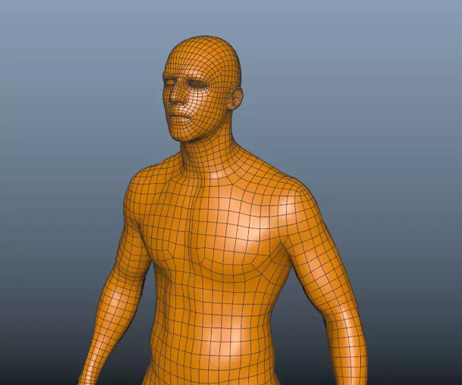
1) UV Layout - Your UV layout for the male head was fine, but the body layout is much too spaced out. Much of the male and female body textures looked to be repeated or mirrored... this can easily be done by simply overlapping the UVs from both sides of the model onto the same area of the texture! You could have easily have done the same body texture in half the size. The female head layout is ok, but could probably have been saved some space. Save for the mole on the female, it looks like both sides of the head are pretty much the same... space could have been saved by halving the texture and simply mirroring the UVs over it.
2) Texture quality - I commend you for hand painting the majority of your texture! However, I think if you do so, it would be best to go all or nothing. The Male's face looks too different in comparison to the rest of it! The female face is just one color, which was noticeable. Aside from that, I think you're on the right track! Better and better quality will come with practice. That said, I think the female's headgear was quite nice.
3) - Modeling - Your modeling shows promise.
A decent texture is really what makes your models shine. Of the two, I'd say the male was the better model. However, for both models, you have lots and lots of polygons that are not adding to the shape in any important way. I think, aside from the smoothness of the male's plume, you could have almost exactly the same model with 1500 polys or maybe even less. The geometry used to model the straps on the male's chest is totally lost in the texture, and could have probably been done just with the texture alone.
The female especially shows far too many polygons to justify the shape, and I think could again, have been done with half of what was used. Also, the dress has unnessesary geometry for it, and could have been done with the texture alone.
Hope that didn't all sound too harsh! You are definitely on the right track and have already exceeded what I see coming out of many art schools. Practice geometry efficiency. Try to meet that 1500 limit! Put a little more contrast into your textures to make them pop more, and keep practicing!
Congrats!
Excellent feedback, and much appreciated.
Thanks Mike

Chris
Posting Rules Forum Rules
Similar Threads
September Challenge: Witchy - Normal
by Witchy in forum Previous Challenges (Archives) replies 68 on 01-10-2003
September Challenge: Darkware - Normal
by Darkware in forum Previous Challenges (Archives) replies 60 on 01-10-2003
September Challenge - Concepts Posted!
by mtmckinley in forum Previous Challenges (Archives) replies 109 on 01-10-2003
September Challenge - Mayaguy_dr - Normal
by mayaguy_dr in forum Previous Challenges (Archives) replies 8 on 09-09-2003
September Challenge - mumbojumbo_13 - Normal
by mumbojumbo_13 in forum Previous Challenges (Archives) replies 2 on 05-09-2003
Topics
Free Courses
Full Courses
VFX News
How computer animation was used 30 years ago to make a Roger Rabbit short
On 2022-07-18 14:30:13
Sneak peek at Houdini 19.5
On 2022-07-18 14:17:59
VFX Breakdown The Man Who Fell To Earth
On 2022-07-15 13:14:36
Resident Evil - Teaser Trailer
On 2022-05-13 13:52:25
New cloud modeling nodes for Bifrost
On 2022-05-02 20:24:13
MPC Showreel 2022
On 2022-04-13 16:02:13


