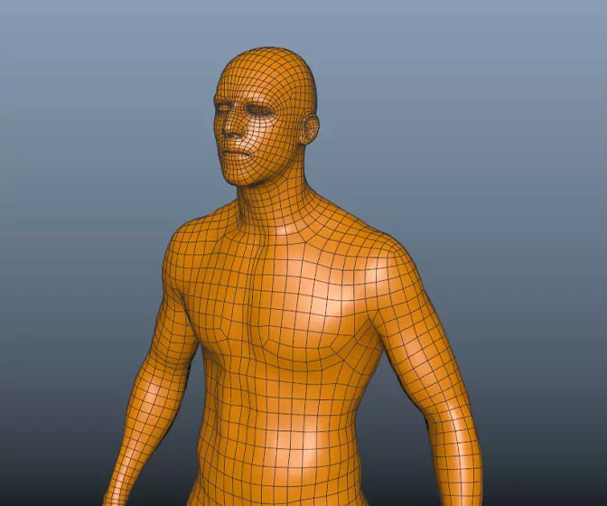
Digital humans the art of the digital double
Ever wanted to know how digital doubles are created in the movie industry? This course will give you an insight into how it's done.
#
1
30-05-2007
, 07:02 PM
Registered User
Join Date: Apr 2006
Join Date: Apr 2006
Location: NYC
Posts: 30
Lighting interior
This is an interrogation room I plan to use with in an animation...As of now, I think I am having trouble lighting it nicely. I am using 4 area lights on the ceiling and then one ambient light to fill the room...I plan on using occlusion pass to bring back some of the detail that the ambient light washed away. I would like the room to look very sterile. Anyway, comments would be greatly appreciated on anything, especially the lighting!!! thank you:attn:
#
2
30-05-2007
, 07:03 PM
Registered User
Join Date: Apr 2006
Join Date: Apr 2006
Location: NYC
Posts: 30
#
5
02-06-2007
, 09:56 PM

#
6
03-06-2007
, 12:45 AM
#
7
03-06-2007
, 04:49 AM
Yay, not a freshman anymore!
#
8
04-06-2007
, 04:56 AM
Registered User
Join Date: Apr 2006
Join Date: Apr 2006
Location: NYC
Posts: 30
#
9
04-06-2007
, 05:53 AM
Chris (formerly R@nSiD)
When the power of love overcomes the love of power the world will truely know peace - Jimmy Hendrix
 Winner SM VFX Challenge 1
 3rd Place SM SteamPunk Challenge (May 2007)
#
10
05-06-2007
, 09:09 AM
Setup: Mac Pro Quad 3
#
11
06-06-2007
, 01:52 AM
Registered User
Join Date: Apr 2006
Join Date: Apr 2006
Location: NYC
Posts: 30
Update
#
12
06-06-2007
, 05:56 AM
Subscriber
Join Date: Aug 2004
Join Date: Aug 2004
Posts: 515
normally a ceiling light like that will be dimmer (and not pure white as that is) and you will usually also be able to tell that there is distinct areas where the light is being made by bulbs behind the light. you should see 2 or more definite light sources behind the light, rather than the entire thing as one big light.
First year 3D Grad
#
13
08-06-2007
, 01:06 AM
I NEED A JOB!
#
14
08-06-2007
, 01:59 PM
Posting Rules Forum Rules
Similar Threads
interior lighting mental ray
by drubster in forum Finished Work replies 15 on 28-06-2011
Interior Design - Texturing, Lighting and Rendering
by Nilla in forum Site News & Announcements replies 2 on 25-11-2009
Interior Lighting
by Lion`I in forum Work In Progress replies 25 on 30-05-2009
Interior Lighting Question
by Azman in forum Maya Basics & Newbie Lounge replies 6 on 20-05-2007
Topics
Free Courses
Full Courses
VFX News
How computer animation was used 30 years ago to make a Roger Rabbit short
On 2022-07-18 14:30:13
Sneak peek at Houdini 19.5
On 2022-07-18 14:17:59
VFX Breakdown The Man Who Fell To Earth
On 2022-07-15 13:14:36
Resident Evil - Teaser Trailer
On 2022-05-13 13:52:25
New cloud modeling nodes for Bifrost
On 2022-05-02 20:24:13
MPC Showreel 2022
On 2022-04-13 16:02:13
