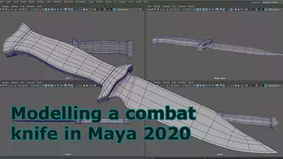
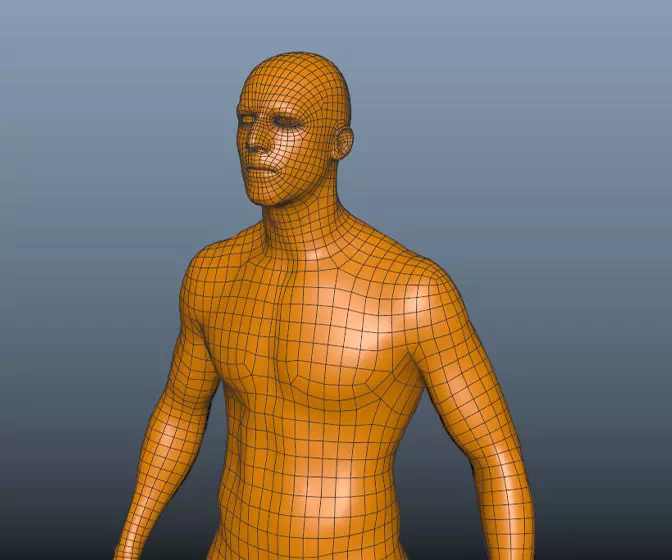
Maya 2020 fundamentals - modelling the real world
Get halfway through a model and find it's an unworkable mess? Can't add edge loops where you need them? Can't subdivide a mesh properly? If any of this sounds familiar check this course out.
#
1
18-03-2007
, 07:37 PM
Alien Invaders
As well as my TELL TALE HEART project, I have a compositing project that I need to complete before the end of the semester. The idea is that aliens are invading so, on footage that the class shot last week, I need to composite a spaceship and make it kill one of the students.
Being as there's less than 2 months before the end of the semester, I thought it would be a good idea to make a start. So I spent the day making this spaceship (as well as looking after my 2 kids, who says men can't multi-task!!).
I've not finished it yet but it's modeled, rigged and partly textured which isn't really toobad, in my eyes, considering I had nothing this morning!!
THIS is a link to a very quick test render, nothing special, bad animation, no shadows or any prettyness, I just wanted to see the controlls working and get a feel of how it animates. It's a little under 1Meg so right click and save as to sve my bandwidth please.
enjoy,
Mat.
#
2
18-03-2007
, 07:50 PM
Banned
Join Date: May 2005
Join Date: May 2005
Location: new zealand
Posts: 193

#
3
21-03-2007
, 03:15 AM
nice work...
No sure if its the effect you're after but when the turret, comes up its almost as if there is excess room between the outer ship and where the central turret meet, giving a kind of oldish and worn feel to the movement. If this is the feel of animation you're trying for then excellent, dare i say it but overall its looking like 'wild wild west' gadgetary. Nice work...
#
4
21-03-2007
, 03:22 AM
"No pressure, no diamonds" Thomas Carlyle
#
5
21-03-2007
, 12:29 PM
How's it going?
Cheers for the words, the gap was due to my hasty rigging effort. I kind of liked the way the turret moved out of sync with the rest of the body but it caused problems with movement when the turret was down, see in the animation that the gun hatch doors are an issue too. It's all fixed now but I might still see if I can add a stable version of that moving effect, it adds character.
Steve,
it never crossed my mind but now you come to mention it there is a definate similarity.
Take it easy,
Mat.
#
6
21-03-2007
, 12:34 PM

Keep it up Matt and get it perfected ,you already have a good start.
#
7
23-03-2007
, 02:16 AM
Subscriber
Join Date: Feb 2006
Join Date: Feb 2006
Posts: 1,937

goodluck with the rest, hope to see more updates
marlon
#
8
25-03-2007
, 09:59 PM
I've taken my first steps into the world of After Effects, I'm not finding it a very easy package to get my head around. I'm sure that I'll get there in the end though (I need to otherwise I fail my module!!).
HERE'S my first attempt at compositing then, hopefully I'll get better at it!
Enjoy,
Mat.
#
9
25-03-2007
, 11:25 PM
Theres lots of ways to composite, I prefer to render in layers then comp them all together, including a occlusion layer.
Theres a good book on after effects that i've got,
https://www.amazon.co.uk/After-Effect...4930816&sr=8-7
It goes over lots of ways to create nice little clips "advert style" if you will, showing how to use laters, time warp, sound fx, tracking markers etc etc, as well as a tutorial on compositing layers from a 3d programme (lightwave in this case but it dosent tell you anything about it just that the model was done in lightwave).
theres also another book "maya 6 the complete reference" that has 2 chapters dedicated to rendering in layers (as well as camera mapping a simple scene) and compositing in after effects which follows the same method as the After effects book (I think that its the same guy who did the tutorials for both books), Its also coming out as "Maya 8 the complete reference" soon, but there might be differences in the tutorials.
"No pressure, no diamonds" Thomas Carlyle
#
10
26-03-2007
, 01:24 AM
I get my grant next monday so I may well get myself a book on the subject as I'm lost when I look at the UI.
I remember having trouble with Photoshop when I first used it, I'm fine with it now but I think that Adobe user interfaces aren't very friendly. Also having to learn a new set of techno-babble in a short time space is enough to send anyone loopy!!
My tutors have put some good tutorials (that I was meant to work through) on the university website, I'll take a look at them too.
I think that the main thing I need to remember is something that I'm totally used to with Maya, you get no quick fixes. If I want it to look good I need to spend time learning how to do it.
Thanks,
Mat.
#
11
29-03-2007
, 04:20 AM
looks good mate
take it easy and life will be easy
#
12
30-03-2007
, 03:33 AM
Here is a LINK to some great video tuts for AE from a guy who knows his stuff. There's a couple on compositing too from memory.
Good luck M8 & keep us posted

#
13
01-04-2007
, 05:01 AM
and cheers for your feedback and thoughts.
Mirek: I'm getting there with After Effects, it's a bit of a slog at first but then once you gain momentum there's no moss gathering!!
Dave: Cheers for that, I've already been pointed in the direction of that site....... must be good!! I took a quick look at it and many of the tutorials are AE 6 and 7. Unfortunately, I'm using 5.5, I can't see that so much will have changed. If it has I'm sure I'll get good pointers from the tutorials!!
Anyway, here it is then......... I've worked hard this week getting this together and would appreciate any crit that you folks could spare the time to give, Cheers.
RIGHT CLICK AND SAVE this link to see my work so far. I still need to put seperate images on the screens in the UFO, make the laser effects and the effects of the laser on the students.
Later,
Mat.
#
14
01-04-2007
, 06:12 AM
edit: as far as crits go, i'd have to say that the lighting of the top of the ufo matches your video shots, but the underside (especially the feet when it lands) are way too dark/underexposed.
Accept no substitutions.
#
15
01-04-2007
, 06:25 AM
The composite is nice and clean (aint alpha grand
 ). In a couple of shots the UFO looks a little dark. This is tricky to solve without rending a dozen passes with reflections/shadows/hilights/etc. A quick fix may be to add an adjustment layer in AE and use that to remove some hue or even make it sepia (there are even a few AE plugins that can give ya vid a nice movie look).
Also, if you want quick special effects, grab the trial of Particle Illusion (from wondertouch.com) its great for lasers, explosions, dust, smoke, etc.
I disagree with Neo on the pace of the shots. I dont mind the quick cuts. A bit of fast paced action movie music in background would certainly sell this shot for me. But I do have 1 suggestion - at the end where the gun pops out and fires, we then see the victim look scared, points up then gets hit and falls back. I think a re-cut might add some pace. Try to have the gun draw - victim react and point up - cut back to gun which then fires - then back to guy falling back.
Remember to have loads for fun

Posting Rules Forum Rules
Similar Threads
Cowboy VS Alien = Hoping for a small short
by cgisoul in forum Work In Progress replies 38 on 17-04-2012
New tutorial - Surfing with the Alien volume 3
by Nilla in forum Site News & Announcements replies 0 on 08-10-2011
Organic Modeling with Alien PT3 ????
by korvic in forum SimplyMaya Tutorials replies 9 on 08-10-2011
Alien temple
by Sil-Valeor in forum Work In Progress replies 3 on 15-09-2008
Animating an alien character
by drkillpatient in forum Animation replies 3 on 03-01-2006
Topics
New tutorial - Create tileable textures from photos. Photoshop to Alchemist to Maya 2
By David
Site News & Announcements
5
Free Courses
Full Courses
VFX News
How computer animation was used 30 years ago to make a Roger Rabbit short
On 2022-07-18 14:30:13
Sneak peek at Houdini 19.5
On 2022-07-18 14:17:59
VFX Breakdown The Man Who Fell To Earth
On 2022-07-15 13:14:36
Resident Evil - Teaser Trailer
On 2022-05-13 13:52:25
New cloud modeling nodes for Bifrost
On 2022-05-02 20:24:13
MPC Showreel 2022
On 2022-04-13 16:02:13


