Introduction to Maya - Modeling Fundamentals Vol 2
This course will look in the fundamentals of modeling in Maya with an emphasis on creating good topology. It's aimed at people that have some modeling experience in Maya but are having trouble with complex objects.
# 1 13-08-2013 , 10:25 PM
dustykhan's Avatar
Subscriber
Join Date: Apr 2012
Posts: 187

Low Poly Game Character (Houdini)

I have actually modelled this in Houdini, as a way to learn the software, but I might bring it into maya to UV as the UVing tools in houdini dont seem as strong. I would like to render with mantra as a way to learn shading and rendering in houdini.

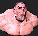
All feedback on modelling and topology would be appreciated user added image

Attached Thumbnails

Last edited by dustykhan; 14-08-2013 at 01:55 PM.
# 2 19-08-2013 , 11:09 PM
dustykhan's Avatar
Subscriber
Join Date: Apr 2012
Posts: 187
Started on the UV's. Not sure on the best way to do the top of the head though...

Attached Thumbnails
# 3 20-08-2013 , 12:33 AM
Juanpax's Avatar
Having Fun!!!!
Join Date: May 2012
Location: Puerto Rico
Posts: 157
Looking Nice Mate!!! I'm in to low poly right know too. I will post as soon as I have something worth watching user added image Take care and keep it up.user added image

# 4 20-08-2013 , 03:21 PM
Events Team at Wargaming.net
Join Date: Dec 2008
Location: Crystal Lake, Illinois
Posts: 486
For uving the head it would be the same process as a high poly. Search head uv maps, will give you a good idea of how to lay it out

# 5 29-08-2013 , 08:55 PM
dustykhan's Avatar
Subscriber
Join Date: Apr 2012
Posts: 187
Cheers Juanpax, coming along whenever I find time to work on it!

Right after taking Ozgalis tip and just looking at how others UV characters, it realy helped. I am calling the UVs done for now. Moving on to the texuring. There are a couple of areas on the texture that could be refined such as the forehead, but it is good enough for now.

Attached Thumbnails
# 6 02-09-2013 , 09:48 PM
dustykhan's Avatar
Subscriber
Join Date: Apr 2012
Posts: 187
Ok Texture and lighting test.
Texture still needs work on, any help or tips would be appreciated user added image

Attached Thumbnails
# 7 13-09-2013 , 12:54 AM
Juanpax's Avatar
Having Fun!!!!
Join Date: May 2012
Location: Puerto Rico
Posts: 157
Looking good so far!! are you using smooth preview? if you do, My first recommendation is not to used it since you want it low poly.

# 8 13-09-2013 , 08:56 AM
Nilla's Avatar
Administrator
Join Date: Jun 2009
Location: Prague
Posts: 827
Wicked character. I reckon you should give him a Hawaii shirt to liven him up a bit and get some color boost user added image

# 9 14-09-2013 , 04:27 AM
NextDesign's Avatar
Technical Director
Join Date: Feb 2004
Posts: 2,988
The texture needs some work. It's clearly tiled, lacks any kind of tonal differences, and there is no sign of wear and tear on the surface. For example, there's no color change for the inside of the mouth, or even around the eyes. Grunge him up a bit!


Imagination is more important than knowledge.
# 10 16-09-2013 , 07:47 AM
silkroadgame's Avatar
Registered User
Join Date: May 2013
Location: Room 801, Building A, Ying Da Li Tech Digital Park, Fu Tian free trade zone, Shenzhen, China
Posts: 61
Well,not so good,but not so bad as a test work.
UVs need to update.

# 11 17-09-2013 , 09:22 PM
dustykhan's Avatar
Subscriber
Join Date: Apr 2012
Posts: 187
Thanks for the responses. I am using smooth preview currently as I am not too fussed about keeping the model super low poly. In regards to giving the character a colour boost I have added a 'nice' bright background to give it a it more interest, though the Hawaiian shirt does sound pretty cool, I think I might leave it for this project depending on how much time I have.

I have now hand painted a new diffuse texture, keeping in mind the grunge element NextDesign mentioned especially on the jeans, but could realy do with a few pointers on the skin texture as this is where I am having troubles getting it to look right. I still need to create the bump and specular for this model also to really brink it to life.

silkroadgame can you be more specific about how I should ho about updating my UVs. They have changed slightly from the screenshot above, but I still feel that I have a few layout issues.

Attached Thumbnails
# 12 17-09-2013 , 11:14 PM
tweetytunes's Avatar
Subscriber
Join Date: Jan 2004
Location: Bolton - UK
Posts: 2,457
I like him - For a simple cartoon character there is a lot of charm.

New background helps a lot.

I also think the shirt would be a good idea as his chest does look bare though.

And the UV`s look fine to me, only thing I would have done differently is maybe placed all the flesh colour parts together, moving the shoe parts together to have made the painting a bit easy on yourself.


# 13 18-09-2013 , 08:43 AM
MrYeti's Avatar
Lifetime Member
Join Date: Feb 2013
Location: Down Under
Posts: 245
Hi dustykhan, I'm liking the look of this guy (does he have a name?user added image).

If you want to add a bit of texture to the skin you could try adding a bit of noise in photoshop. Also just above the pants is a ridge in the tummy, I'd add those UVs to the pants instead.


Cheers, the Yeti.
# 14 21-09-2013 , 04:51 PM
dustykhan's Avatar
Subscriber
Join Date: Apr 2012
Posts: 187
Yes I really should have arranged the UVs a liitle better rather then just use the auto layout, but it works for now! The guys name is Donny. So here is a small update...

Attached Thumbnails
# 15 25-09-2013 , 12:21 PM
dustykhan's Avatar
Subscriber
Join Date: Apr 2012
Posts: 187
Now with bump and specular!

Attached Thumbnails
Posting Rules Forum Rules
You may not post new threads | You may not post replies | You may not post attachments | You may not edit your posts | BB code is On | Smilies are On | [IMG] code is On | HTML code is Off

Similar Threads