Maya 2020 fundamentals - modelling the real world
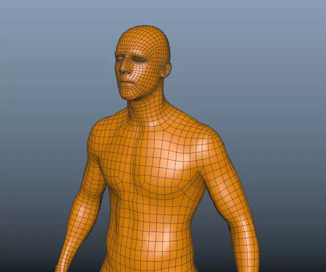
Get halfway through a model and find it's an unworkable mess? Can't add edge loops where you need them? Can't subdivide a mesh properly? If any of this sounds familiar check this course out.
#
46
22-07-2006
, 05:00 PM
I ended up using nurbs to build the outer wall. I then converted it to polygons and built the rest of the room.
Aside from a couple of early experiments, I don't have too much experience with nurbs, so I really need to do a decent nurbs tutorial as it seems like they are much better suited to non-organic stuff.
#
47
24-07-2006
, 01:48 PM
When I first used maya I did everything in NURBS but i've moved away from them now (dont know why, just have), I generally use them now for creating a basic shape of what I want to model, then convert to polys.
cant wait to see your job textrued, whats the colour scheme going to be?? wild colours, furturistic chromes and whites or you keeping it under wraps??
#
48
24-07-2006
, 10:12 PM
 I have had a few ideas for textures, but nothing definate yet. It probably won't be too wild, but we will see. I am hoping to go out and take some photographs in the next few days.
 My first few attempts at nurbs were very painful, but I think I am beginning to see how they work now. They seem really useful to know. I'll take a look at that car tutorial.
I have been working on another one of the rooms and also trying to sort out the scale of everything. Nothing too interesting to post at the moment.
#
49
25-07-2006
, 01:30 AM
Registered User
Join Date: Jun 2002
Join Date: Jun 2002
Posts: 74
#
50
27-07-2006
, 06:33 PM
Here is the latest picture of the main structure - I realised that I didn't have enough rooms, so as you can see, I have changed the design a bit and have added another level. I have been having a bit of a nightmare with the modeling, partly because I let lack of sleep drunk me have a look at my model and partly because I haven't really made something like this before.
#
51
27-07-2006
, 06:39 PM
#
52
27-07-2006
, 07:26 PM
Any advice? I think I am just going to keep going, but I am wondering what is the better way of doing this.
#
53
27-07-2006
, 07:47 PM
I think this is great, it reminds me of that Roto-Stack stuff you can get for small rodents only it's people sized!! Where's the running wheel?!?
Take it easy,,
Mat.
edit:
I just read your previous post (instead of just looking at the pretty pictures!) and my thoughts are.... it's up to you. Consider that you may have to texture it at some point will you find it easier to texture the model as a whole or in seperate parts? Also if you want to change any aspect of it before it's finished how easy will that be if it's all joined together? Think Roto-Stack (for people!!!).
Mat

Last edited by happymat27; 27-07-2006 at 07:51 PM.
#
54
27-07-2006
, 07:52 PM
#
55
27-07-2006
, 07:55 PM
 - Now I am wondering if I should just rebuild... hmmm...
#
56
27-07-2006
, 09:18 PM
either way, it's coming along quite nicely

Accept no substitutions.
#
57
28-07-2006
, 10:21 AM

I dont know whether you've seen the bank adverts with the guinea pigs acting like humans but you could do the same with some hamsters in your house

Its coming on nice arran, especially with the detail inside. I maybe wouldn't put too much detail on the inside if you're not going to see it in the final render though. Then again a final piece with an outside view and a few inside pics could look good.
Examples of bTraffic - a traffic animation tool for Maya
bFlocking - a tool for Maya 8.5+ to generate flocking and swarming behaviours
Jan/Feb Challenge 2007 Entry and W.I.P
May/Jun Challenge 2006 Entry and W.I.P
Mar/Apr Challenge 2006 Entry and W.I.P
Jan/Feb Challenge 2006 Entry and W.I.P
Nov/Dec Challenge 2005 Entry and W.I.P
Sep/Oct Challenge 2005 Entry and W.I.P
Jul/Aug Challenge 2005 Entry
www.flash-fx.net
#
58
02-08-2006
, 04:31 AM
I have actually been having a few problems with my view panels which have been going blank in the side view and in the top and front views the objects have been disappearing when I select them. I thought that it might be a problem with my video card, as it sounds like a similar problem that others have had, but then I noticed it was only happening on this project. I ended up fixing it by creating new view panels for the time being, though I am still not sure what is going on.
So I ended up remodelling the corridors that connect the rooms to the elevator and I think that it is working a lot better. I also reworked the elevator entrance, added some supports below the main dome, finished the kitchen and added a few other details here and there. I think that I have pretty much finished doing most of the modelling on the house. I might add a few more pieces to the interiors, but I think that it is definitely time to move on to texturing.
Last edited by arran; 02-08-2006 at 04:47 AM.
#
59
02-08-2006
, 04:34 AM
#
60
02-08-2006
, 04:38 AM
Posting Rules Forum Rules
Similar Threads
July/August - norm - THX1138
by THX1138 in forum Previous Challenges (Archives) replies 53 on 06-09-2006
July/August - norm - happymat27
by happymat27 in forum Previous Challenges (Archives) replies 107 on 28-08-2006
July/August - norm - aZriel
by aZriel in forum Previous Challenges (Archives) replies 37 on 12-08-2006
July/August - norm - T1ckl35
by t1ck135 in forum Previous Challenges (Archives) replies 48 on 29-07-2006
july/august - norm - falott
by Falott in forum Previous Challenges (Archives) replies 0 on 01-07-2006
Topics
New tutorial - Create tileable textures from photos. Photoshop to Alchemist to Maya 2
By David
Site News & Announcements
5
Free Courses
Full Courses
VFX News
How computer animation was used 30 years ago to make a Roger Rabbit short
On 2022-07-18 14:30:13
Sneak peek at Houdini 19.5
On 2022-07-18 14:17:59
VFX Breakdown The Man Who Fell To Earth
On 2022-07-15 13:14:36
Resident Evil - Teaser Trailer
On 2022-05-13 13:52:25
New cloud modeling nodes for Bifrost
On 2022-05-02 20:24:13
MPC Showreel 2022
On 2022-04-13 16:02:13


