Introduction to Maya - Modeling Fundamentals Vol 1
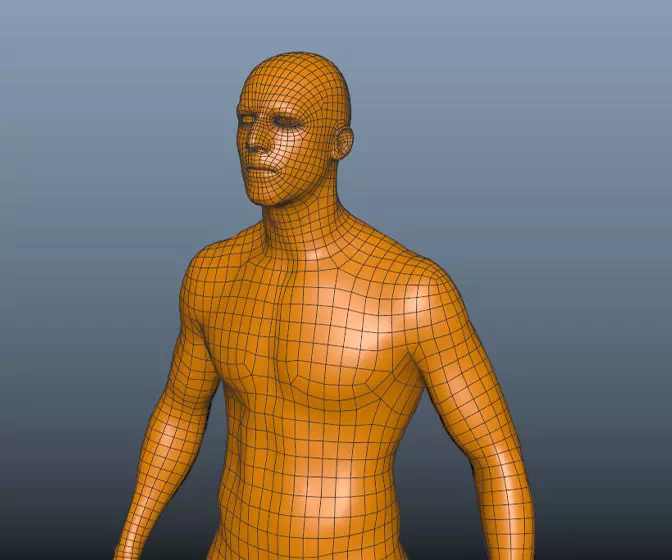
This course will look at the fundamentals of modeling in Maya with an emphasis on creating good topology. We'll look at what makes a good model in Maya and why objects are modeled in the way they are.
#
16
04-08-2003
, 07:33 PM

Björn 'santa' Fredriksson
<A href=https://www.bjornfredriksson.com>Site Online.</A>
Check out our 1on1on1 battle for the SandCrawlers.
#
17
04-08-2003
, 08:07 PM
#
18
04-08-2003
, 08:29 PM
#
19
04-08-2003
, 08:39 PM
 and I may have to make that curly wire a bit larger so it doesn't get lost or reposition it somewhere with a kinder background.
#
20
05-08-2003
, 03:29 PM

I'm not 100% on the wall texture. Is that a temporary one? it seems to uniform to be from the medieval times

Alan
#
21
05-08-2003
, 07:15 PM

Unfortunately, I'm moving this weekend so this is the last post for about 2 weeks (or until I get internet service at the gaining base). I will keep WIP pics and may make a mass posting when I get back online.
Some changes made last night, but no time to take screenies
 , moved some things around, larger curly wires so they could be seen better, new legs on the table, second table with more stuff, among others.
Thanks for all suggestions.
#
22
05-08-2003
, 10:14 PM
#
23
06-08-2003
, 03:54 AM
Registered User
Join Date: Aug 2003
Join Date: Aug 2003
Location: Australia
Posts: 264

#
24
06-08-2003
, 10:36 AM
the advice i can give you is that you should mess the place...it looks too clean and orgenized....
but it looks really good!!
- TwEeK
#
25
20-08-2003
, 01:12 AM
 Great.... ( Scraggy cries into hands..)
#
26
23-08-2003
, 05:54 PM

#
27
23-08-2003
, 06:00 PM
#
28
23-08-2003
, 06:19 PM
 very nice bit of work :thumbsup:
#
29
23-08-2003
, 06:21 PM
There is some friggin athmopshere....perfect. The image scares me a bit. :O :O ahhhhhhhhhh....looks like some ghosts live there.
you have enough talent to join as normal next time.

#
30
23-08-2003
, 11:18 PM
Keep it up!

Björn 'santa' Fredriksson
<A href=https://www.bjornfredriksson.com>Site Online.</A>
Check out our 1on1on1 battle for the SandCrawlers.
Posting Rules Forum Rules
Similar Threads
August Challenge - ^^TwEeK^^ - Noobie
by ^^TwEeK^^ in forum Previous Challenges (Archives) replies 100 on 01-09-2003
August Challenge - 3Demon - Noobie
by 3Demon in forum Previous Challenges (Archives) replies 46 on 31-08-2003
August Challenge - Imperator - Noobie
by Imperator in forum Previous Challenges (Archives) replies 1 on 11-08-2003
August Challenge - DrKnow - Noobie
by drknow in forum Previous Challenges (Archives) replies 24 on 08-08-2003
August Challenge - Orgee - Noobie
by orgeeizm in forum Previous Challenges (Archives) replies 5 on 08-08-2003
Topics
Free Courses
Full Courses
VFX News
How computer animation was used 30 years ago to make a Roger Rabbit short
On 2022-07-18 14:30:13
Sneak peek at Houdini 19.5
On 2022-07-18 14:17:59
VFX Breakdown The Man Who Fell To Earth
On 2022-07-15 13:14:36
Resident Evil - Teaser Trailer
On 2022-05-13 13:52:25
New cloud modeling nodes for Bifrost
On 2022-05-02 20:24:13
MPC Showreel 2022
On 2022-04-13 16:02:13


![[icarus_uk]'s Avatar](image.php?u=7129&dateline=1054840783)


