Introduction to Maya - Modeling Fundamentals Vol 1
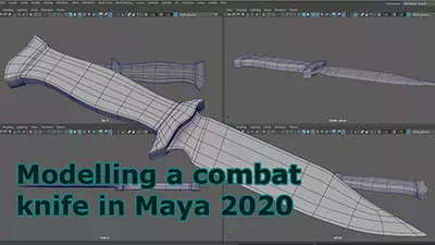
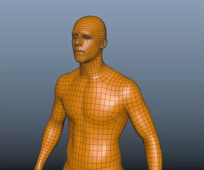
This course will look at the fundamentals of modeling in Maya with an emphasis on creating good topology. We'll look at what makes a good model in Maya and why objects are modeled in the way they are.
#
1
27-02-2003
, 07:16 PM
My Website
https://www.climaax.com
#
2
27-02-2003
, 09:47 PM

I like the colours.
gimme everything u got
#
3
28-02-2003
, 01:30 AM
Or will you be using css/css-p to make all of your background colors?
Just wondering

#
4
28-02-2003
, 05:47 AM
#
5
28-02-2003
, 05:52 AM
 . This way your website would look correct on every resolution.. and would be better that way
  . Other than that i would have to see it complete to give more feedback.. but good start so far
  .
.BTW.. the look of a site is HUGE for myself.. if its a personal portofilo that is.. but simplicity and speed are even bigger than that! So, your rollovers may be a bit too much, and the text used for the dates and whatnot, really arent needed.. you can use verdena at size 2 or 1 for that instead
 . Think about the 56 k'ers. Cya.
"I should call you sugar maple tree cause i'd totally tap that" haha
email - mattwettstein@gmail.com
Posting Rules Forum Rules
Similar Threads
New 3D Tutorial Website In Development
by keithd203 in forum Maya Basics & Newbie Lounge replies 9 on 21-01-2009
Perfecto's Website
by Perfecto in forum Maya Basics & Newbie Lounge replies 9 on 24-06-2007
Website UP!!! (BETA - Big time) -- feedback
by tariqrf in forum Maya Basics & Newbie Lounge replies 4 on 27-04-2005
Need a website for a shader please.
by davis_drawings in forum SimplyMaya Tutorials replies 4 on 24-04-2005
Website Help
by painterdan in forum Maya Basics & Newbie Lounge replies 17 on 20-04-2004
Topics
Free Courses
Full Courses
VFX News
How computer animation was used 30 years ago to make a Roger Rabbit short
On 2022-07-18 14:30:13
Sneak peek at Houdini 19.5
On 2022-07-18 14:17:59
VFX Breakdown The Man Who Fell To Earth
On 2022-07-15 13:14:36
Resident Evil - Teaser Trailer
On 2022-05-13 13:52:25
New cloud modeling nodes for Bifrost
On 2022-05-02 20:24:13
MPC Showreel 2022
On 2022-04-13 16:02:13


