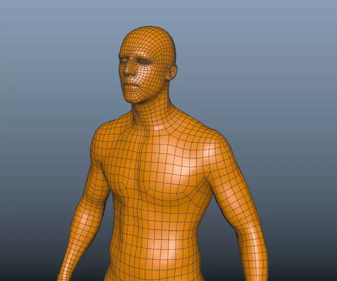
Maya 2020 fundamentals - modelling the real world
Get halfway through a model and find it's an unworkable mess? Can't add edge loops where you need them? Can't subdivide a mesh properly? If any of this sounds familiar check this course out.
#
76
25-05-2007
, 02:09 PM
Love the shape and look of the sword apart from the letters on the blade- they look too big or too deep can`t quite put my finger on it.

#
77
25-05-2007
, 03:57 PM
#
78
25-05-2007
, 06:18 PM
If you've got time, and if you havn't already, you should check out subsurface scattering. I hear it's great for skin.
Don't be satisfied with what you can do but rather strive to do the things you can't do!
Exceed Expectations!
#
79
25-05-2007
, 11:56 PM

Are you up for a challenge Sandman? Add wear and tear to the armor (still within the cartoon realm of the original design). I'm thinking more a field knight that puts his stuff to good use hehe. Not too much. I love how solid and inpenetratable that armor looks. I'd wear that to Rugby on Sunday haha.
I know it's not a rigging and posing challenge but may I offer you an anatomy trick? Knees, shoulders and elbows are just pivots. It's the pelvis (hipbones) that drives all motion. The hips and most importantly the Nose knows where the weight is. If you can imagine that, your characters will have strong, balanced poses.
Last edited by AlphaFlyte; 25-05-2007 at 11:58 PM.
#
80
29-05-2007
, 02:52 PM
also, not sure about his groin target either...
Last edited by arran; 29-05-2007 at 03:00 PM.
#
81
30-05-2007
, 01:15 AM
AlphaFlyte, If I had another month to work on it... It could be done.
Perfecto I'm glad I could inspire. I'm always looking at what other people do to get myself psyked up to create.
Here's what I did today (my back yard).
#
82
30-05-2007
, 12:39 PM
Gr8 work on the medevil guy tho

Chris (formerly R@nSiD)
When the power of love overcomes the love of power the world will truely know peace - Jimmy Hendrix
 Winner SM VFX Challenge 1
 3rd Place SM SteamPunk Challenge (May 2007)
#
83
30-05-2007
, 05:38 PM
So kudos for that

https://i.ivillage.com/DF/103105/snac..._Kudos_366.jpg

#
84
30-05-2007
, 09:08 PM
I'm glad you like him.
severinianthony, I started out thinking all silver, then I tried the gold and it just looked better, I actually thought of making the chain gold too but Then I thought that gold chainmail is really just impractical. gold is too soft an heavy (not to mention expensive)to make the chain solid, and plating would look ugly very quickly. On the other hand I was trying to keep it as simple as possible while giving the appearance of complexity. On the third hand (if your keeping track), I found from experience that if you have too much gold it stops looking like gold.
Posting Rules Forum Rules
Similar Threads
Hardware texturing problem...
by DeirdreDarling in forum Maya Materials & Textures replies 2 on 05-07-2012
Preparing a model before texturing...
by goggles in forum Maya Basics & Newbie Lounge replies 7 on 09-09-2011
Getting good in texturing
by chameleon101 in forum Maya Basics & Newbie Lounge replies 3 on 11-08-2011
maya texturing - whole process greatly confusing
by n88tr in forum Maya Materials & Textures replies 11 on 09-06-2010
Texturing without Photoshop?
by Classical in forum Maya Basics & Newbie Lounge replies 2 on 14-11-2007
Topics
Free Courses
Full Courses
VFX News
How computer animation was used 30 years ago to make a Roger Rabbit short
On 2022-07-18 14:30:13
Sneak peek at Houdini 19.5
On 2022-07-18 14:17:59
VFX Breakdown The Man Who Fell To Earth
On 2022-07-15 13:14:36
Resident Evil - Teaser Trailer
On 2022-05-13 13:52:25
New cloud modeling nodes for Bifrost
On 2022-05-02 20:24:13
MPC Showreel 2022
On 2022-04-13 16:02:13

