Maya for 3D Printing - Rapid Prototyping
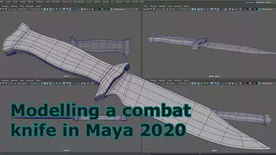
In this course we're going to look at something a little different, creating technically accurate 3D printed parts.
#
46
27-04-2007
, 01:24 PM
Sparticus
Expect to excell...
#
47
27-04-2007
, 01:33 PM

I've been going through tons of websites and a backlog of 3D world cd's for reference textures since Jay mentioned about the free ones on the latest edition. Its time consuming going through over 20 cd's I can tell ya!
I'm also on with making a game in virtools for a project so progress on this scene will come and go over the next couple of weeks.
Si
Examples of bTraffic - a traffic animation tool for Maya
bFlocking - a tool for Maya 8.5+ to generate flocking and swarming behaviours
Jan/Feb Challenge 2007 Entry and W.I.P
May/Jun Challenge 2006 Entry and W.I.P
Mar/Apr Challenge 2006 Entry and W.I.P
Jan/Feb Challenge 2006 Entry and W.I.P
Nov/Dec Challenge 2005 Entry and W.I.P
Sep/Oct Challenge 2005 Entry and W.I.P
Jul/Aug Challenge 2005 Entry
www.flash-fx.net
#
48
28-04-2007
, 02:41 AM

Here's another update adding some other textures in. Somre are unfinished but I'm aiming to get all the textures in and then concentrate on hand painting it up to a decent level. There will be text overlaid along the top and some text/icons along the bottom (on bands of light areas) so I might not get to do the vehicles till a later time. The sky still hasnt been added back in.
Si

Examples of bTraffic - a traffic animation tool for Maya
bFlocking - a tool for Maya 8.5+ to generate flocking and swarming behaviours
Jan/Feb Challenge 2007 Entry and W.I.P
May/Jun Challenge 2006 Entry and W.I.P
Mar/Apr Challenge 2006 Entry and W.I.P
Jan/Feb Challenge 2006 Entry and W.I.P
Nov/Dec Challenge 2005 Entry and W.I.P
Sep/Oct Challenge 2005 Entry and W.I.P
Jul/Aug Challenge 2005 Entry
www.flash-fx.net
#
49
30-04-2007
, 05:00 AM

Text will be overlaid along the top and bottom and so a few bits will be obscured (like the front right textures on the round building.
The sky color is bluer as well but I cant find where I put the layer (d'oh)

Si

Examples of bTraffic - a traffic animation tool for Maya
bFlocking - a tool for Maya 8.5+ to generate flocking and swarming behaviours
Jan/Feb Challenge 2007 Entry and W.I.P
May/Jun Challenge 2006 Entry and W.I.P
Mar/Apr Challenge 2006 Entry and W.I.P
Jan/Feb Challenge 2006 Entry and W.I.P
Nov/Dec Challenge 2005 Entry and W.I.P
Sep/Oct Challenge 2005 Entry and W.I.P
Jul/Aug Challenge 2005 Entry
www.flash-fx.net
#
50
30-04-2007
, 06:39 AM
KUTGW
Dave.
#
51
30-04-2007
, 03:27 PM
good progress Si. Which university are you studying at now?
Mat.
#
52
30-04-2007
, 03:45 PM
Good progress mate, a small suggestion, this harks back to my days when doing 2d art (Im reminising whilst smoking his pipe in a rocking chair) : make the foreground buildings darker, then adjust the mid section slightly less and so on until the background is the brightest part of the image. This will add even more depth and scale and also contrast.
Get those cars done LOL too!!
Best
Jay
#
53
30-04-2007
, 09:43 PM

Cheers Mat, I'm at Leeds Met doing Creative Technology (3D mainly with some photoshop thrown in). I think you said you were at Bradford weren't you? I very nearly was there this year but changed my mind at the last minute (job related).
Cheers Jay, thanks for the tip - I've been playing with that technique today and it does help. Eee, these old grandpa's in their rocking chairs can still teach us young whippersnappers a thing or two

For this hand-in I'm probably going to omit any detailed cars and just motion blur some elements in there. In the future when I revisit this (and do a far better job) I think some uber cool futuristic vehicles will be the order of the day!
Cheers

Si

and a reversed black and white which I do quite a bit when working things up (or used to do many years ago):

Examples of bTraffic - a traffic animation tool for Maya
bFlocking - a tool for Maya 8.5+ to generate flocking and swarming behaviours
Jan/Feb Challenge 2007 Entry and W.I.P
May/Jun Challenge 2006 Entry and W.I.P
Mar/Apr Challenge 2006 Entry and W.I.P
Jan/Feb Challenge 2006 Entry and W.I.P
Nov/Dec Challenge 2005 Entry and W.I.P
Sep/Oct Challenge 2005 Entry and W.I.P
Jul/Aug Challenge 2005 Entry
www.flash-fx.net
Last edited by t1ck135; 30-04-2007 at 09:49 PM.
#
54
07-05-2007
, 01:55 PM

I think it will kick start some more attempts at futuristic scenes soon.
cheers for the help and advice Jay and Steve

Si

Examples of bTraffic - a traffic animation tool for Maya
bFlocking - a tool for Maya 8.5+ to generate flocking and swarming behaviours
Jan/Feb Challenge 2007 Entry and W.I.P
May/Jun Challenge 2006 Entry and W.I.P
Mar/Apr Challenge 2006 Entry and W.I.P
Jan/Feb Challenge 2006 Entry and W.I.P
Nov/Dec Challenge 2005 Entry and W.I.P
Sep/Oct Challenge 2005 Entry and W.I.P
Jul/Aug Challenge 2005 Entry
www.flash-fx.net
#
55
07-05-2007
, 09:19 PM

#
56
07-05-2007
, 10:02 PM

Examples of bTraffic - a traffic animation tool for Maya
bFlocking - a tool for Maya 8.5+ to generate flocking and swarming behaviours
Jan/Feb Challenge 2007 Entry and W.I.P
May/Jun Challenge 2006 Entry and W.I.P
Mar/Apr Challenge 2006 Entry and W.I.P
Jan/Feb Challenge 2006 Entry and W.I.P
Nov/Dec Challenge 2005 Entry and W.I.P
Sep/Oct Challenge 2005 Entry and W.I.P
Jul/Aug Challenge 2005 Entry
www.flash-fx.net
#
57
07-05-2007
, 10:22 PM
A good learning curve for sure. At least you have the option to go back and do even more if you want. If I had the time I would have love to have helped, another time maybe...
All the best
Jay
#
58
07-05-2007
, 11:09 PM
matte painting is something that I mean to have a go at one day, you've done a great job there. Like Jay said, you can always go back and do a bit more if you wanted.
Flipping images is something that I used to do aswell (when I could be bothered to put pencil to paper!!) I found that it lets you see the picture in a new light.
Later,
Mat.
#
59
08-05-2007
, 08:56 AM

if you do decide to make more, it might be nice to have some clean futuristic city scenes and some that are more dirty and messed up, with billboards and signs and smoke - sort of a contrast between utopia and distopia. just an idea.

#
60
08-05-2007
, 06:42 PM

Jay - yeah definitely, I think modelling the very foreground buildings would be a good exercise as well as adding in more detail. I understand on lack of time, especially with your Outlaws launch - hope it goes well

Mat - yeah the matte painting part was fun but made me realise how long ago it was since I'd done any perpective pictures! You're right about the flipping of pictures - I did it last thing at night for a quick look and then the next day started working on the flipped version before eventually flipping it back. It's good to see where the eye is drawn and to spot those ever present bad areas

arran - good idea on the contrasting styles - maybe make the same scenes all polished and shiny and then redo them as if there has been a war and everything has gone to ruin

I've got some 3D stuff for a game that I might put up soon, some 2D pictures and will be starting working on my final project (9 months at it) so plenty more threads will be coming this way

Si
Examples of bTraffic - a traffic animation tool for Maya
bFlocking - a tool for Maya 8.5+ to generate flocking and swarming behaviours
Jan/Feb Challenge 2007 Entry and W.I.P
May/Jun Challenge 2006 Entry and W.I.P
Mar/Apr Challenge 2006 Entry and W.I.P
Jan/Feb Challenge 2006 Entry and W.I.P
Nov/Dec Challenge 2005 Entry and W.I.P
Sep/Oct Challenge 2005 Entry and W.I.P
Jul/Aug Challenge 2005 Entry
www.flash-fx.net
Posting Rules Forum Rules
Similar Threads
trouble opening maya scene
by jooleyinboots in forum Maya Technical Issues replies 3 on 07-10-2022
Virtual City Scape Competition - Street Scene
by Henhrig666 in forum Previous Challenges (Archives) replies 8 on 26-02-2009
Referencing Problem: Child Nodes misplaced on reloading of Parent Scene
by shekibobo in forum Maya Technical Issues replies 1 on 20-05-2008
futuristic city in jungle
by metalrahul in forum Work In Progress replies 2 on 20-04-2006
Futuristic City - 3D Matte Painting
by kbrown in forum Work In Progress replies 14 on 07-01-2006
Topics
New tutorial - Create tileable textures from photos. Photoshop to Alchemist to Maya 2
By David
Site News & Announcements
5
Free Courses
Full Courses
VFX News
How computer animation was used 30 years ago to make a Roger Rabbit short
On 2022-07-18 14:30:13
Sneak peek at Houdini 19.5
On 2022-07-18 14:17:59
VFX Breakdown The Man Who Fell To Earth
On 2022-07-15 13:14:36
Resident Evil - Teaser Trailer
On 2022-05-13 13:52:25
New cloud modeling nodes for Bifrost
On 2022-05-02 20:24:13
MPC Showreel 2022
On 2022-04-13 16:02:13


