Introduction to Maya - Modeling Fundamentals Vol 2
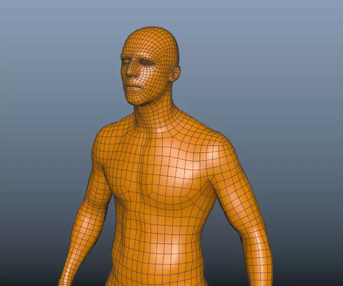
This course will look in the fundamentals of modeling in Maya with an emphasis on creating good topology. It's aimed at people that have some modeling experience in Maya but are having trouble with
complex objects.
#
76
05-08-2006
, 10:15 AM
as i said, i tossed up about mashing your piece (im hopeless in PS) and thought that this would give you the option to make a firm desicion about the grass and what not.
i hope you are not too possessive of your work, its like i write a peice for a film and it comes back as a jigsaw puzzle, i know some get upset but i really dont mind, it was in the pleasure of doing it rather than the exhibition.
i think you may be th same and enjoy the process. i
take it easy and life will be easy
#
77
05-08-2006
, 12:57 PM
Update time.....
The tree is no longer a 3d model instead I've made a shader from an image that I made in Photoshop. It seemed the right thing to do as it's pretty much silhouetted anyway, why use 3000 polys when 1 will do?
Here's how it looks, cheers,
Mat.
#
78
05-08-2006
, 08:01 PM

#
79
05-08-2006
, 08:20 PM
there's no need to fret about the camera angle, I just framed that section to illustrate the new tree. All will be back to normal for the next one.
Take it easy,
Mat.
#
80
05-08-2006
, 08:48 PM
#
81
08-08-2006
, 01:30 PM
I think I'm just about done with this, it's got to the point where I'm having trouble seeing the picture because I've looked at it for too long! I took a couple of days off from it to clear my head but I still can't seem to see it.
There are a couple of small touches that I need to put into it before I submit it but that's about it. I've had a play with it in photoshop to get an idea of how to dirty it up a bit, tell me what you think.
I'll get the final bits done and sort out a couple of high res renders to submit. How does submition work, does Mike start a new thread to post final pieces on?
Cheers,
Mat.
#
82
08-08-2006
, 01:53 PM
Also, there's not a good sense of depth to the image. The water spout almost looks like it's 2 stories tall next to the trailers, for example, haha.
 Obviously that's not the intent, but perhaps play with depth of field and camera lens settings.
#
83
08-08-2006
, 02:50 PM
I knew that there was something that I was meant to do, D'OF! I'll have a play with that now, cheers for the suggestion about the lighting too, even though the HDRI isn't emmiting light it still washes the whole stage with reds and oranges. I've tried to break that up using the blue/green tinge to the mist and a pale blue light at the front of the scene. I'll have a bit more of a mess before I give in.
Cheers,
Mat.
Oh yeah, how does submitting the finished piece work?
#
84
08-08-2006
, 05:54 PM
I had a go with the Maya software DOF which has nice easy to understand controls. However, as I'm rendering in mentalray I needed to use the less than intuative DOF lens shader. After much messing around I have come up with this. Does anyone know why the main lights (2 area lights with quadratic drop off) have been affected so much?
Cheers for your thoughts,
Mat
#
85
12-08-2006
, 12:45 PM
I decided to put a small living thing in the scene and plumped for a lizard. He's not based on any living lizard but I figured that would be ok as long as the basic shape is there. I've rigged him very simply so that I he's posable for the scene.
Cheers for your thoughts,
Mat.
#
86
12-08-2006
, 12:50 PM
I've pretty much finished this now, I've got a few bits and bobs to do in photoshop but overall I'm happy with the scene.
My next image will be the finished article.
Thanks again for your thoughts,
Mat
#
87
13-08-2006
, 01:36 AM


#
88
14-08-2006
, 07:35 PM
 .
.I have finally got round to installing my scanner software to my new computer so, as I've now completed my picture, I thought I'd share a couple of my idea sketches.
You'll have to excuse the scrappiness of them, they were initially meant for my eyes only!!
This first one is what eventually became the finished piece with..... ahem.... a few minor alterations. It's meant to show how rough some poeople have it in comparison to us with our running water.
#
89
14-08-2006
, 07:37 PM
I guess I sort of used a mish-mash both ideas in my final piece which will be posted when the thread is available.
Cheers,
Mat
#
90
14-08-2006
, 11:39 PM
spectacular mate. waiting for the finished result.
take it easy and life will be easy
Posting Rules Forum Rules
Similar Threads
July/August Norm Gster123
by gster123 in forum Previous Challenges (Archives) replies 29 on 02-08-2006
July/August - norm - T1ckl35
by t1ck135 in forum Previous Challenges (Archives) replies 48 on 29-07-2006
July/August - Norm - Jsprogg
by jsprogg in forum Previous Challenges (Archives) replies 7 on 08-07-2006
July/August - Norm - 13uRneR
by 13uRneR in forum Previous Challenges (Archives) replies 2 on 03-07-2006
july/august - norm - falott
by Falott in forum Previous Challenges (Archives) replies 0 on 01-07-2006
Topics
New tutorial - Create tileable textures from photos. Photoshop to Alchemist to Maya 2
By David
Site News & Announcements
5
Free Courses
Full Courses
VFX News
How computer animation was used 30 years ago to make a Roger Rabbit short
On 2022-07-18 14:30:13
Sneak peek at Houdini 19.5
On 2022-07-18 14:17:59
VFX Breakdown The Man Who Fell To Earth
On 2022-07-15 13:14:36
Resident Evil - Teaser Trailer
On 2022-05-13 13:52:25
New cloud modeling nodes for Bifrost
On 2022-05-02 20:24:13
MPC Showreel 2022
On 2022-04-13 16:02:13


