Introduction to Maya - Modeling Fundamentals Vol 1
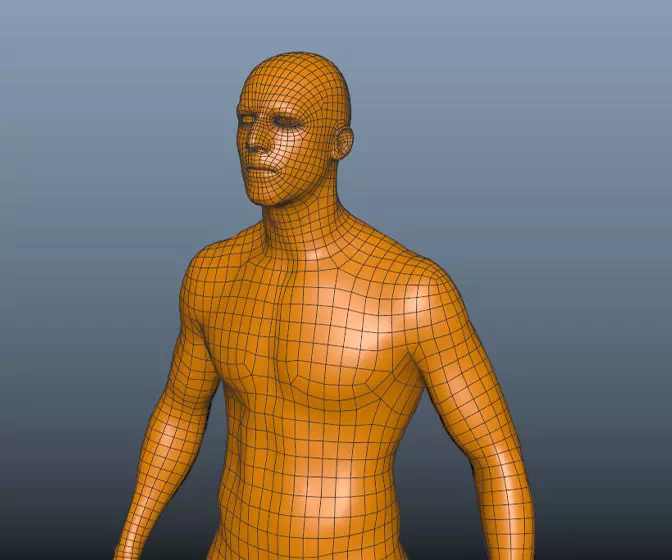
This course will look at the fundamentals of modeling in Maya with an emphasis on creating good topology. We'll look at what makes a good model in Maya and why objects are modeled in the way they are.
#
1
24-05-2003
, 04:09 PM
A photoshop shading exercise
[list=1][*]Let me know what you think[*]Give her a name[/list=1]
Today man, tomorrow bird...i already have the plumage
#
2
24-05-2003
, 04:12 PM
Today man, tomorrow bird...i already have the plumage
#
3
24-05-2003
, 05:56 PM
"The nutmeg is the epitome of nuts"
#
4
24-05-2003
, 07:39 PM
#
5
24-05-2003
, 09:02 PM
#
6
24-05-2003
, 10:40 PM
How bout Sarah.
how did you do it? Ias it many a layers or just a simple Filter?
- Matt
#
7
25-05-2003
, 07:48 AM
Of course i had a photo for reference, and yes it was all done in photoshop (8 hours) with a f*****g graphic tablet that worked half the time ...
I made a custom brush for the hair ('t was very handful for the glossiness of the hair)
For the method, if you understand french :
https://forum2d.free.fr/concours/tut_beart/beart.html
That's ok for Sarah
Today man, tomorrow bird...i already have the plumage
#
8
25-05-2003
, 07:54 AM

adldesigner
Caracas, Venezuela
Hell .. not gone perse, but with a certainly lower post count per day.

#
9
25-05-2003
, 08:03 AM
Many times i had to reevaluate the tone scale to match the photo.
Today man, tomorrow bird...i already have the plumage
#
10
25-05-2003
, 02:05 PM
I'm not for sure if you would like a more indepth critique, but if you do, I'd be more than happy to help you out with a few things.
Good job though!
#
11
25-05-2003
, 05:12 PM
Today man, tomorrow bird...i already have the plumage
#
12
25-05-2003
, 07:14 PM

Now, on to the critique. This piece looks unfinished to me. You have some great tones layed down, but now you need to clean them up a little. I won't go into detail about the facial structure looking a little loopsided, but I think you need to look at her eye placement just a bit. They are either to far apart or not big enough. But that's a small issue because she might actually look like that.

Now on to the actual things I can help you with. First things first. You need more contrast on the face. I don't know if you are trying to do a dry brush look, which is fine, but I think you need to keep you piece's consistent throughout. The fingers are blended together well, and you have a good sense of contrast there. So that's why I circled them in the blue. Now the cheeks, and chin could use more highlights. Which I show you here:


The next thing is the hair. Great value so far, and lends nicely as a base to work from. One thing to note about hair is that it flows, like water, and has a sense of volume, ie, highlights, mid tones, and shadow. One thing you are missing, besides the flow, is mid tones and strong highlights. This is actually pretty easy to do.
1. Create your shapes and form of your hair in one layer. (For example, I used your hair that you have so far as this layer)
2. Make another layer, just on top of it. Select the brush tool, and set it to change size and opacity according to the stylus pressure. Also select the brightest highlight of your hair.
3. Begin drawing your hair, and be sure to follow the forms you've already layed out, and you can make a stray hair or two for added effect.
4. Once you are satisfied with how you have layed out your hair, it will look stringy, believe me. But now, duplicate that layer. On the duplicate hair layer, go to guassion blur and soften the hair a bit. With the other hair layer underneath, you will see that it gets an amazing amount of form from so easy a task.
5. Next, lock the transparency of the layer, and select a large fuzzy brush. Pick a medium color, and set the brush to multiply. In the unblurred hair layer, begin lightly brushing the shadows of the hair to make it a little darker.


Next I would suggest softer highlights on the clothes. I don't know what your reference looks like, but your highlights just look to strong.


Overall though I like what you have so far. But like I said earlier, it just looks unfinished. I hope this helps a little.
#
13
26-05-2003
, 08:52 AM
As for the hair highlights, they need to be tuned like you did, but i won't go as far as you did just because she has dark hair, and too much highlights would mean she's blond.
In its context (the photograph), the subject is placed in front of a foliage background, and sunbeams are coming from the top and i guess from the front, that's why there's that large area of light on her cloth, and there you're right : it needs to be blurred a little up (especially the sleeve)
Thank you guy, the critique is interesting
Today man, tomorrow bird...i already have the plumage
#
14
26-05-2003
, 06:50 PM

I removed my updates, because this is your thread. If you do update your illustration any, I'd really like to see it.
Have fun.
#
15
27-05-2003
, 02:45 PM
I darkened the hair, added grain on the skin, ...

Today man, tomorrow bird...i already have the plumage
Posting Rules Forum Rules
Similar Threads
No Shaders in Photoshop from Maya
by frussell89 in forum Maya Technical Issues replies 2 on 12-03-2014
Stone Texture , How to create with Photoshop
by dubai3d in forum Maya Basics & Newbie Lounge replies 31 on 21-08-2011
maya software wont render my scene
by joemilkweed in forum Maya Technical Issues replies 1 on 30-10-2010
unusual polygon shading
by DougFisher in forum Maya Modeling replies 2 on 15-05-2007
Maya Alpha Transparancy Photoshop
by hevans in forum Maya Basics & Newbie Lounge replies 2 on 02-12-2003
Topics
Free Courses
Full Courses
VFX News
How computer animation was used 30 years ago to make a Roger Rabbit short
On 2022-07-18 14:30:13
Sneak peek at Houdini 19.5
On 2022-07-18 14:17:59
VFX Breakdown The Man Who Fell To Earth
On 2022-07-15 13:14:36
Resident Evil - Teaser Trailer
On 2022-05-13 13:52:25
New cloud modeling nodes for Bifrost
On 2022-05-02 20:24:13
MPC Showreel 2022
On 2022-04-13 16:02:13
