Beer glass scene creation
This course contains a little bit of everything with modeling, UVing, texturing and dynamics in Maya, as well as compositing multilayered EXR's in Photoshop.
#
151
30-05-2012
, 03:16 PM
Edge flow or unwrapping?
What is your suggestion on making the hair? I didnt detail the naked body on lower body, so i thought it would be useless to get the head retopped without the hair. I am trying to go one piece with every part of the body. ( Don't know if this is good for game engines and geo). So i am open to suggestions on makin the hair.
Last edited by goggles; 30-05-2012 at 11:47 PM.
#
152
31-05-2012
, 02:59 AM
With the UV map, it's all trial and error.
Imagination is more important than knowledge.
#
153
01-06-2012
, 08:54 AM
#
154
03-06-2012
, 03:51 PM
Registered User
Join Date: Jun 2012
Join Date: Jun 2012
Location: Osijek, Croatia
Posts: 6
#
155
03-06-2012
, 08:44 PM
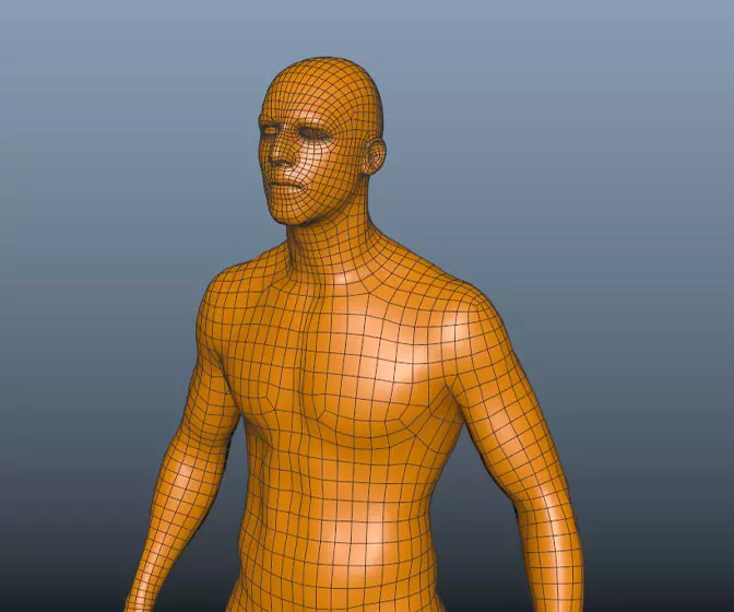
If I were to give you ten pence worth of advice, ad an extra loop from the corner of the mouth so you have 3 quads there instead of two, so 1 top one middle and one lower, as I have found over the years it eliminates probs when opening the mouth a bit better too.
Also the loops from the labial nasal area are very wide, I would bring those in a little more, that way you can add another loop to flow across the bridge of the nose, around the cheek and under the chin.
again great start...
edit: As for the poles, they're in good shape there. Alot of people (mainly inexperienced and copycat parrots) tend to shudder at the sight of them and scream hellfire. But if the loops are correct anatomically then poles become just part of the geo as normal then a good artist is able to work with them without even worrying about them
Jay
#
156
04-06-2012
, 06:54 PM
Registered User
Join Date: Jun 2012
Join Date: Jun 2012
Location: Osijek, Croatia
Posts: 6
I added a few details on the geo, but I'm not very happy about what I did, especially on the area around the cheekbones (highlighted with green). Something is wrong, but I can't figure out what? What do you think about the loops from the labial nasal now, I think it's still to wide?
I think I'll start from scratch again, need more practice for sure.

#
157
04-06-2012
, 07:02 PM

Avatar Challenge Winner 2010
#
158
05-06-2012
, 02:16 PM
Registered User
Join Date: Jun 2012
Join Date: Jun 2012
Location: Osijek, Croatia
Posts: 6
#
159
05-06-2012
, 04:06 PM
if I can direct you to my own thread....https://simplymaya.com/forum/showthre...t=35363&page=4
this is page 4 and the mesh has become more refined if you read it from start.
Also reference is gonna be your biggest help for the positioning of any of the anatomy. Asking me wont help as I dont know what you are looking at. Again, poles dont really matter once you get the loops right. So just concentrate on the forms right now and proportions, once you have that sorted the rest should fall into place
Jay
#
160
25-06-2012
, 06:25 PM
Registered User
Join Date: Jun 2012
Join Date: Jun 2012
Location: Osijek, Croatia
Posts: 6
I was at the European Championships in Poland to support Croatian team, so I was quite absent. Thanks Jay, I started to read your thread, there are a lot of good stuff there. I'll definitely read the entire thread.
In the meantime I started a new model, I couldn't wait to come back and open Maya.
 Maya junky!! I know there is still much work to do and there are a lot of bad things in the mesh but...
Comments and criticisms are welcome.
Kindest regards,
Deni
#
161
25-06-2012
, 08:23 PM
Jay
#
162
24-08-2012
, 03:40 PM
mike-ster
Join Date: Jan 2011
Join Date: Jan 2011
Location: England
Posts: 23
#
163
24-08-2012
, 03:45 PM
mike-ster
Join Date: Jan 2011
Join Date: Jan 2011
Location: England
Posts: 23
#
164
24-08-2012
, 03:47 PM
Registered User
Join Date: Aug 2011
Join Date: Aug 2011
Location: Sliema Malta
Posts: 497
#
165
24-08-2012
, 10:30 PM
mike-ster
Join Date: Jan 2011
Join Date: Jan 2011
Location: England
Posts: 23
Posting Rules Forum Rules
Topics
Free Courses
Full Courses
VFX News
How computer animation was used 30 years ago to make a Roger Rabbit short
On 2022-07-18 14:30:13
Sneak peek at Houdini 19.5
On 2022-07-18 14:17:59
VFX Breakdown The Man Who Fell To Earth
On 2022-07-15 13:14:36
Resident Evil - Teaser Trailer
On 2022-05-13 13:52:25
New cloud modeling nodes for Bifrost
On 2022-05-02 20:24:13
MPC Showreel 2022
On 2022-04-13 16:02:13
